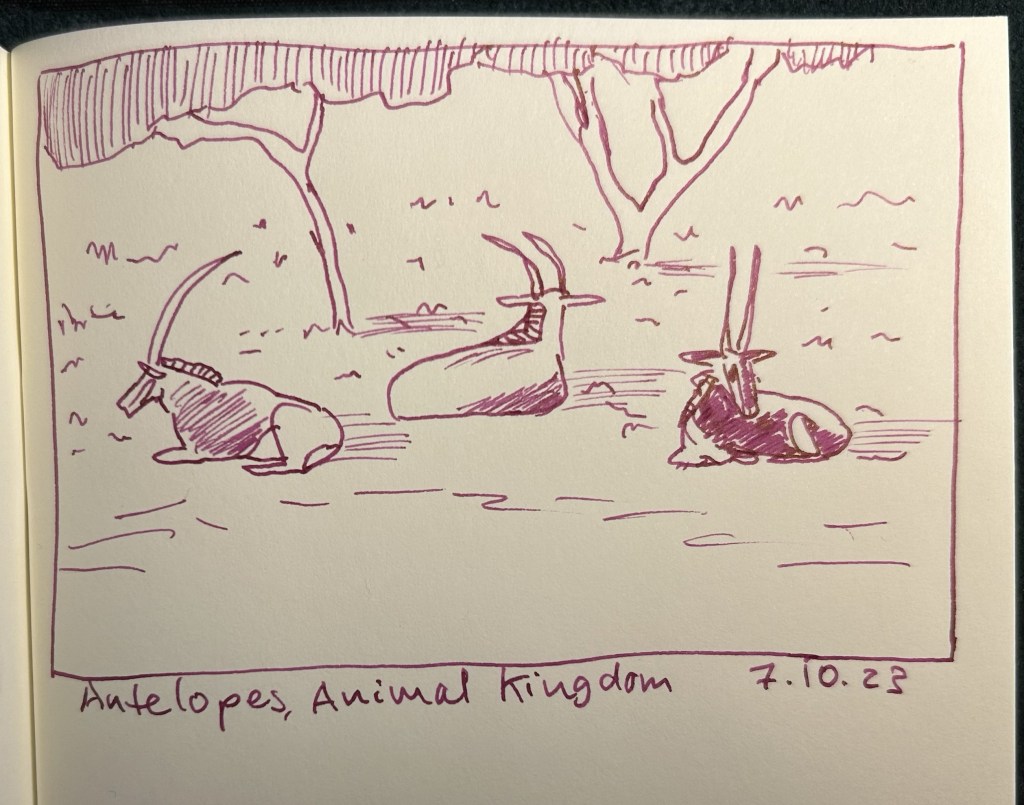
Inktober 2023 Day 7: Pink Antelopes
I wasn’t in the mood to sketch these, but I decided to sketch them anyway. Pelikan Souverän M600 vintage Tortoise Shell brown fine nib with Pilot Iroshizuku Yama Budo.
A blog about writing, sketching, running and other things
I wasn’t in the mood to sketch these, but I decided to sketch them anyway. Pelikan Souverän M600 vintage Tortoise Shell brown fine nib with Pilot Iroshizuku Yama Budo.
I enjoy sketching with grey inks, so I oftentimes have a pen filled with a grey ink of some kind or another. Today’s selection is the Pelikan Souverän M605 Stresemann with a medium nib (which as it’s a gold nibbed Pelikan, verges on the broad) filled with Diamine Silver Fox. Silver Fox is from Diamine’s 150th anniversary collection (one of the original ones they issued), and is a slightly warmish medium grey with fantastic shading.

African elephants are pretty fun to sketch, so I may be tempted to sketch another one of them later this month.

If you’re looking for a grey ink that’s well behaved, offers a lot of shading, is readable even in fine nibs and is slightly on the warmer side of the grey spectrum, then I recommend giving Diamine Silver Fox a try.
I like inks that are on the teal/turquoise range so I almost always have a pen inked up with something in that shade (I currently have three – this Robert Oster Peppermint, Robert Oster Fire and Ice and a Graf von Faber Castell Turquoise). I sketched this white rhino without considering the background — which was just plain rock face, and so something that I should have changed up.

The pen body is from Woodshed Pens, and the nib is a Franklin Christoph fine. I like this combination, as it allows some sheen and shading to appear and yet is still relatively quick drying.

Can you guess what the next sketch will be?
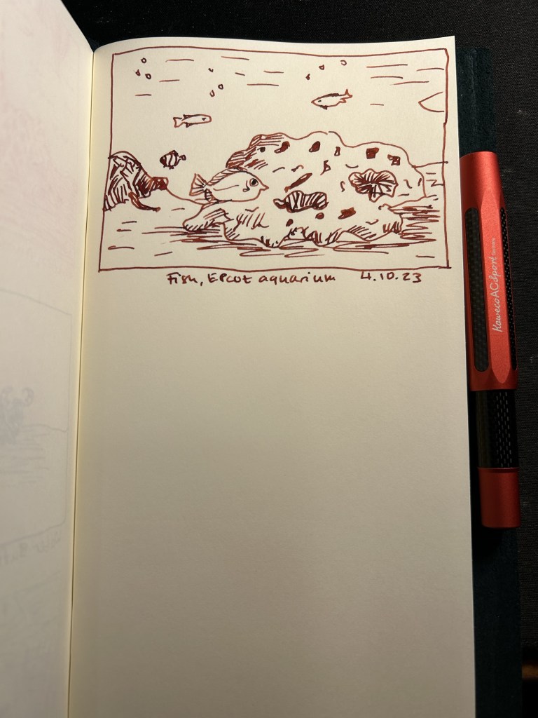
Diamine Monaco Red is a dark red/maroon like colour that has darkened even more in my Kaweco AC Sport Carbon red fountain pen. The fine nib still shows the significant shading this ink has. Google photos brought up this aquarium photo from Epctot’s “The Seas” aquarium so I decided to sketch it even though it was much better suited for watercolours. The fish in the foreground looked so worried that I thought it was worth a try.

I’m not a fan of red inks, but Diamine Monaco Red seems to be dark enough and well behaved enough for me to enjoy it. There’s also something particularly satisfying with crossing to-do list items with red ink: this thing is DONE.
Day 3 of Inktober is for pelicans, and I resisted the urge and didn’t sketch this pelican with a Pelican. Instead I sketched it with a Kaweco Sport in frosted blueberry with a medium nib and a Graf von Faber Castell turquoise ink cartridge.

We have flocks of pelicans passing in the country on their yearly migration, and they are impressively big and impressively loud birds when disturbed. I have a penchant for turquoise and teal inks, so you’ll see quite a lot of this hue during the coming weeks. I like the shade and shading of the Graf von Faber Castell turqoise, so I may yet buy more cartridges once this pack runs out.

It’s day 2 of Inktober, and it’s water buffalo time. These are big, impressive and pensive beasts that you don’t want to mess with. They were chewing their cud in the sun, keeping an eye on us as we admired them from a distance when we saw them at Animal Kingdom, Disney World.

I sketched them using a Lamy Safari fine nib and Platinum Carbon ink. Carbon ink lays down a shiny black line that takes forever to dry and so is my least favourite waterproof black fountain pen ink to sketch with (De Atramentis Document Ink is first place, with R&K Sketch Ink Lotte and Noodler’s Bulletproof Black in the middle of the pack). Since I was afraid of smudging the ink, it’s kind of a barebones sketch.

There was a delightful cast member standing nearby, ready to answer questions, and he was a massive Star Wars fan. He clocked my brother and I’s Star Wars Celebration shirts and we started talking Star Wars while standing in front of these guys and gals’ paddock. Of course he got a cast compliment from us (talking to him made our day), and we got to hear about past Star Wars events at the parks from behind the scenes.
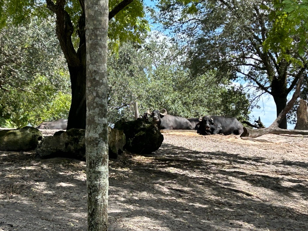
The funny thing is that if we would have rushed past their paddock on the way to see the tigers (like everybody else did), we wouldn’t have had this moment and memory, and the tigers everyone was rushing to see decided to hide in the shade anyway.
It’s October and that means Inktober time. This year I’ve decided to participate in the challenge but to do it a bit differently than I did in previous years:
Now without further ado, here’s Inktober day 1’s sketch:

The giraffes aren’t originally pink, of course, but I sketched them with Pilot Iroshizuku Kosumosu ink and a Franklin Christoph 03 Iterum Sedona Spa fountain pen with a Nagahara fine cursive italic. It’s a beautiful combo, and fine cursive italics are great for getting interesting line variations while sketching with pen and ink.

Giraffes rarely sit down in the wild, as that’s way to risky for them (it takes to much time to get up and run, should they need to). In captivity they will sit down if they feel safe and comfortable, and it’s quite a sight. We saw these two during a night time safari at Animal Kingdom Lodge in Walt Disney World, Florida. Giraffes are suffering from poaching, from habitat fragmentation and from habitat lost, and many giraffe sub-species have only a few hundred individuals left. If you want to help them, the giraffe conservation fund focuses on these elegant and fascinating creatures: https://giraffeconservation.org
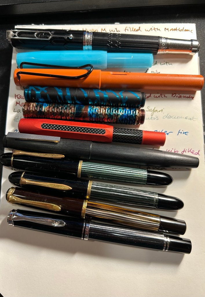
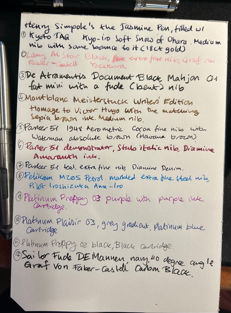
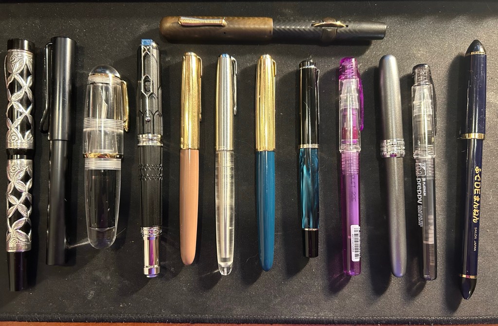
I’ve recently switched out most of my fountain pens and inks for a new batch, so here’s a quick overview of them (from top to bottom):
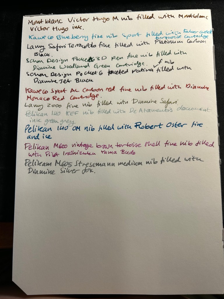
Montblanc Victor Hugo medium nib filled with Montblanc Victor Hugo ink. I bought this at Mora Stylos just before they closed, mainly because the design is based on the Notre Dame de Paris, which I adore. It’s a weird design and quite a hefty pen, but I enjoyed the nib, despite it being a medium. The ink, also limited edition (but knowing Montblanc is likely a relabeled existing ink) is a nice, warm brown with a good amount of shading. As I post this I’ve written this pen dry.
Kaweco Sport Frosted Blueberry fine nib filled with a Graf von Faber-Castell turquoise cartridge. This is the only fountain pen that I took with me on my recent trip to the US, and I used it on the plane (not during takeoff and landing).
Lamy Safari Terracotta fine nib filled with Platinum Carbon ink. I wanted a waterproof ink for my sketches, and I haven’t used Platinum Carbon for ages. The Safari Terracotta is the perfect coloured pen for this season.
Schon Design Pocket Six 3D Teal x Matte Black pen with a fine nib filled with a Diamine Woodland Green cartridge. This pen is already been written dry by the time I’ll post this.
Schon Design Pocket Six Faceted Patina fine nib filled with a Diamine Jet Black cartridge. Schon Design pens made me enjoy pocket fountain pens, and Diamine Jet Black is proving to be a solid, dark black ink (not greyish or brownish).
Kaweco Sport AL Carbon Red fine nib filled with a Diamine Monaco Red cartridge. The perfect pen and ink match. I don’t normally use red inks, but Monaco Red skews towards the raspberry side of things, and is very pleasant.
Lamy 2000 fine nib filled with Diamine Safari. Before I filled a flock of Pelikans, this was supposed to be my workhorse pen. Diamine Safari is great for sneaking unusually coloured inks into serious office settings without drawing attention to yourself.
Pelikan 140 KEF nib filled with De Atramentis green grey document ink. Another sketching combo, perfect for watercolours when I want my line work to melt into the background. KEF stands for Kugelspitze Extra Fine – or Ball-tip extra fine. It’s a very forgiving and rather firm gold extra fine nib. I inked this up on the Friday of the Pelikan hubs even though I didn’t go to a hub. The 140 is a piston filler from the 1950s with a gold nib that was dirt cheap and is an utter workhorse. It’s user grade due to the brassing, but brassing adds character.
Pelikan 140 OM nib filled with Robert Oster Fire and Ice – Pelikan stopped making OM nibs in 2014 because they’re scratchy and unpleasant to write with if you don’t hold them at the right angle. But at the right angle this nib is phenomenal, and it works great with inks that shade and sheen – and Robert Oster Fire and Ice is definitely one of those. You can see a visible sheen at the edges of each letter, and it makes them all glow. I inked this to celebrate the Pelikan hubs.
Pelikan M600 brown tortoise shell fine nib inked with Pilot Iroshizuku Yama-Budo. This is a vintage M600 from the 1980s, with West Germany printed on the band. It’s a lovely workhorse, like all Pelikan Souveräns, and the Yama Bodu ink manages to shade even with the Pelikan fine nib. Also inked for the Pelikan hubs.
Pelikan M605 Stresemann medium nib filled with Diamine Silver Fox. I haven’t had a grey ink in rotation for a while, and Silver Fox is an interesting and dark grey with plenty of shading, particularly with a juicy Pelikan medium nib. Also inked for the Pelikan hubs.
First thing’s first: if you are looking for a writing pen, then the Majohn Q1 mini fountain pen is likely not for you. While you can purchase it with an extra-fine, fine or medium nib, it’s weird body shape would likely make it uncomfortable for long writing session, and as it’s an eyedropper filler, it’s designed to have a giant ink capacity, normally suitable for long writing sessions.
If, on the other hand, you are looking for a fountain pen to sketch with, the Majohn Q1 may be a very worthy addition to your kit.
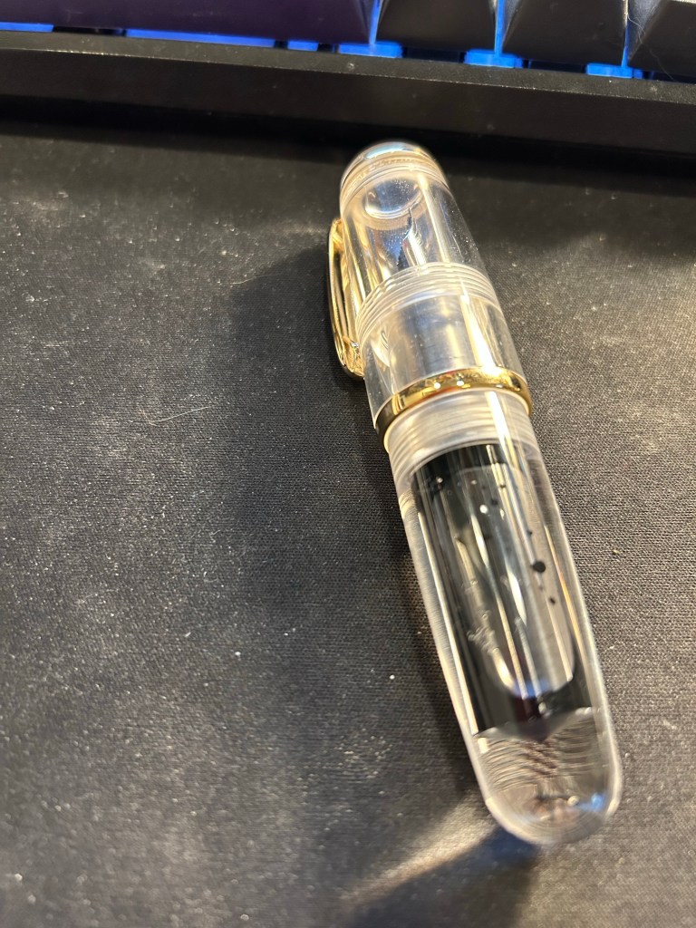
I purchased the Majohn Q1 bent nib fountain pen after seeing Paul Heaston use it in one of his sketches. “What is THAT?!” I asked, and immediately set out on getting one. This weird looking fountain pen reminded me of the Tombow Egg pen (google it. I’ll wait), which I always wanted and never got because I couldn’t afford one at the time. The Majohn Q1 appears to have almost the exact same design as the Tombow Egg, with a few minor details in the trim and molding of the grip section. I purchased mine on Amazon for $22.
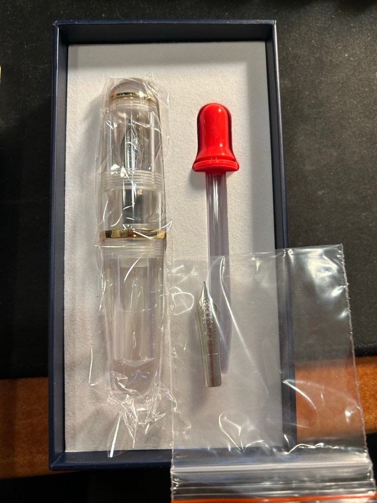
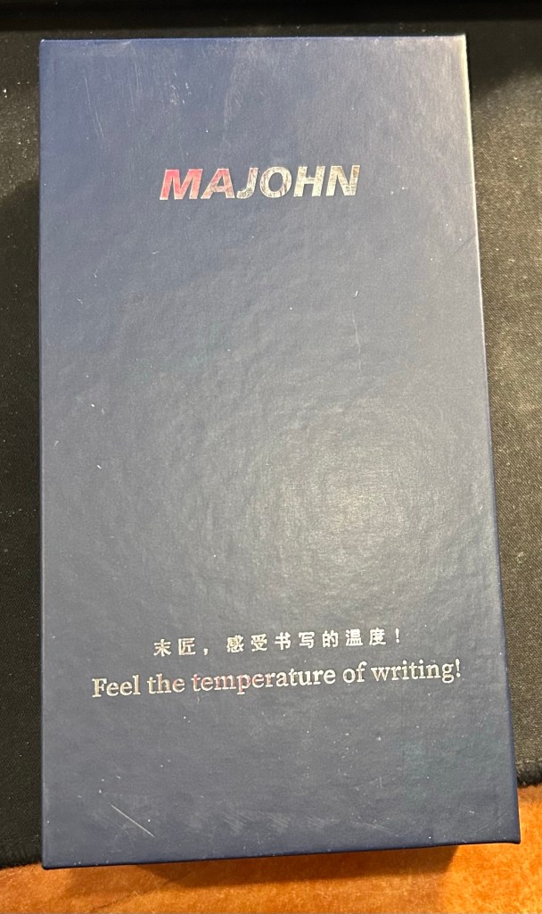
The box the Majohn Q1 arrives in is good looking enough to gift someone. Inside there’s the pen with the Fude/bent nib installed, a spare medium nib (the bent nib is an “aftermarket” installation) and a glass eyedropper that you can use to fill the pen with. The pen itself comes installed with an o-ring so that it can safely be eyedroppered. I filled mine with De Atramentis Black Document ink, which is waterproof when dry.
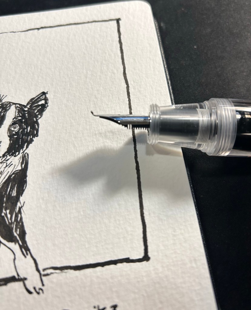
Now the Majohn Q1 is a very small pen, that holds a very, very large amount of ink. That’s why I was interested in it, as I thought that it would be a perfect fountain pen to add to my urban sketching kit. I currently use a Sailor Fude DE Mannen fountain pen for my urban sketching, and it’s a favourite among urban sketchers for the expressive, painterly lines it creates. It is, however, very long and pretty unwieldy: difficult to pack, and sometimes awkward to hold. Here are the Majohn Q1, a Lamy AL Star and a Sailor Fude pen laid next to each other, for size comparison:
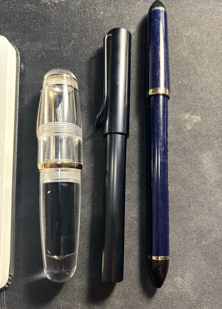
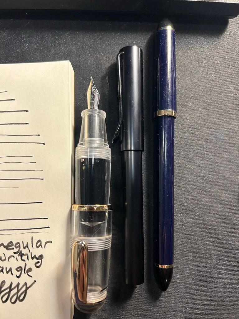
As you can see, the Majohn Q1 is pocket pen sized in length, and very, very wide. It can’t be used unposted, as is to be expected with pocket pens, but once it’s posted, it just becomes an extra wide standard length fountain pen:
The point of this pen is the bent/Fude nib, so here it is, in all the different line widths it can create:
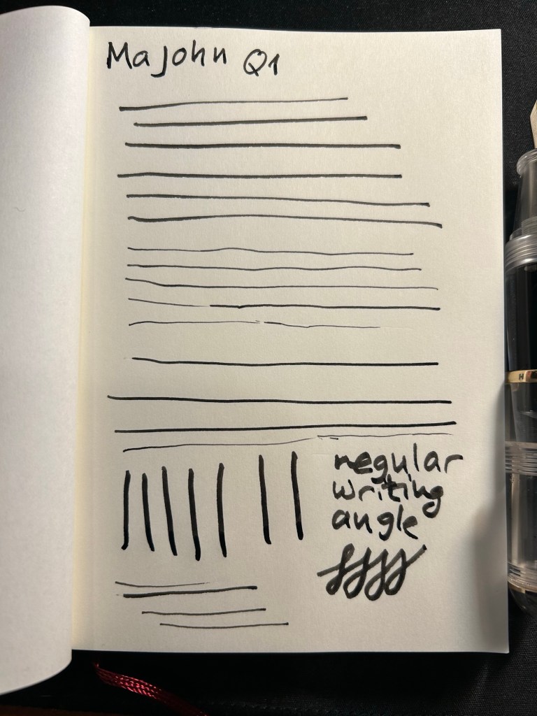
And here’s the Sailor Fude for comparison:

The Majohn Q1 offers much more line width control and consistency than the Sailor Fude, but you sacrifice some of the painterly quality and dynamism of the Sailor Fude to achieve that control.
The Majohn, like the Sailor, isn’t perfect in terms of gripping experience. While it’s much easier to grip the Majohn in a variety of different angles to get a variety of different lines, there’s a pretty pronounced step between the pen body and the grip section that can be uncomfortable if that’s where your fingers naturally land on. For me, I grasp the pen either closer to the nib, or not on the section at all but rather on the pen body. I’d recommend trying it out first, but for $22, it might be worth it just to buy the pen and try it out for a while.
Here’s a sketch of a friend’s border collies sketched with the Majohn. As you can see, it’s relatively easy to get both a good level of control with this pen, a lot of line variation, and some of that painterly quality to the line that makes it more interesting and expressive.
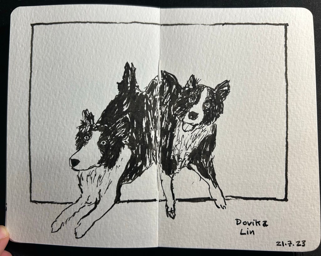
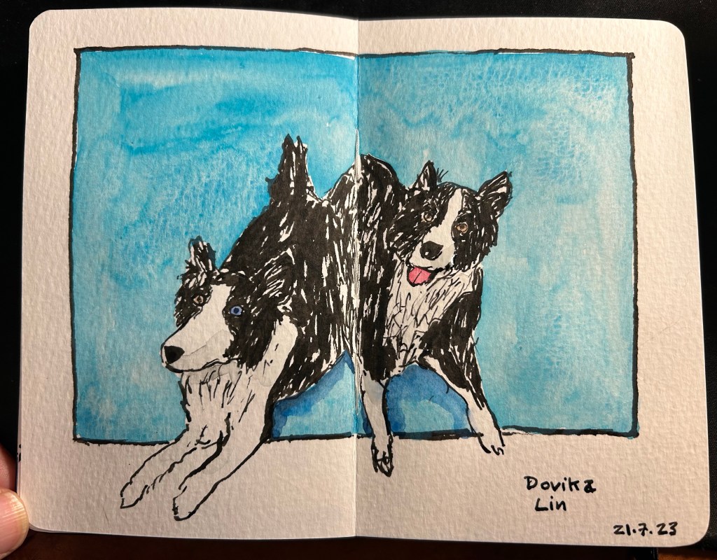
Here’s the complete sketch, just for fun:
If you’re at all interested in fountain pen sketching, and especially if you are an urban sketcher, I recommend giving the Majohn Q1 bent nib fountain pen a try. It’s easier to control and to transport that a Sailor Fude, and holds a much larger ink capacity, which is great for long sketching sessions or when you need to block out a large section with ink. For such a low price you get quite a lot, and the learning curve is much less steep than with a Sailor Fude DE Mannen fountain pen. I don’t do calligraphy, but I assume that it could be worth a try for calligraphy as well, especially if you are looking for a travel friendly solution. And who knows, maybe you’ll get to feel the temperature of writing while using it…
Long time no update, so I decided that it’s about time to write one up.
I’ve been in a terrible reading rut, and I blame the book that I’m currently reading: “The Books of Jacob” by Olga Tokarczuk, a 912 (!) page historical epic about Jacob Frank and his followers. I’m halfway through, and I’ve decided to put it aside for now and train my brain to enjoy reading again with some lighter and more fun material.
The book itself is masterfully written and researched, with the narrative made out of a carefully pieced together mosaic of characters, voices and narrative styles. I just cannot handle the subject matter right now. As my rights are being taken away by religious, power hungry fanatics, I don’t want to spend my free time reading about religious, power hungry fanatics. It has reached a point where I balk at the idea of reading again, and that’s just not healthy. I hate giving up on books like that, especially good books, but if I want to actually read again and not just beat myself up for not reading, I’m going to have to start reading something else.
I went through a CPET (Cardiopulmonary Exercise Testing) last week and it was pretty intense. My lungs aren’t working well in high intensity since my chemo, and so a lung specialist sent me to get this test, to see whether my heart or my lungs are the issue.
It started with a spirometry test (which is a simple test done to check your lung capacity and performance), and then went on to the CPET itself. I was hooked up to an EKG and pre-test measurements were taken. Then I was fitted with a special mask and filter that recorded my air intake and CO2 levels. Finally I was put on a special stationary bike, attached to a blood pressure monitor and a blood oxygen level monitor, and told to pedal without stopping until I felt chest pain or was about to faint, or until I was told to stop. As the technician calmly told me, they have a lot of people fainting during this test, which is why they do it on a bike and not a treadmill. I said it was intense, right?
Anyway, I pedalled for my life, with the bike’s resistance being constantly raised, and me gradually getting out of breath. The point was to see why, so I didn’t stop until the technician stopped me, at which point a little over 10 minutes of constant intense exercise had gone by and I was drenched in sweat and panting. H
ere’s hoping that I get some useful insights from the results. In the meanwhile I’m still running 5 times a week, just not as fast as I would like.
I wrote most of my pens dry and filled in a new batch, this time consisting of mostly vintage pens. There are also two expensive pens in this rotation, a few old ink favourites and some completely new to me inks, and a weird selection of colours.
I’m working on an adventure for a 30+ tabletop roleplaying convention at the end of the month. I may publish something here about how I write adventures for conventions.
In the meanwhile my D&D 5E game, set in a university like setting and a university town next to it, is progressing nicely. It’s the most complex campaign that I have ever written, but it’s wonderful to see the players rush around in this world, having the time of their lives exploring, interacting and trying to break stuff. D&D is a pure joy and a wonderful escape from the pretty dark reality we live in these days.
Speaking of both dark reality and things that cheer me up:
