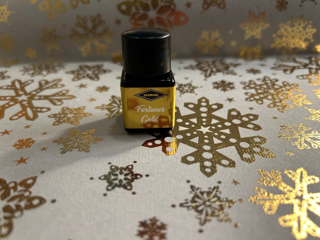
Diamine Inkvent 2023 Day 8

This is the Diamine Inkvent 2023 day 8 door:

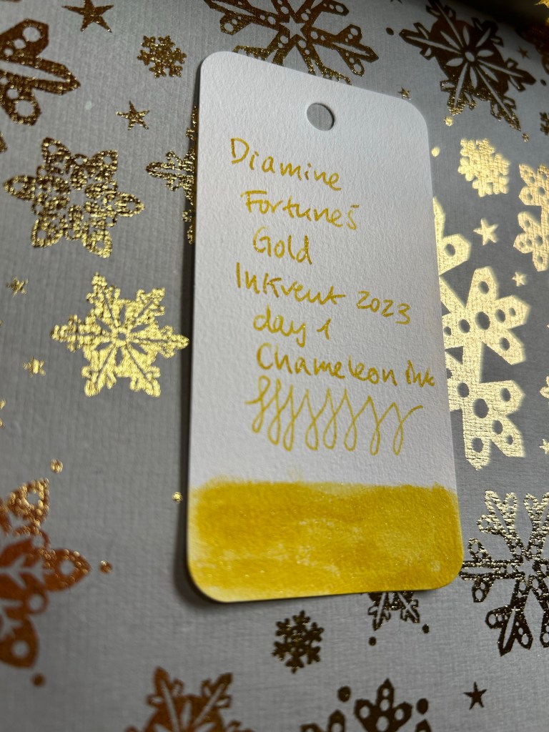
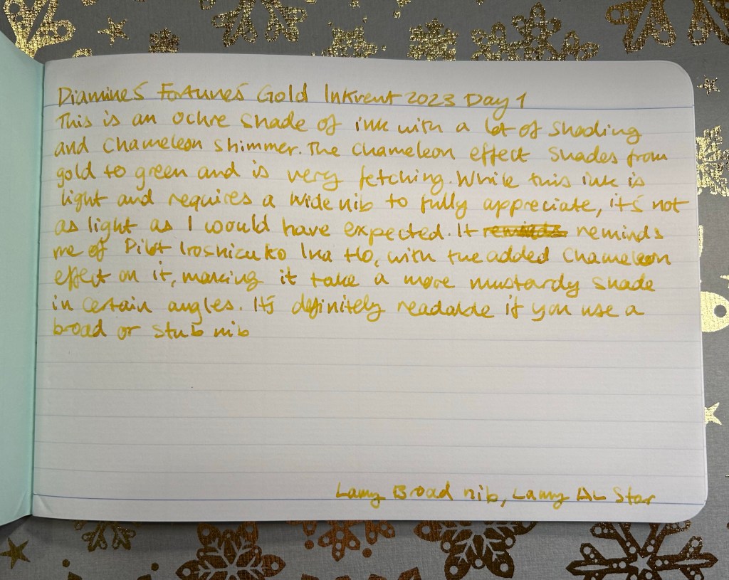
Day 8’s ink is Diamine Jacaranda. It’s a standard ink.

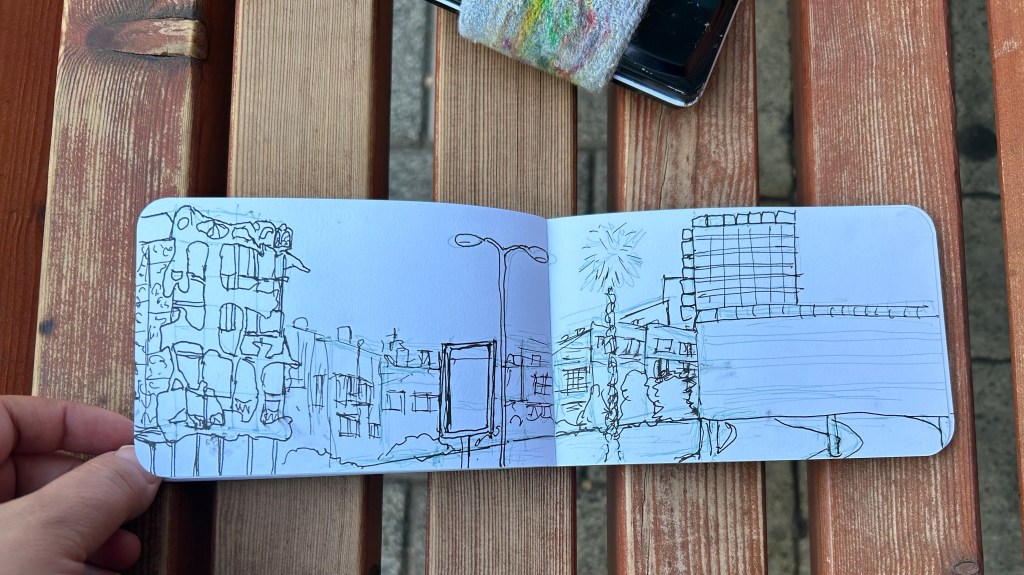
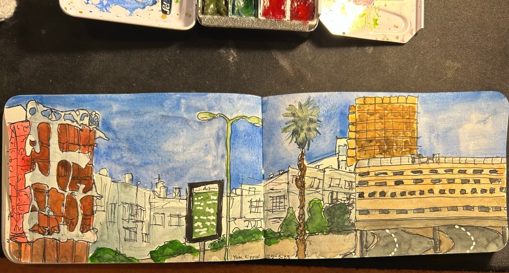
Today’s ink is a standard ink in a lovely bluish-violet, very aptly named Diamine Jacaranda.

Col-o-ring swab of Diamine Jacaranda

Jacaranda shades beautiful and I love the subtlety of its colour – this is an ink that can be used both for journaling and for work, and you could definitely use it for greeting cards. Like all purple inks it’s very difficult to photograph so the photo of the best sketch made it look much bluer than it is. The other photos are more true to life.

Writing sample of Diamine Jacaranda

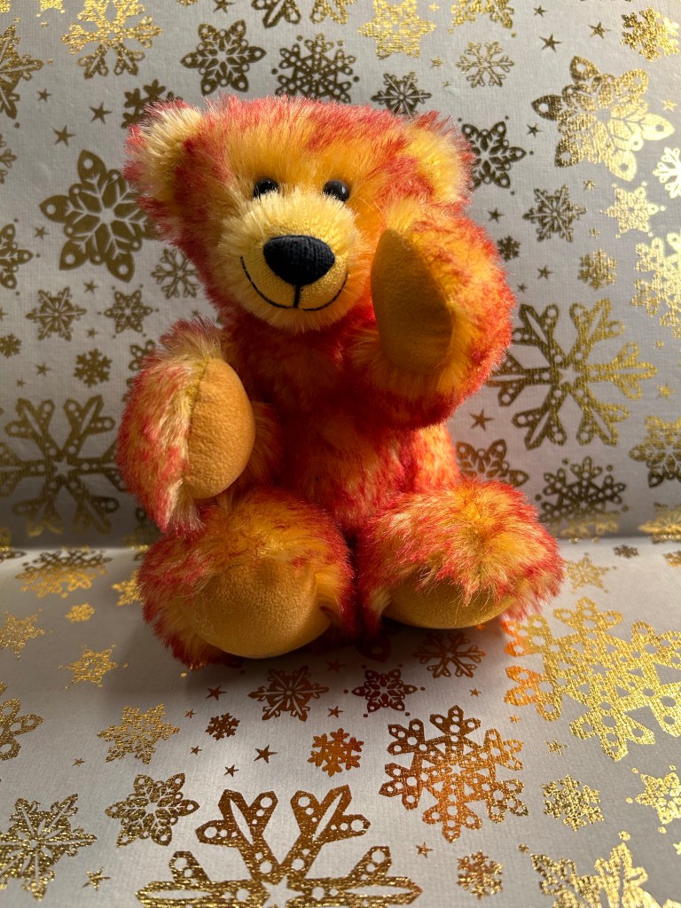
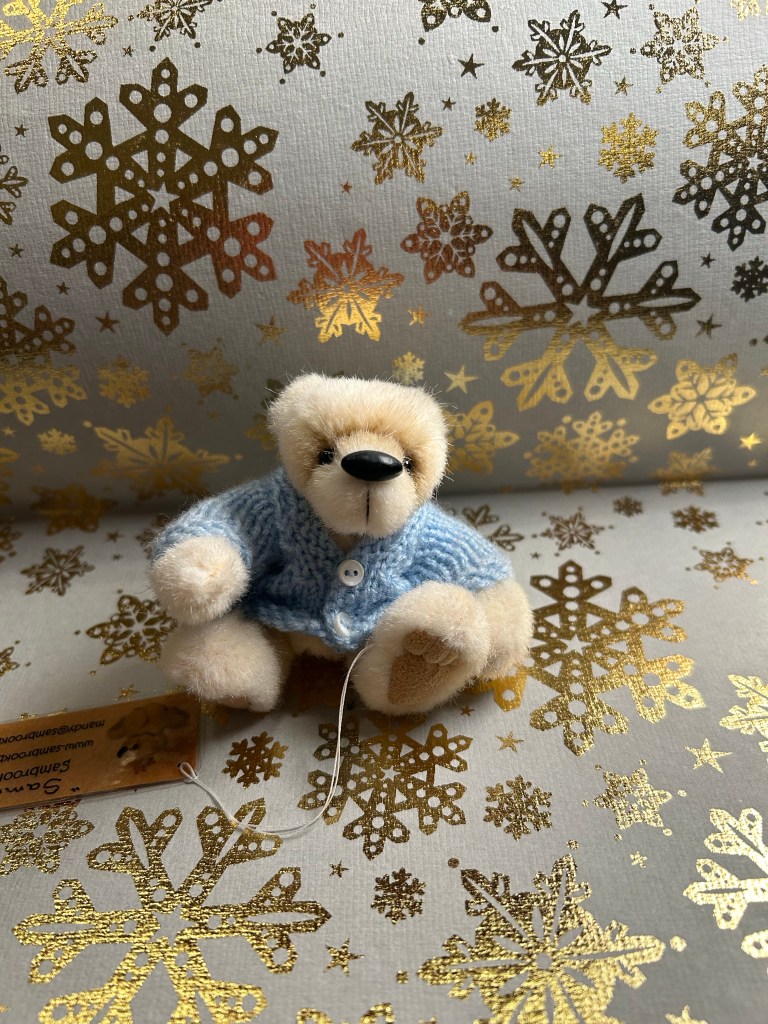
This bear is called Sammy and he has an unusual head shape and a cardigan, so he’s an outlier in my collection. He’s got a polar bear thing going on, instead of the more traditional brown bear influences.

Here’s Sammy with his perfect cardigan and his perfect toes:

Diamine Jacaranda is one of the inks that I’m more likely to buy a full bottle of once this Inkvent is over. I like the colour, the shading and the name, plus it’s a standard ink so it’s more generally useful to me. Do you see yourself using Diamine Jacaranda in the future?

Diamine Inkvent 2023 Day 7

This is the Diamine Inkvent 2023 day 7 door:

Day 7’s ink is Diamine Sweet Dreams. It’s a scented ink.

Oh no, it’s a scented ink! I loath scented inks, and this one is particularly bad. Diamine Sweet Dreams is day 7’s ink, and it’s a bubblegum pink ink that smells of bathroom potpourri. It also has flow issues like all the scented inks I tried so far – you can see it in the writing on the col-o-ring swab below:

Col-o-Ring swab of Diamine Sweet Dreams

There’s relatively little shading in this ink, which is surprising as it’s not a super saturated ink. There is way too much scent. No idea why anyone would want this in their lives.

Writing sample of Diamine Sweet Dreams

This tiny bear is called Mervin (not Marvin) and he’s a very unusual bear: short dual tone “fur”, donkey ears, strangely shaped eyes and nose. He adds interest to my collection, and he’s adorable.

Here’s Mervin:

I don’t like this ink, and I don’t like scented inks. If you do, you might like its sickly sweet smell. I personally am going to dump it out and thoroughly clean out the pen now.

Diamine Inkvent 2023 Day 6

This is the Diamine Inkvent 2023 day 6 door:

Day 6’s ink is Diamine Buck’s Fizz. It’s a chameleon ink.

Wow is today’s ink eye searing! Diamine Buck’s Fizz is a light orange with a lot of chameleon shimmer that shades from green to silver to orange and salmon and gold. There’s some shading to it, and so far it’s one of the lightest inks in this year’s Inkvent.

Col-o-Ring swab of Diamine Buck’s Fizz

The chameleon effect from another angle:

I had to look up what Buck’s Fizz is as I don’t (and have never) drunk alcohol. This ink likely evokes the drink and so is aptly named, but it’s impractical for writing, as it’s much too light. With a broad or wider nib your writing would be more legible, but Diamine could have gone with a darker orange to make this more practical. Then again, I don’t think that this ink is meant to be practical.

Writing sample of Diamine Buck’s Fizz

Today’s bear is from the same maker as yesterday’s bear, so it’s also tiny, clothed and has a domed head. I bought the pair of them together in a bear shop in York.

Here’s the actual bear:

I won’t be buying a bottle of Buck’s Fizz and I’ll likely be dumping out this ink and cleaning out the pen because I don’t see myself finding use for it. If you use fountain pen inks as highlighters or a fan of fun orange inks then this ink is for you. What do you think? Is there room for Buck’s Fizz in your ink collection?

Diamine Inkvent 2023 Day 5

This is the Diamine Inkvent 2023 day 5 door:

Day 5’s ink is Diamine Nightfall. It’s a chameleon ink.

It’s day 5 of Inkvent 2023 and we get our first dark ink, Diamine Nightfall. This is chameleon ink, and the effect works wonderfully well with dark inks, adding light, depth and zing to them. Diamine Nightfall looks like a night sky full of colour shifting stars, and it’s gorgeous.

Col-o-Ring swab of Diamine Nightfall

The chameleon effect from another angle:

The base ink is a saturated indigo, so there’s not much shading but there is some red sheen to it. The chameleon shimmer shades from blue to silver and green and it makes for a very striking effect.

Writing sample of Diamine Nightfall

This tiny bear is one of the few clothed bears in my collection (not counting bears with accessories like scarves and hats). I love his domed head and the contrast between his face and his body mohair colours.

And here is Flippy in all his tiny glory:

I think that Diamine Nightfall is a striking and beautiful ink, and suitable for the Inkvent holiday theme. Do you see yourself writing greeting cards with it? Sneaking it into meetings?

Diamine Inkvent 2023 Day 4

This is the Diamine Inkvent 2023 day 4 door:

Day 4’s ink is Diamine Masquerade. It’s a shimmer ink.

Diamine’s Masquerade is a duskier, browner leaning pink than day 2’s Diamine Cashemere Rose. You can imagine a papier-mâché carnival mask made in this colour. The copper shimmer in it is pronounced, and adds to its somewhat kitschy appeal.

Col-o-Ring swab of Diamine Masquerade

I think Masquerade would work well on cream coloured paper, and I’m pretty sure that there will be many fans of this ink. It would work well as a journaling ink, as the colour is calming, and it has both shading and shimmer, and so plenty of interest.

Writing sample of Diamine Masquerade

I think I have two, maybe three pink teddy bears in my collection, and Candy is the smallest of the bunch. I like her kind of forlorn look.

Here’s the original bear:

Between Diamine Cashmere Rose and Diamine Masquerade, I prefer Cashmere Rose and not only because it’s much lower maintenance than Masquerade, as it’s a standard ink. Masquerade is just a bit too much for me, but I’m sure many people would prefer it to Cashmere Rose. Which one would you see yourself using more?

Diamine Inkvent 2023 Day 3

This is the Diamine Inkvent 2023 day 3 door:

Day 3’s ink is Diamine Early Dusk. It’s a standard ink.

I expected Diamine Early Dusk to be darker, a more blue-black type of in from its name, but it’s actually a pretty cheerful cobalt blue. There’s a periwinkle shade to it that makes it very attractive, and it offers some shading.

Col-o-Ring swab of Diamine Early Dusk

I was worried that this would be a boring sky blue, one of the many, many inks in that shade already in the market, but Diamine Early Dusk has enough shading and enough of a violet leaning to make it interesting. It’s not like there aren’t other inks in this shade to be found, it’s that it’s nice to have a relaxing yet somewhat interesting blue in this Inkvent set. Between the shimmers, the chameleons and the sheens its good to have an office suitable ink that has a little character.

Writing sample of Diamine Early Dusk

I don’t have many blue bears, but Nestor is one of them, and he’s a delight. His greyish blue mohair makes me think of him as an aging bear, and that just makes him even better.

Look at all that shading!

Here’s Nestor in all his blue mohair glory:

Do I see myself buying a full bottle of Diamine Early Dusk? Maybe. I like the colour very much, and it is very practical but with a little bit of fun to it. Would Diamine Early Dusk become an office staple for you?

Diamine Inkvent 2023 Day 2

This is the Diamine Inkvent 2023 day 2 door:

Day 2’s ink is Diamine Cashmere Rose. It’s a standard ink.

Cashmere Rose is a lovely, dusky shade of pink that makes you practically want to eat the words of the page. There’s something about it that is just calming and satisfying.

Col-o-Ring swab of Diamine Cashmere Rose

There’s a lot of interesting shading with this ink, even with a fine nibbed pen, and I have a feeling that this ink would look even better on cream coloured paper.

Writing sample of Diamine Cashmere Rose

I didn’t think pink would make for a good sketching ink colour, but Cashmere Rose works for that too. The muted colour and the shading makes it work well for vintage style sketches.

This bear is one of my favourites, and it has a very unusual dual tone mohair setup. I bought it years ago at a Christmas fair in Berlin. The grandma that made him knew no English and I knew no German but we got along fabulously with hand gestures and miming. Such is the power of teddy bears — the love of them in universal.

Here is the original bear. Doesn’t he look happy?

Diamine has several great inks in muted pink/red colours and Cashmere Rose is a great addition to that lineup. I like this ink enough to consider buying a whole bottle of it. What do you think? Could you see yourself using Diamine Cashmere Rose?

Diamine Inkvent 2023 Day 1

This is the Diamine Inkvent 2023 day 1 door:

Day 1’s ink is Diamine Fortune’s Gold. It’s a chameleon ink.

The base mustard colour has a lot of shading to it, and the chameleon effect shades from gold to green. This makes Fortune’s Gold both more readable and more interesting than standard gold shimmer inks.

Col-o-Ring swab of Diamine Fortune’s Gold

From another angle to try and capture some of the chameleon effect:

Fortune’s Gold is still a light ink so you want to go with a broad or stab nib for this one, to best capture the effect and ensure readability.

Writing sample of Diamine Fortune’s Gold

I don’t remember where I bought this tiny hand made bear, but it’s likely from York, UK. You can see how much Fortune’s Gold shades in this sketch:

And here’s the original bear, in all its cuteness:

Diamine Fortune’s Gold provides a strong start for the 2023 Inkvent calendar. It’s very fitting thematically, and they’ve added interest and variation to a pretty staple holiday ink colour. Would you use it or do you prefer inks that lean more heavily into the pure gold hue?

Diamine Inkvent 2023: Spoiler Free Introduction

This is the Diamine 2023 Inkvent calendar. It contains 24 doors with 12ml bottles of fountain pen ink behind them, and one 30ml bottle of ink behind door 25. As in every year so far I will review all the inks in the calendar, publishing one post per day for 25 days, and then a summary post looking back at the calendar as a whole.

Inkvent 2023 – this time it’s purple

As I’m travelling this year at the beginning of December, I already wrote the first two weeks of reviews ahead of time (don’t worry, no spoilers). I don’t use dip pens for these reviews, but instead fill 25(!) fountain pens. This year, however, I’ve been a bit smarter about things and haven’t filled them to the brim.

Each review will contain a Col-o-Ring swab and writing sample, and that’s where you’ll get the best impression of the full range of colour of the ink.

I will also be including a writing sample, this year on a Penco notebook, and a sketch in a Midori MD notebook. This year I’m going for a theme for my sketches, sketching teddy bears out of my teddy bear collection. So you’ll also get a photo of a cute teddy bear as a bonus with each review.

At the end of each review I’ll try to give an idea of where and when I think this ink could be used, and whether I’m inclined to purchase a full bottle of it (Diamine will issue gorgeous glass bottles of the Inkvent inks later on next year).
Happy Inkvent to all who celebrate!

De Atramentis Document Ink Green Grey

De Atramentis Document Ink Green Grey is a waterproof fountain pen ink that could have easily been called “Sage Green”. It’s dry and offers a fair amount of shading, is quick drying and would be a good addition to any Urban Sketcher’s kit.

Ink swab on Col-o-Ring

While I think that De Atramentis Document Ink Green Grey is much too light to be useful as a writing ink (see sample below) its subtlety, natural shade and waterproofness makes it very useful when coupled with watercolours.

Writing sample with two different pens on Midori MD cotton paper.

When used by itself, particularly in wider nibs, DA Geen Grey gives sketches a “vintage” feel and a good amount of interest: it both shades and allows for dry brushing effects because it’s so dry. Want a dry brush effect? Just work fast, and the tendency of this ink to skip will suddenly be an advantage:

Dry brush effect
Vintage look to a vintage motorcycle
This shade makes this sketch a bit melancholy, which is what I was looking for.

DA Green Grey truly shines as an under-drawing ink for watercolours. You can freely sketch guidelines and work directly in ink with it, and then add watercolour. It’s light enough to fade into the background, while still remaining permanent on the page and providing you with useful references.

Under-drawing/guideline sketch
Ink sketch with a Staedtler pigment liner

Can you even see DA Green Grey lines in this sketch? (you can, from very close by and if you know what you’re looking for)

If you work with watercolours, especially if you’re an urban sketcher, I highly recommend adding De Atramentis Document Ink Green Grey to your kit. It can replace a pencil for the under-sketches of your work, and it doesn’t change the shade of the watercolours, nor does it need to be erased. A pen with this is going to be added to my sketch kit, though I will probably use a fine or medium nibbed fountain pen for this ink and not go any finer because it’s so dry.