I’ve been unhappy with my watercolour palette lately, and so I’ve been experimenting with new colours instead of some of the old ones. I usually swap out one colour at a time, try out the new colour for a while, and then either keep it or swap it out for something else. This time I’m doing my usual swap procedure, and also building a completely new palette on the side. The idea is to speed up the new colour discovery process, as there are 5-6 colours that I want to replace in my current palette, and that’s a lot.
The first colour to leave was Daniel Smith Cerulean Blue Chromium. I have too many similar blues and it’s slowing me down having to decide between them every time I need a blue. In its place I swapped Daniel Smith Rhodenite Genuine, which is a bright pink.
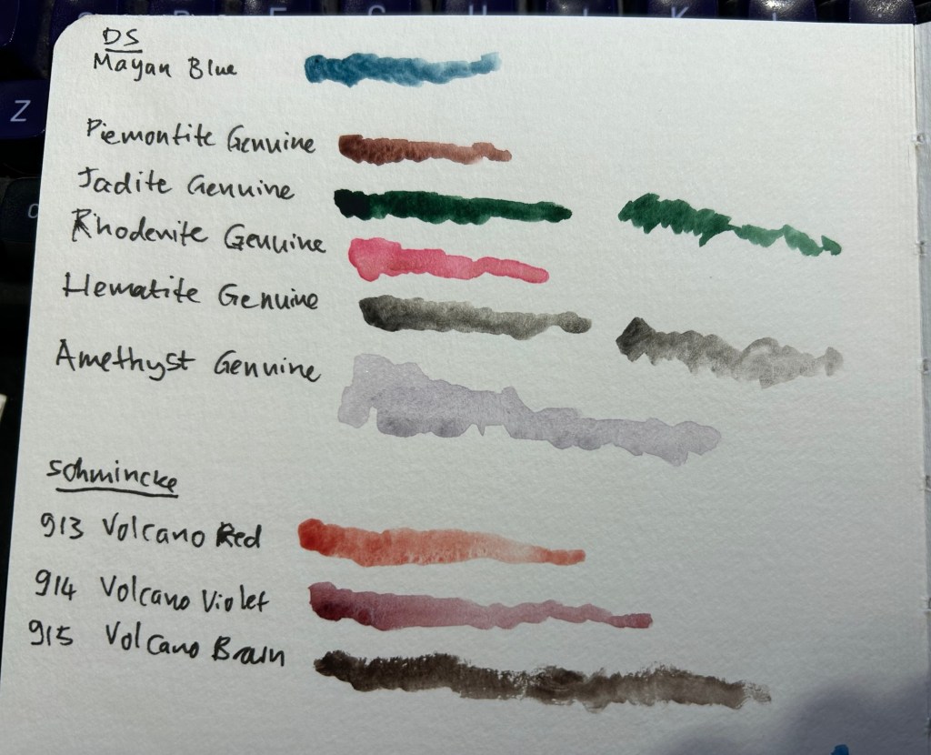
Samples of some of the colours I considered swapping in. Amethyst Genuine was a genuine disappointment – I don’t think I’ve seen such a bland, pale, washed out purple anywhere.
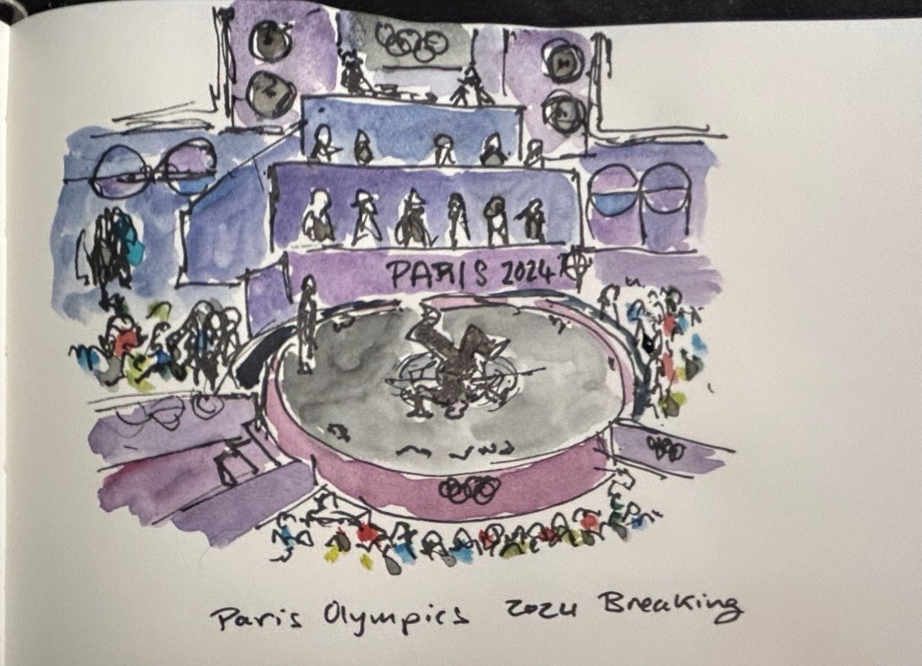
I then sketched one of the scenes from the 2024 Paris Olympics Breaking final, which I was going to see in person before I had to cancel my trip. Luckily my brother was there and sent me photos and videos, which I had fun sketching from. There was a lot of purple in this scene, so I had fun mixing Rhodenite with blues and purples on my palette.
Quick Paris Olympics Breaking sketch
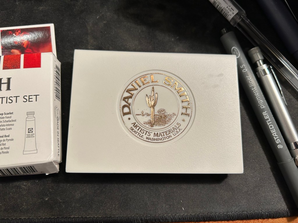
The new palette is something I’m building in a Daniel Smith plastic paintbox. It’s not a box that I’d regularly use (it doesn’t have enough mixing space for me), but it’s useful for the testing I want to do.
This box came as part of a set of two, one of which had paints in it.
I then set up a legend in my sketchbook:
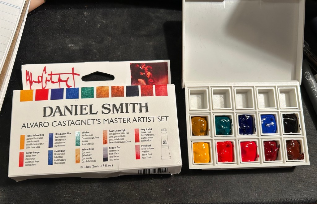
Next I broke ou the Alvaro Catagnet Daniel Smith Master Artist set and filled the pans with paint. I’ll give them 2-3 days to completely dry out before finishing the legend and trying them out. I would never have built a palette which is so heavily skewed towards reds, but this is part of the experiment – after a heavily blue skewed palette it’s time to try something new.
I can’t wait to give these new paints a try. I’ve worked with the Schmincke versions of Yellow Ochre (I no longer use it because of its opacity), Viridian (way to artificial a green for my tastes), Ultramarine Blue and Cobalt Blue, but it will be interesting to see Daniel Smith’s take on these colours.
So I was sick, which made sketching impossible for a few days. I’m still sick but I’m slightly better, so I sat down and powered through the rest of the missing sketches.
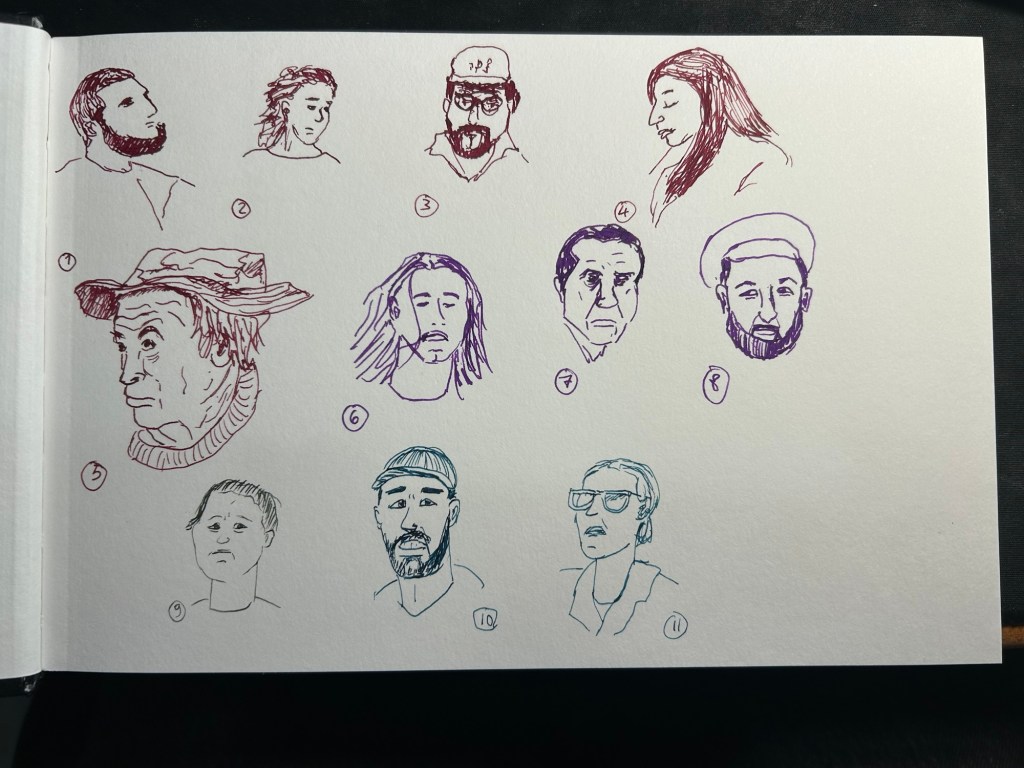
As I mentioned last time 61-68 were draw from life, the rest from earthsworld. This site is so much better for reference photos than the flickr gallery I used in previous years that it affected both my speed and my sketching quality. Also, I had a lot more fun sketching these portraits this year. The Leonardo Momento Zero Bohemian Twilight fine nibbed fountain pen was the perfect sketching companion, and Diamine fireside snug performed well on the Stillman and Birn Alpha paper. The larger landscape format also helped make these a joy. Here are the previous days’ sketches: day 1, day 2, day 3, day 4, day 5, day 6, day 7.
This sketching challenge is always great to do, as it really pushes me outside my comfort zone. If you haven’t yet, I highly recommend giving it a try.
I really didn’t feel like sketching today, as I discovered that my cat has a large lump on his hind leg so I need to take him to the vet tomorrow. I’m worried about him and so considered skipping today entirely, but ended up sketching some people to distract myself. Same setup as yesterday – Leonardo Momento Zero fountain pen, Diamine Fireside Snug ink, Stillman and Birn Alpha.
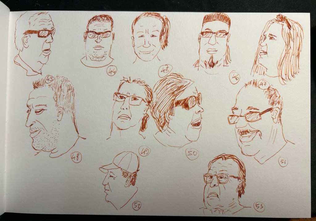
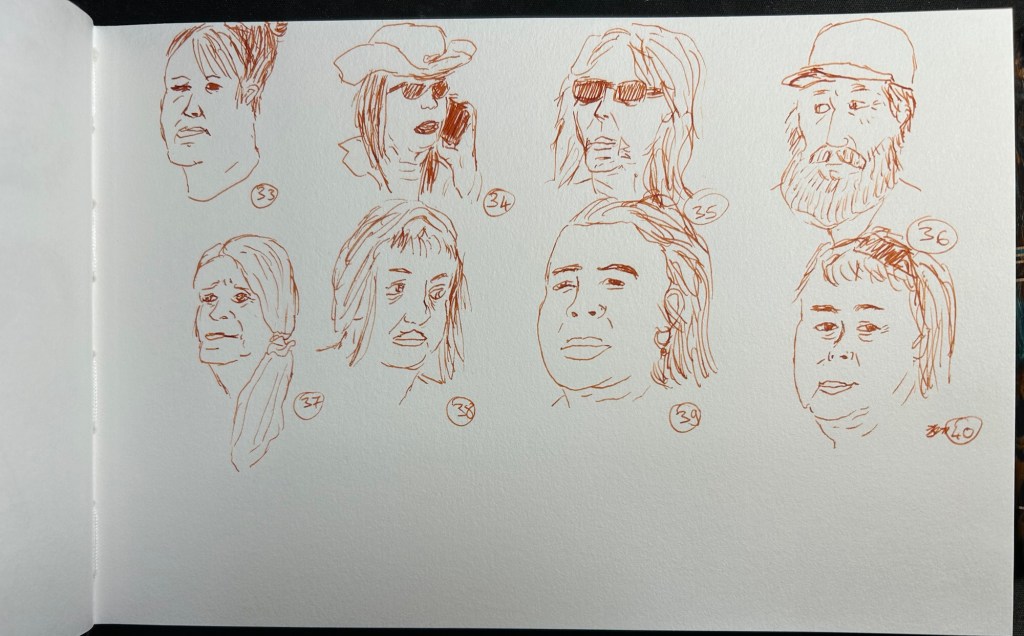
The result is sketches 12 to 40 (yes, I got that many done in a single sitting). The fact that I have much better reference photos made such a huge difference, as I didn’t have to waste time digging through urban landscape photos in search for half decent portraits. Also, the Earthworld photographs feature People with a capital P – frumpy, old, ugly, real and incredibly beautiful to sketch. The great Leonardo Momento Zero Bohemia Twilight fountain pen with its fine nib and Diamine Fireside Snug also added to the fun – I love this pen and ink combo so much I’m likely going to use it for the rest of the 60 sketches.
Number 12 was added to this pageI love 14, 17, 18, 20 and 21I picked up speed with these as I warmed upNumber 36 and 37 really came out well, I think
So, now which one is your favourite? I have too many to choose from.
I had a busy day yesterday, so I only got three sketches in and didn’t have time to post them. Numbers 9-11 were what I added, with number 9 being sketched with a vintage Parker Vacumatic filled with Diamine Ash and numbers 10 and 11 being sketched with a Franklin Christoph 45L and Diamine Eau de Nil. I loved the lines that the Parker Vacumatic produced, but it’s an extra fine nibbed fountain pen and it really struggled on the tooth of the Stillman and Birn Alpha. These were the last batch sketched from the Street Photography group on Flickr. I found a better source for photos thanks to a great tip from Tina from the wonderful Fuelled by Clouds and Coffee blog.
I almost didn’t post today as I wasn’t up to sketching and I got only three sketches in, none of them great. But I like it when creators show their failures so I’m doing it myself today: my lack of shoulder mobility coupled with a lack of sleep and the difficulty of the subject made for a bad sketching day.
Parker 51 with Montblanc The Beatles Psychedelic Purple on a Stillman and Birn Alpha. Sketched 6-8 were done today. As usual the goal for me is to get to 100 even if it takes more than a week.
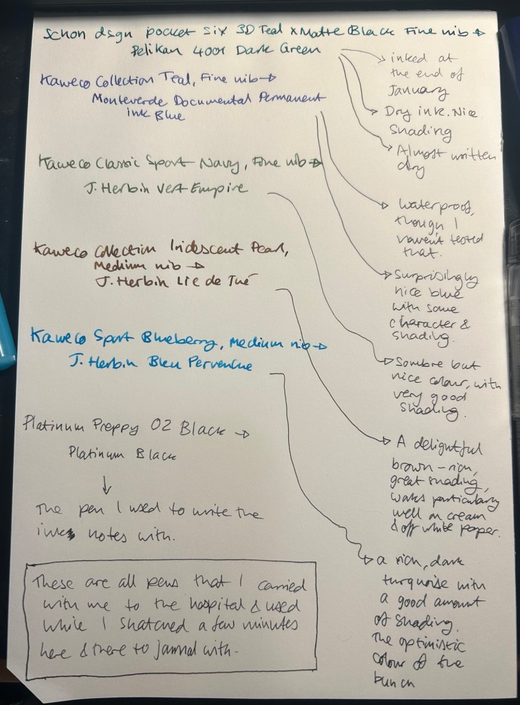
I started the month ready to spend the first half of it in hospital, with my dad. So the fountain pens I chose were all expendable pocketable pens that I was willing to have stolen (apart from the Schon Design Pocket 6 which was a leftover from January and never left my desk). So that meant I inked 4 Kaweco Sport fountain pens using various ink cartridges that I had on hand.
The portable lineup:
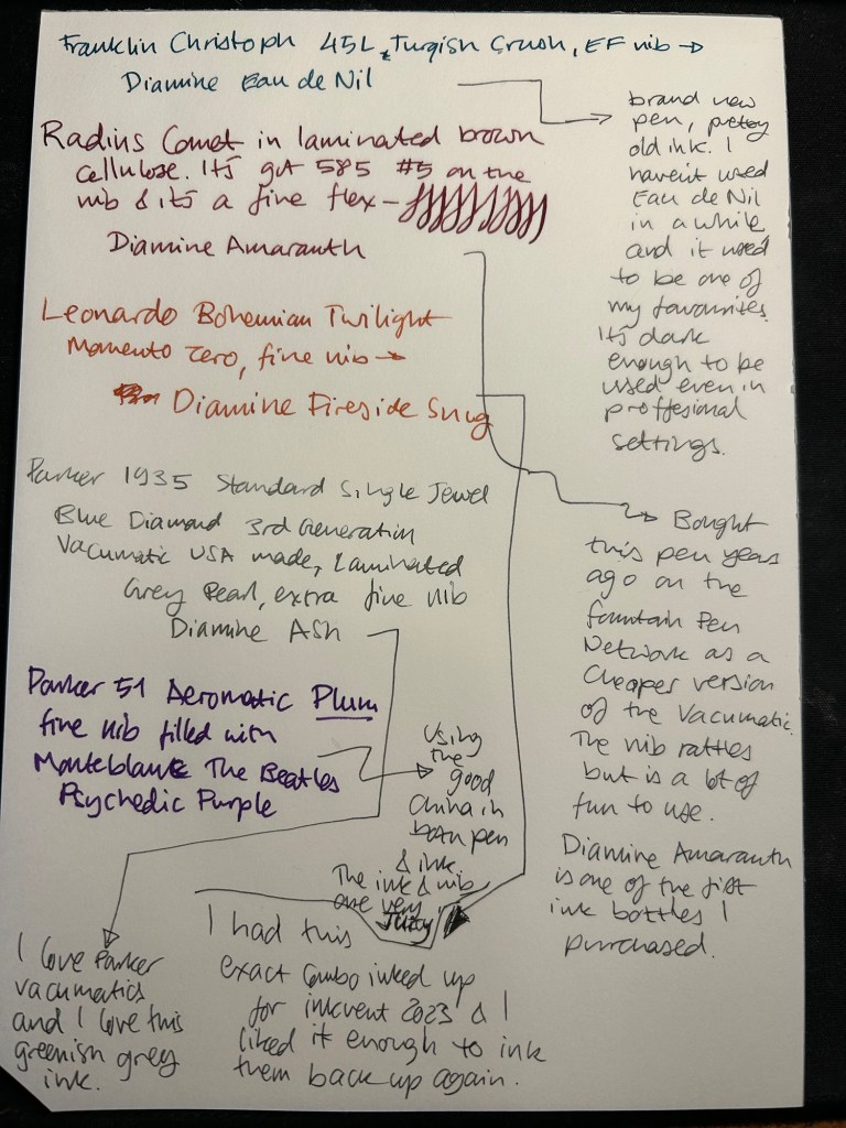
Once my dad got out of hospital and back home, I decided to celebrate by “shopping” from my collection. I inked up a Parker 51 Plum (use the good china!), a Parker Vacumatic, a Franklin Christoph 45L Turqish (spelled like that on their site) Crush that I had purchased but hadn’t inked before, and a vintage Radius Comet (because I heard that the brand was being revived).
The Franklin Christoph EF nib isn’t the best companion to the Eau de Nil as the ink tends to dry in the nib, causing hard start issues. The Radius is a flexible nib of the vintage kind, which means it’s really flexible and not just springy. It also rattles, which makes me not carry it around with me — it stays at home at my desk. The Leonardo is a beautiful pen with a beautiful ink that I refilled immediately — the only Inkvent 2023 ink I did that with. The two vintage Parkers are phenomenal, as usual. The extra fine nib on the vacumatic somehow really well with Diamine Ash, though I was worried at first that the combination would be too light to be readable. The Parker 51 Aeromatic is a treat to use. It’s the rare Plum colour, and it’s got a fantastic nib (as all 51’s have) which pairs very nicely with the Monteblanc The Beatles Psychedelic Purple.
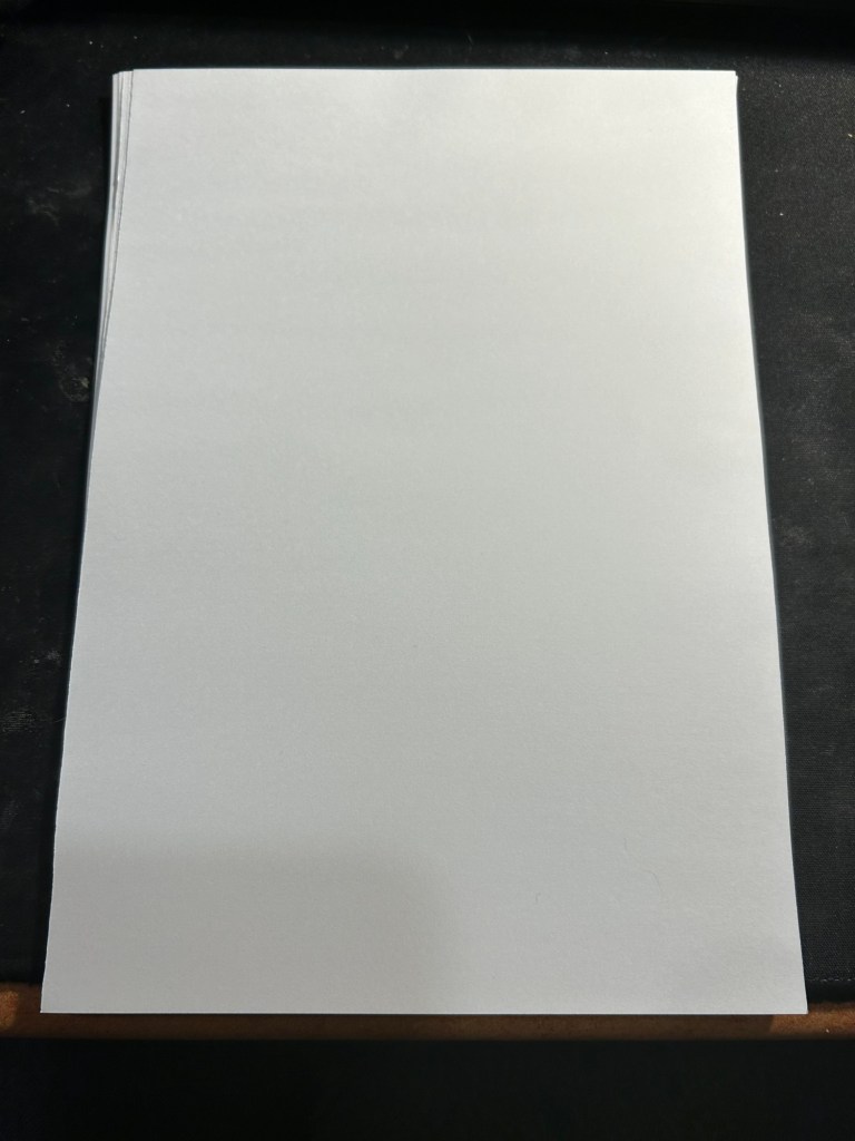
In terms of paper I’ve been using Kokuyo A4 KB paper which I cut to half size (so A5) to manage my daily to do list. The paper is relatively cheap and very fountain pen friendly. I’m also able to use both sides of the page despite there being some show through.
Kokuyo A4 KB paper cut in half to A5 size. This is why standards are great.
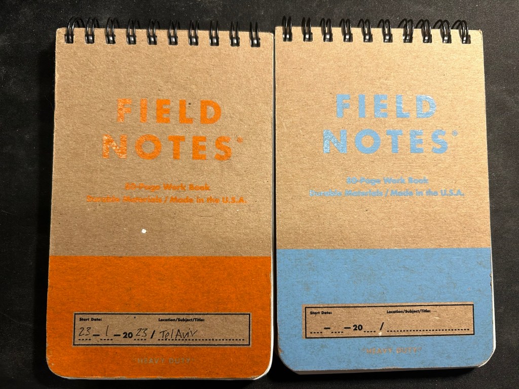
I’ve got a Field Notes Heavy duty on my desk at home and at work, and I just bought a new stock of them. These are where I jot down quick notes, phone call details, doodles during boring meetings. When they’re filled up they get tossed out as nothing in them is permanent — everything important in them moves to somewhere else as I work my way through them.
Field Notes Heavy Duty pocket spiral bound reporter notebooks
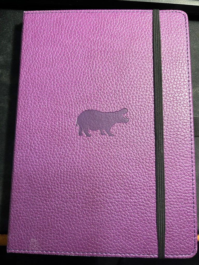
I have finally found a use for my Dingbats notebooks (beyond giving them away as gifts, as I have in the past): this lined purple hippo one is my blog notebook. I discovered that I have a much easier, much quicker time writing blog posts if I first draft them on paper, and this is where I do it in. I’ll likely write a dedicated post to this notebook soon.
Dingbats Puple Hippo A5 lined notebook
Apart from them I still use the notebooks I used last month.
Pencils
I’ve been using the Drehgriffel Nr. 2 as my daily driver. I use pencils extensively to plan, as my plans tend to change, and there’s something about this solid little mechanical pencil that makes me want to use it.
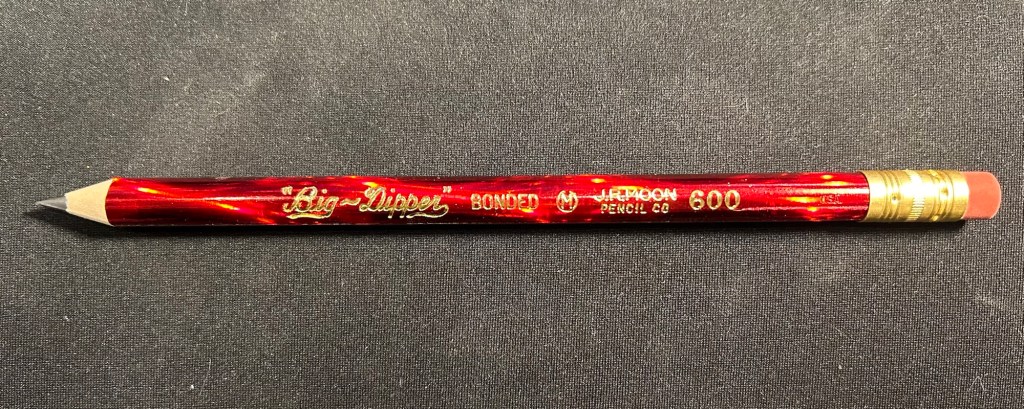
Apart from that I brought two pencils into the rotation, to try to use. One is from my last purchase from the late and great C.W. Pencils Enterprise, and it’s the “Big Dipper” J.R. Moon Pencil Co 600. It’s an oversized pencil, the kind of pencil that kids who are learning to write are expected to use. I’ve been having pretty significant neuropathy in my hands lately and I thought that this would be nice and easy to use, as after all it’s designed for kids just learning to develop their fine motor skills. So far it’s been a disappointment – the eraser and ferrule make it very top heavy, and I’ve been having a hard time manipulating it. I can’t imagine kids using this pencil and having an easy time with it. I like the over the top red foil with gold writing look though, so I haven’t given up on it yet.
Big Dipper J.R. Moon 600
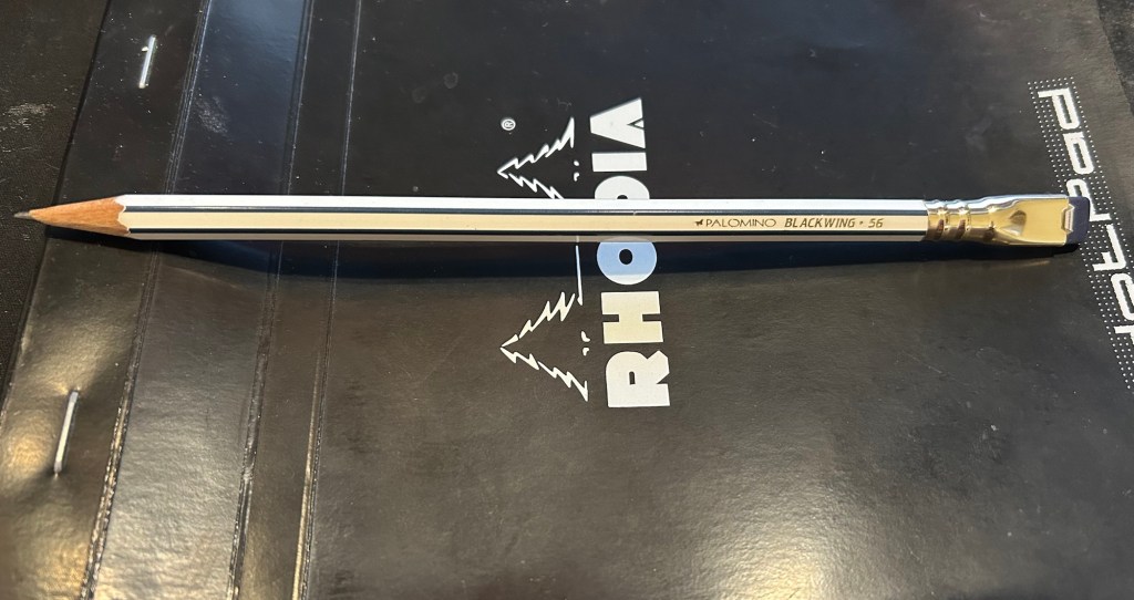
The second pencil is a Blackwing Volumes 56, the baseball themed one. The core is soft and dark, and I’ve been using it for quick and loose sketches. I’m trying to ease into one week 100 people by training myself to work faster than I normally would.
Blackwing Volumes 56
What did you use in February? Any planner changes? Pencil revelations? Pen preferences?