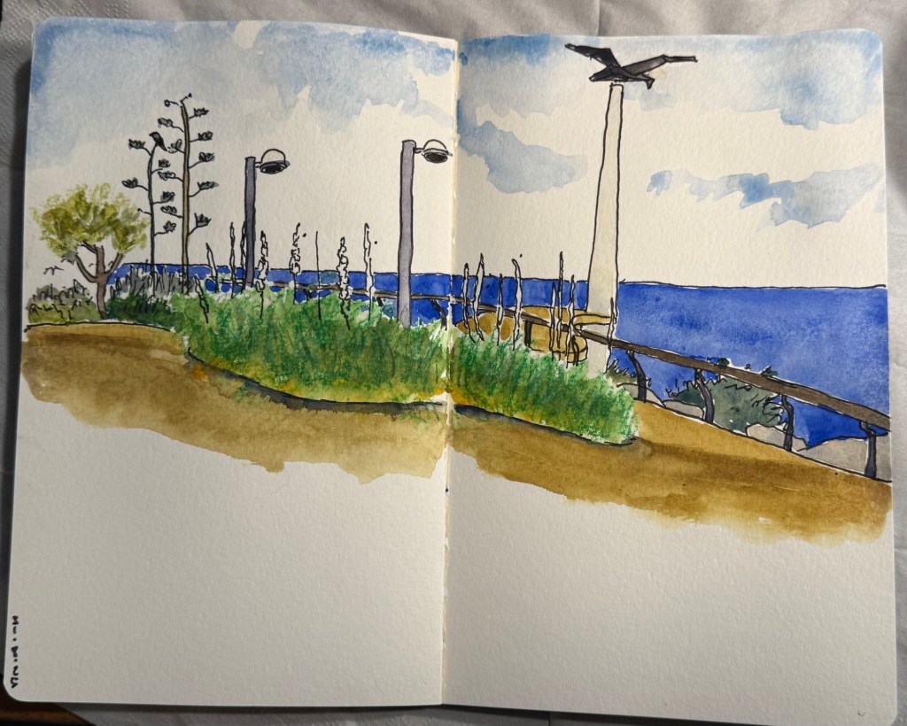
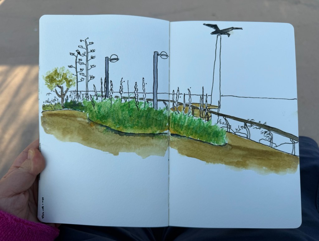
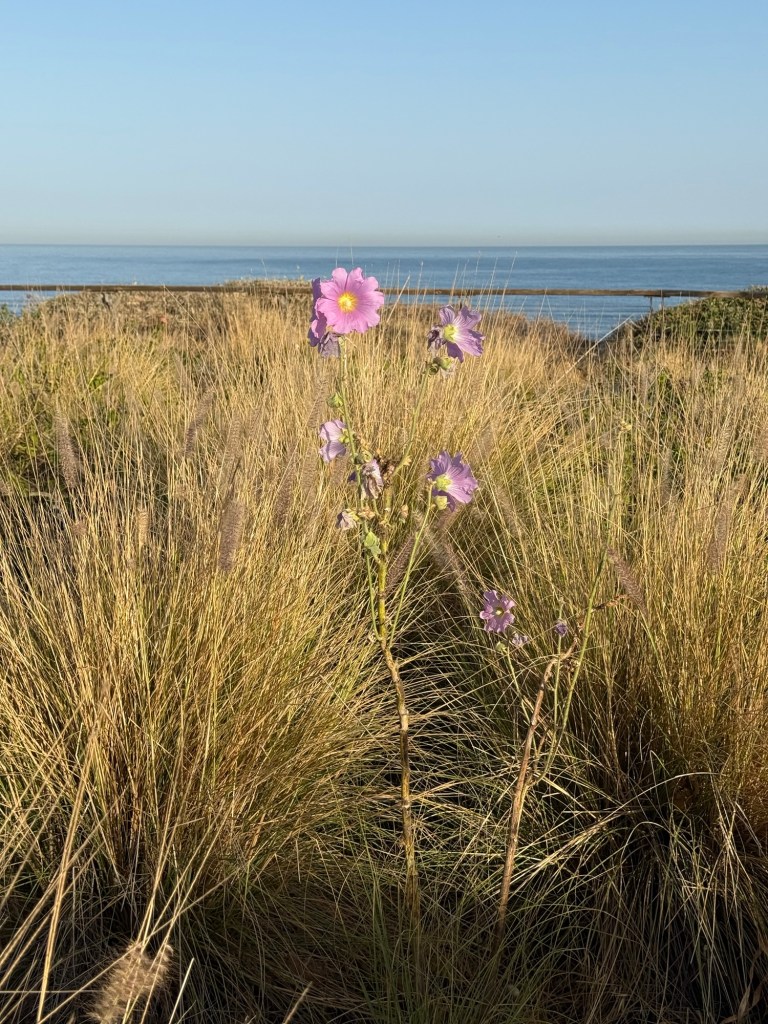
I started this one yesterday on location and then discovered that I needed a proper brush to finish it and not just a waterbrush, so I finished it at home today. The flowers are squills, which have a dreadful name in English but they are magnificent flowers and the heralds of autumn.
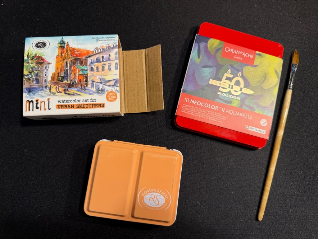
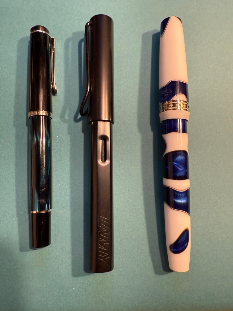
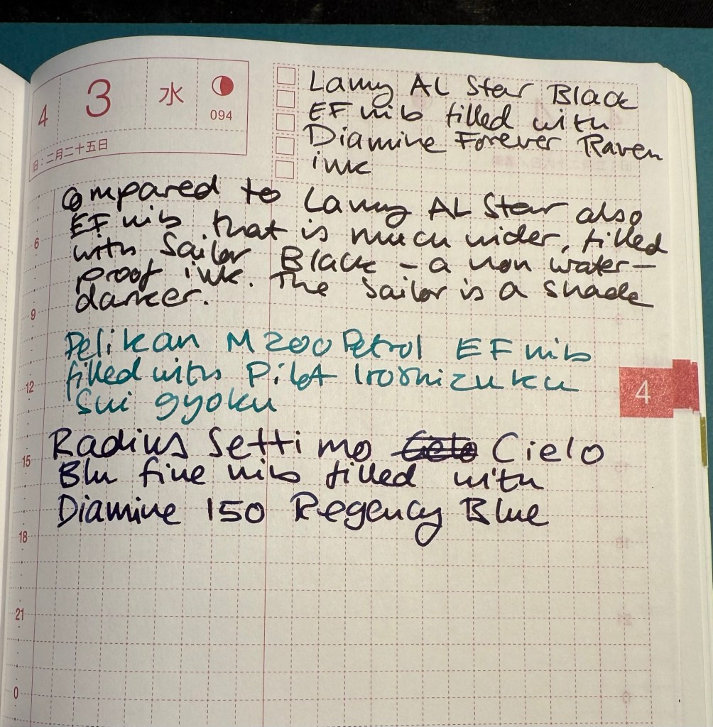
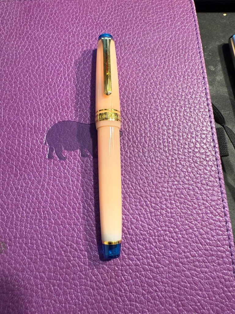
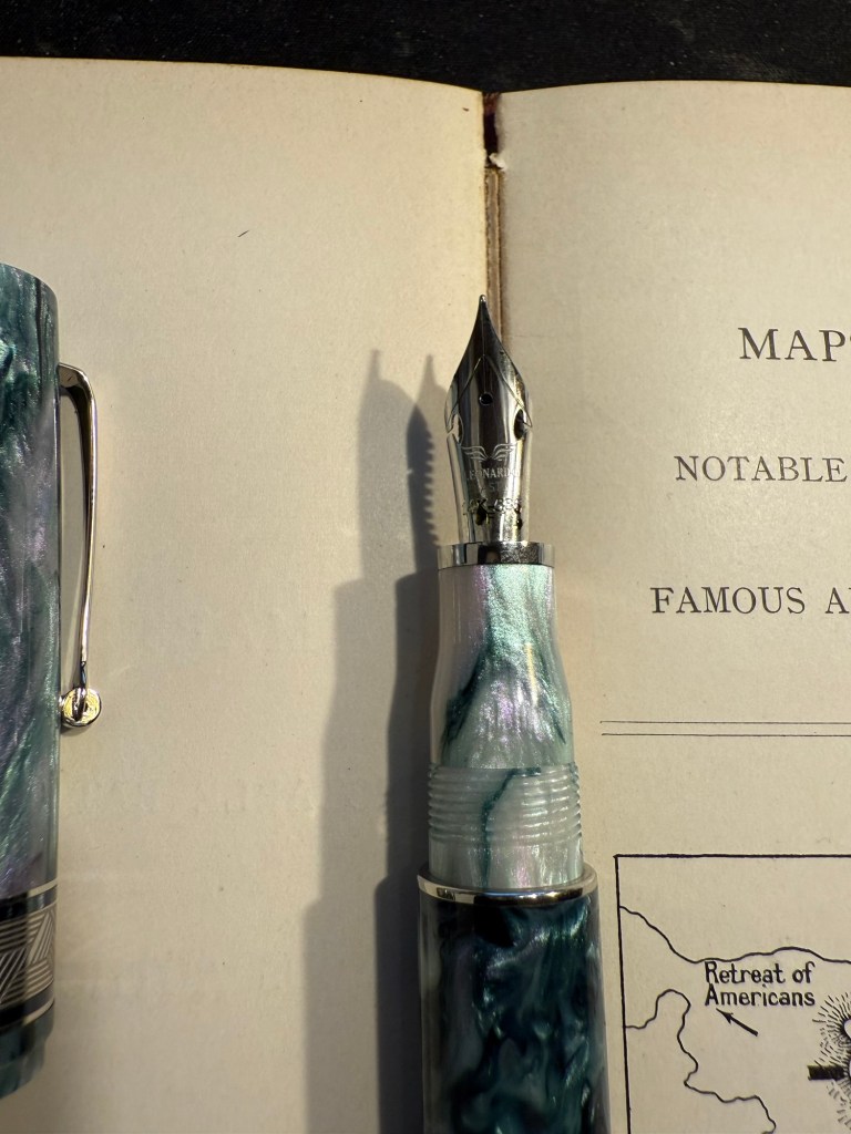
I just received a package from Fontoplumo and I immediately added the pen and inks it contained into rotation. While I already have a good amount of pens inked up, I really wanted to give the Radius 1934 Settimo Cielo Blu a try as soon as I got it. Not only is it a gorgeous looking pen, but I was also curious to see how it compares both the the vintage Radius fountain pen that I own and to my Leonardo fountain pens, as they are also the makers of the Radius.
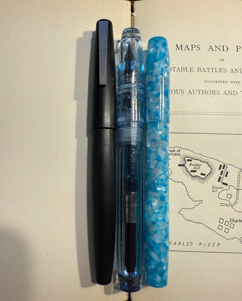
Apart from the Radius the package contained two inks that I was interested in using as soon as possible, so I inked up a Pelikan M200 Petrol with Pilot Iroshizuku Sui gyoku and a Lamy AL Star with Diamine Forever Raven. The Radius got inked up withe Diamine 150 years Anniversary Regency Blue, a rich royal blue with moderate red sheen that fits the blue swirls on the pen body.
From left to right: Pelikan M200 Petrol, Lamy AL Star Black, Radius Settimo Celio Blu
Comparing the Diamine Forever Raven to Sailor Black reveals that the Sailor is slightly darker than the Raven, but both are dark enough to count as proper black inks (and not dark grey or brown). They both have a bit of shading, but the Raven interests me as a waterproof ink, so I’ll be testing it with some watercolour sketches later on.
Writing sample
The Pilot Iroshizuku Sui gyoku isn’t what I expected. I was hoping for a more prominently green ink, but Sui gyoku is more of a turquoise than a green. I like turquoise inks so that won’t be a problem, but it means that I’m still on the lookout for an interesting, bright, readable green. The shading on this ink is delightful.
Diamine 150 Anniversary Regency Blue is a rich royal blue with some red sheen. It’s very saturated, especially in the Radius nib.
Gorgeous blue swirls on the Radius
The Radius interested me not so much as a revival of the old Italian brand since the original Radius was a minor pen manufacturer, and I wasn’t blown away by the vintage Radius that I own. It seemed to me that the old Radius brand was busy making local copies of what Parker was doing at the time, which is understandable. However, Radius as a sub-brand of Leonardo is interesting since Leonardo have been hiking their prices lately but the Radius remains more affordable and offers resins and pen bodies that are just as attractive as what Leonardo has to offer.
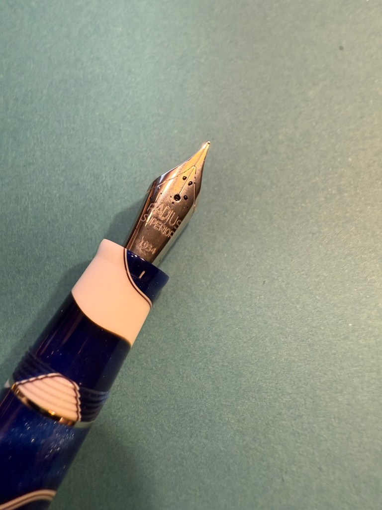
Radius imprint on the nib
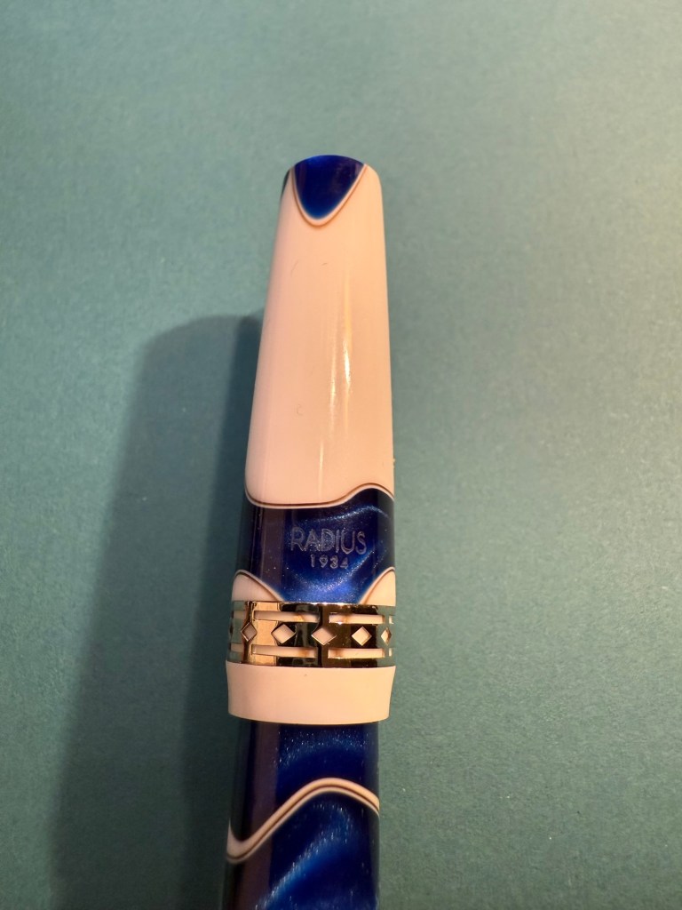
I love both the blue, white and brown swirly resin of this pen and the art deco-ish band. It’s a big wide pen, like the Leonardo pens and Viscontis, but light and comfortable to use.
Radius branding and band
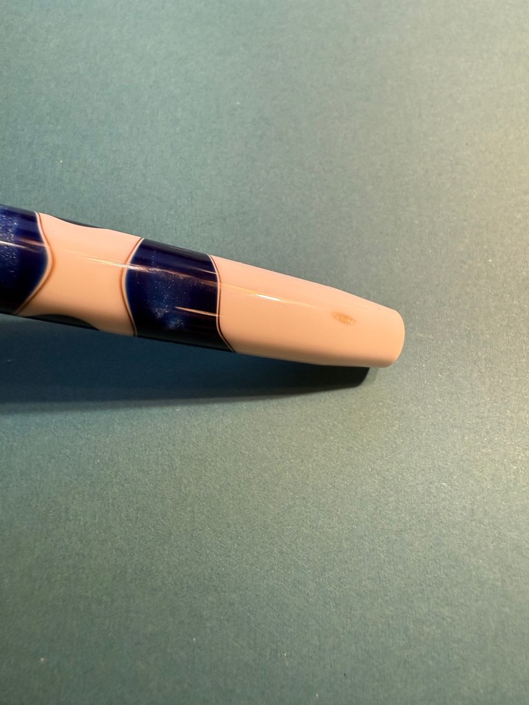
One tiny minus with my pen is that as the bottom part of the body tapers down, a smudge of brown resin was left, making it look like there’s permanent dirt on the pen body. Not ideal, but it’s something I can live with.
The smudge
Here’s a writing sample of all three inks on Col-O-Ring cards.
Ink samples
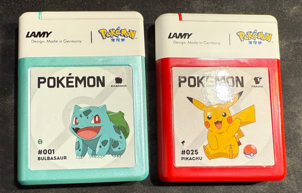
And as a silly little treat I also bought two cartridge boxes of Lamy Pokemon ink cartridges. They are filled with regular black Lamy ink cartridges, which I knew, but is still disappointing – a teal and a red would have been better.
It’s been a while, mostly because life has been hectic, not because I don’t have things to write about. Here’s to trying to get more posts in, even if they aren’t perfect or particularly long.
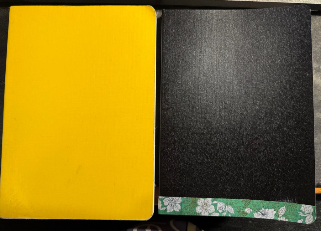
I’ve just finished another journal (the yellow one on the left in the photo below) and have set up my new one. Both are Stalogy 365 B6 notebooks, and both have a similar initial setup:
1.I flip the notebooks upside down so that the header with the dates is on the bottom and out of the way, as I don’t use it.
2. I use the front endpaper to write an “in case of loss” message (my name, email, phone number and a request for the finder to do the right thing).
New journal on the right, old journal on the left.
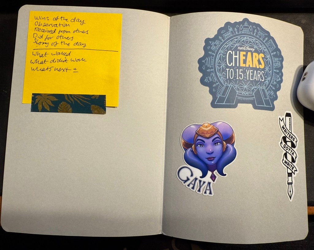
3. I use the back endpaper as a sort of “dashboard”. One side gets stickers on it, the other gets a post it with some journaling and review prompts.
Endpaper view of the new journal.
My new journal’s cover was damaged in transit, so I covered the worst of the damage with washi tape. It adds some character to the black cover, and if it gets too grimy or peels off I can always replace it.
My old journal lasted me for 5 months, which is about what these notebooks last for. My Moleskine journals lasted for 3-4 months because they had fewer paged and I used them for scrapbooking as well.
In other news “Writing at Large” is 10 years old. I never thought that I’d be publishing it for so long, but I’m glad that I started it way back in July of 2015, and I hope to keep it going for many years more. I’ve been through a lot over the past decade, and this site reflects a tiny part of that. If I can recommend something it’s to invest your time in your own site and your own work instead of on social media. If you persist, it pays dividends.
Reading
Finished The Day of the Jackal by Fredrick Forsyth and found it fascinating. I’m planning on reviewing it here.
Started on We Solve Murders by Richard Osman and I’m working on some Ulysses posts.
Health and Fitness
It’s getting hard to run outside, harder than it ever was, in this heat and humidity. Global warming is making treadmill runs more attractive. I’ve started using the NRC app‘s guided treadmill runs and they are pretty good and making treadmill running more bearable.
A mixture of some pens left over from last month, coupled with a slew of new pens in mostly long unused inks characterizes this month’s lineup.
The paper is Hobonichi Techo 2024 this time (I bought it on Black Friday, to compare with the original Tomoe River Paper in my 2014 Hobonichi). The paper in it is almost as good as the original Tomoe River Paper for showing off ink properties.
From June’s rotation I only have:
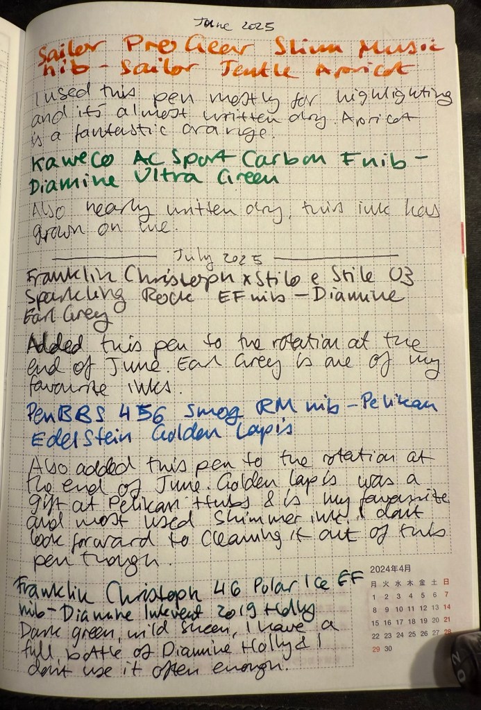
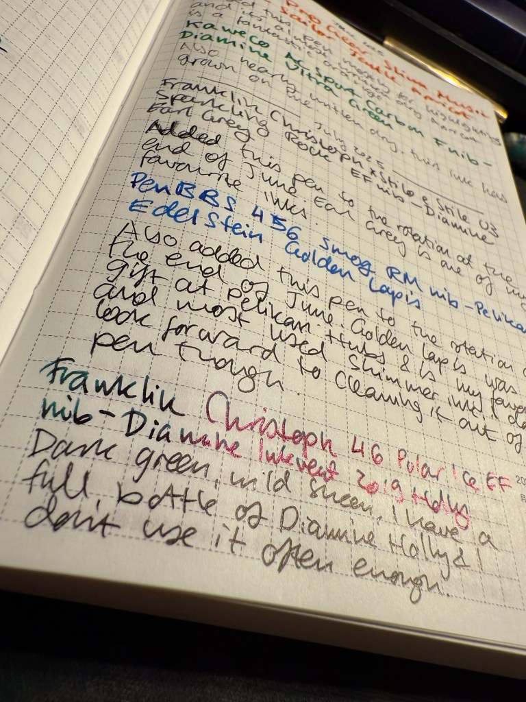
The mauve Sailor Pro Gear Slim with a music nib and delightful yet discontinued Sailor Jentle Apricot. A readable reddish orange ink with generous shading.
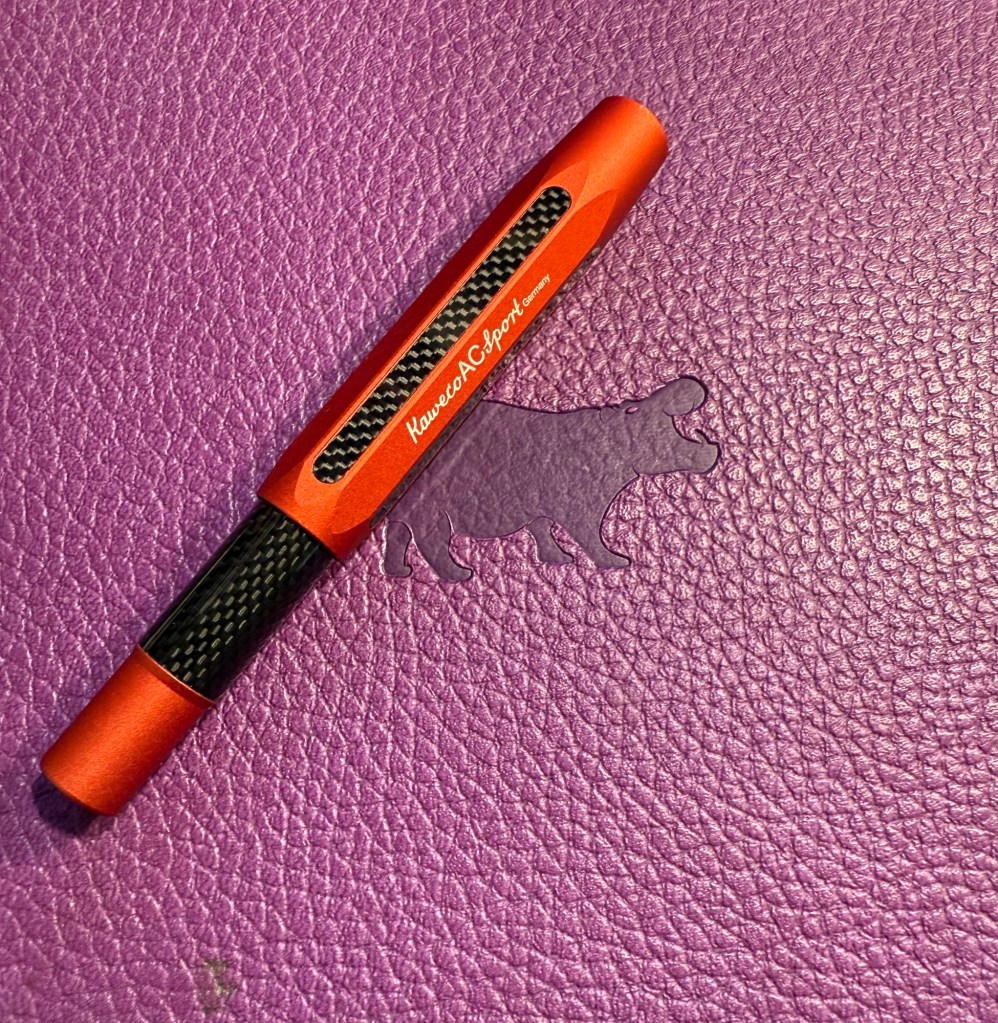
Kaweco AC Sport Carbon fine nib with Diamine Ultra Green. It’s almost written dry but has seen less use than I planned since I’m not in love with the ink colour. It is growing on me though.
Writing sample on Hobonichi 2024 paper
In the end of June I added two new pens into the rotation:
Franklin Christoph x Stilo x Stile 03 Sparkling Rock EF nib with Diamine Earl Grey. Earl Grey is still one of my favourite inks and if you want a readable, interesting grey I highly recommend it.
PenBBS 456 Smog with a RM nib and Pelikan Edelstein Golden Lapis ink. I have no idea what possessed me to fill a vacuum filler with this ink, but I’ll pay for that later. Golden Lapis was a gift from the Pelikan Hubs and has turned out to be my favourite shimmer ink.
Closeup on the sheen on Diamine Holly
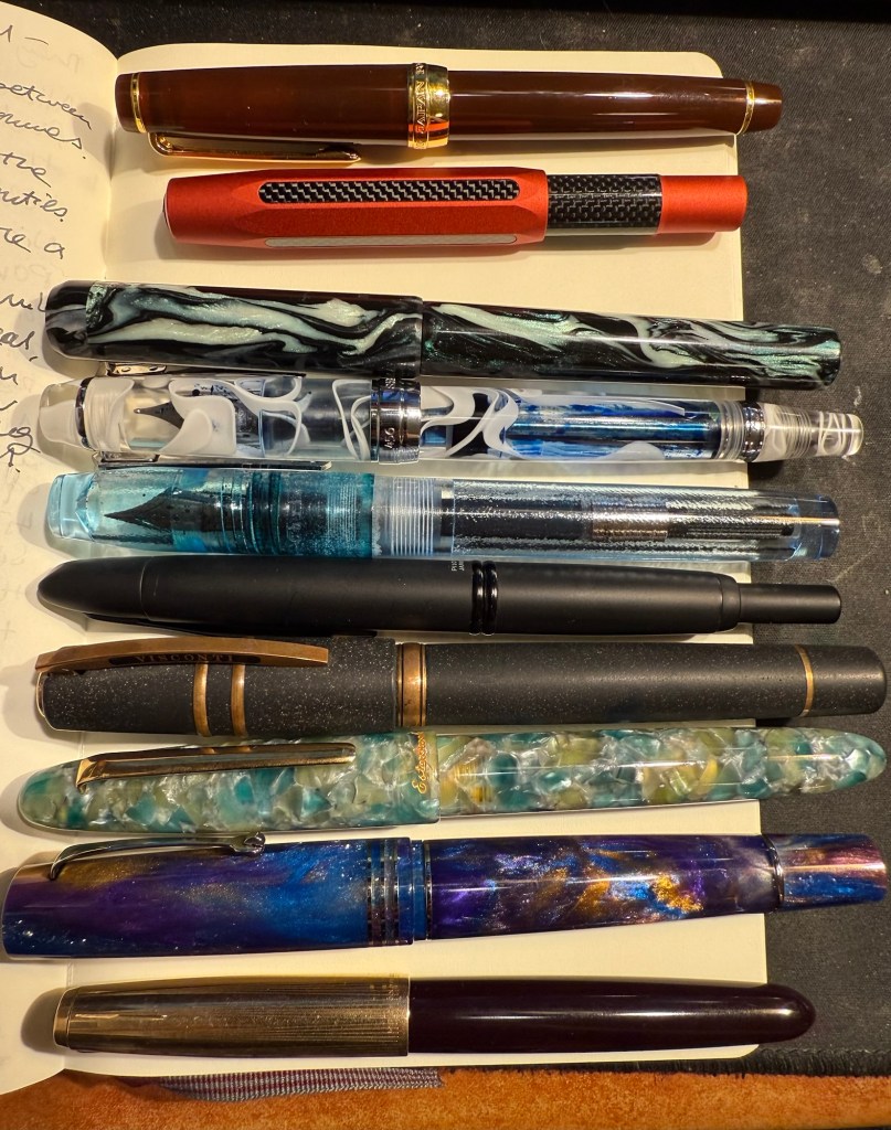
The proper July inked pens are:
Franklin Christoph 46 Polar Ice EF nib with Diamine Inkvent 2019 Holly. I reviewed this ink here and I liked it enough to purchase a full bottle of it, though I have rarely used it since. Holly is a dark blue green with a wild red sheen and is saturated enough to pass as a serious businesslike black at a cursory glance, so you can sneak it into office use 🙂
Pilot VP Matte Black M nib with Pilot Iroshizuku Chiku-rin ink. I used to use my VPs a lot more, especially to take notes in meetings, but now I rarely use them because they have a tiny ink capacity and are a bit of a pain to clean out. They do have beautiful nibs, and I wanted a cheerful green ink so the pairing works well.
Visconti Homo Sapiens Lava black EF with Sailor Shikiori Yama Dori – this is the original Homo Sapiens pen, before Visconti did dozens of versions of it, when it took the pen world by storm. I bought mine at Mora Stylos, and they customized the finial with my initials. Yama Dori is a peacock blue with red sheen, and is a wonderful ink in Sailor’s annoying flat Jentle ink bottles.It was almost impossible to fill this pen due to the bottle shape.
Writing sample on Hobnonichi 2024 paper
Esterbrook Estie Sea Glass Journal nib with Diamine Aurora Borealis. I love the Journal nib, and it really shows off the gorgeous teal of Aurora Borealis. There’s some shading with this ink and a hint of red sheen. This ink is one of the few I own in both bottle and cartridge format.
Leonardo Momento Zero Grande 2.0 Galattica Universe F nib filled with Montblanc The Beatles Psychedelic Purple. A wild pen and a wild ink that have wildly jumped in price over the past year or two. I have a handful of Montblanc inks, but I’ve been priced out of the brand now. Leonardo makes great pens, but I no longer feel the need to buy every limited edition they come out with. The Beatles purple is a wonderful PURPLE – bright, not muddy and perfectly midway between red and blue.
Last but very far from least Parker 51 Plum F nib with Sailor Jentle Peche. A rare 51 and a long discontinued ink coupled together to make sure that I use the good china. Parker 51 pens are my favourites, and this one is a gold capped aerometric with a fantastic nib.
The pens in order of appearance here, from top to bottom.
A new month means a new set of inked pens. From my previous rotation I still have the Lamy 2000 inked with Diamine Silver Fox, the TWSBI ECO Saffron inked with R&K Helianthus (and just about to run dry) and the Manufactus Cappuccino Brown filled with a Diamine Bilberry cartridge, also just about to run dry.
This time I chose the ink hues and inks before I matched them with pens (I usually do it the other way around). I wanted a blue-black, an orange, a pink, a teal and a bright green. The only ink that was completely unknown to me was the green – Diamine Ultra Green in a cartridge. It was also the only ink that I’m unhappy with, and one that I had issues with, but more on that later.
This is the lineup:
Writing sample with all of the inks and pens. The notes were written using a Platinum Preppy 02 with black ink. The paper is a Rhodia dot pad.
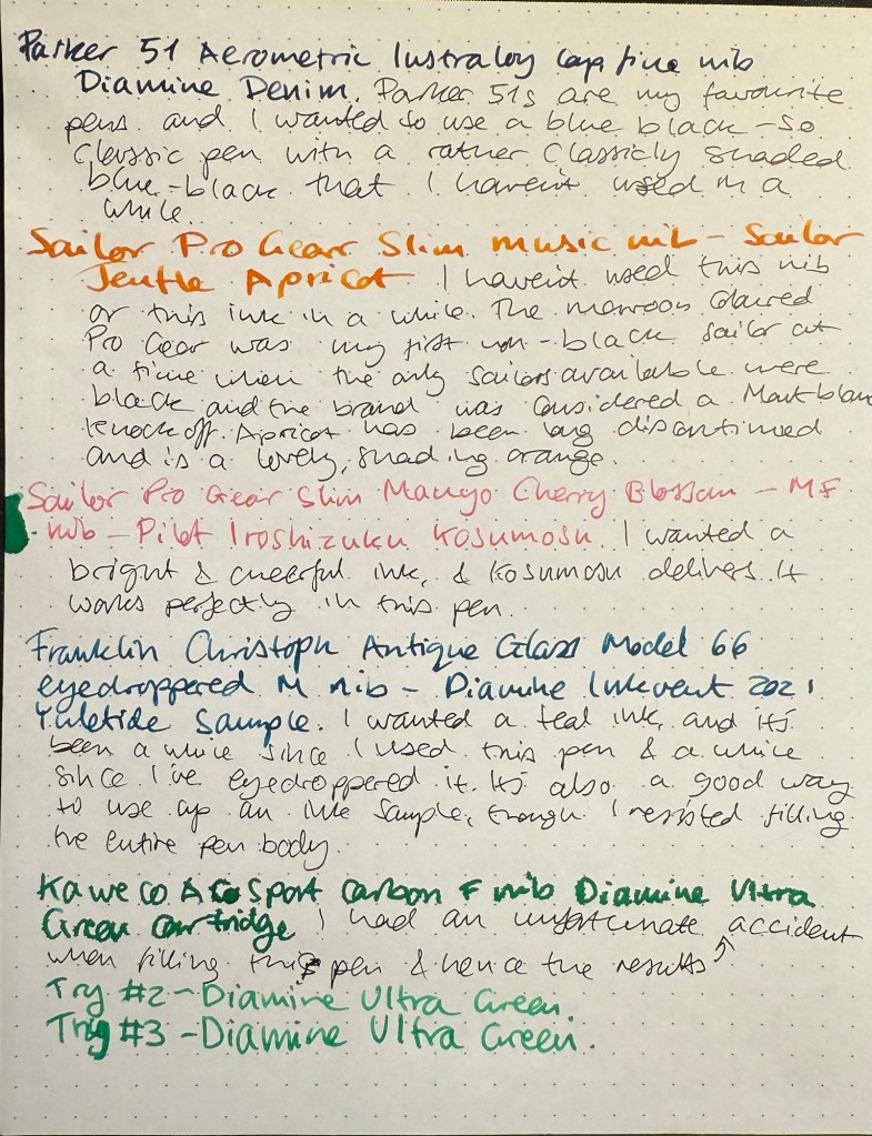
Parker 51 Aerometric Teal with a Lustraloy cap and generous fine-medium nib filled with Diamine Denim – vintage Parker 51s are my absolute favourite fountain pens, both for their look and feel and for the way they make my handwriting look. I haven’t used this specific one in years, and I like the pen body colour but I specifically chose to fill it with the blue-black and not the teal, to mix things up a bit. Diamine Denim is one of my favourite go to blue-black inks, and I love it because it’s well behaved, dark and offers some shading.
Parker 51 Aerometric Teal with a Lustraloy cap
Kaweco AC Sport Carbon fine nib Diamine Ultra Green cartridge – I wanted to try Diamine Ultra Green as I thought that it would fit the bill as the bright green that I wanted, but it didn’t. Two things happened – I flipped the pen upside down for a few minutes to get the cartridge going and I left it that way for too long, which meant that I got a mess. You can see it in the first writing sample and you can see it in the green ink splotch on the left of the page above. That would have been OK if the ink colour was to my taste, but it isn’t. Diamine Ultra Green is a viridian green, which is an unnatural shade of green that isn’t what I was looking for. In retrospect it looks like Diamine Kelly Green (which I don’t have) is closer to what I was looking for. The Kaweco AC Sport is nice but overpriced and I wouldn’t recommend it over an other Kaweco Sport. I got mine at a steep discount when an art supply store was closing down and looking to liquidate its stock.
Kaweco AC Sport Carbon
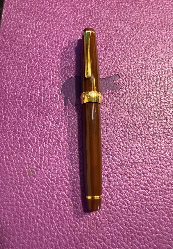
Sailor 1911 Pro Gear Slim Maroon music nib filled with Sailor Jentle Apricot – kids these days will turn up their nose on this pen body colour, but at the time it was the only Sailor that you could get that wasn’t black. I was into fountain pen nibs and didn’t really care what the pen body looked like, so long as I got to try the fabled Sailor music nib – a rare music nib that had only one slit and two tines instead of the usual two slits and three tines that other brand’s music nibs had. It still is a gorgeous nib that works very well with the long discontinued Sailor Jentle Apricot. You really see the shading with this pen and ink combination.
Sailor 1911 Pro Gear Slim Maroon
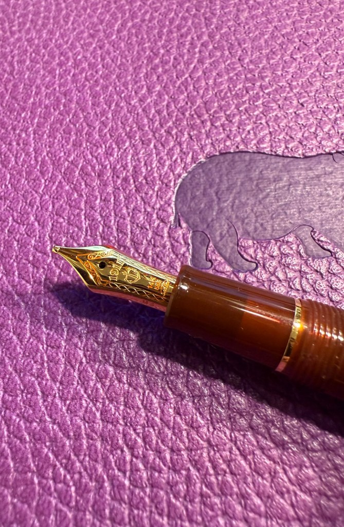
The magical Sailor music nib (yes, the ink flow is fantastic even with one slit):
Closeup of the Sailor Music nib
Franklin-Christoph Model 66 Antique Glass medium nib filled with Diamine Yuletide – this pen is now unavailable through Franklin-Christoph and only through second-hand resellers. It was one of my first Franklin-Christoph pens and one that I couldn’t wait to eyedropper (it’s built for that). The pen has a body that isn’t completely clear – beyond the slight fogging in the material (which is to be expected) the antique glass finish means that it has a blue-green tint, like a vintage coke bottle. It works exceptionally well with teal and turquoise inks, which is why I have only ever filled it up with teal and turquoise inks. In this case the ink of choice was Diamine Yuletide from the 2021 Diamine Inkvent calendar. I like this ink, but I’m still on the fence about buying a full bottle of it as I have a few other inks in a similar tone, some of them even Diamine inks. If you’re wondering how I eyedroppered this pen, it came with an o-ring and I have a tiny vial of silicone grease which I applied generously to the threads when filling it. So far no leaks, though as always with an eyedroppered pen, be careful with how you store it.
Franklin-Christoph Model 66 antique glass
Sailor Pro Gear Slim Manyo Cherry Blossom Medium-Fine nib filled with Pilot Iroshizuku Kosumosu – I was planning on using an orange OR a pink ink, but eventually decided to use both. The Sailor Manyo Cherry Blossom is my nicest looking Sailor pen, one that I bought a few years ago at Choosing Keeping in London mostly because it had an MF nib and I wanted to try one of those. Sailor has been dazzling the fountain pen community with a plethora of mix and match pen body colours, but I remember the brand as an innovator and artisan in fountain pen nibs (which is why I rarely buy Sailors these days and most of my Sailor pens are black). The nib is, of course, perfect, and the ink works well with it. Kosumosu is practically bubblegum coloured, very bright, very cheerful and surprisingly readable.
Sailor Pro Gear Slim Manyo Cherry Blossom
Which fountain pen and ink in this rotation caught your eye? What are you using this month?
The final post of this series, you can find part one here, part two here, and part three here. Grab a cup of tea or coffee and settle in – this one is long but there’s a lot going on here that’s worth your time.
32. I have been tracking my memory recall issues (a chemotherapy side effect) using the Tally app, which I’m hesitant to recommend. On the one hand it does work as a quick tracking app for a handful of things, but on the other hand it has a scammy pricing model – a fair price for the first year (and free if you just track up to three things, like I do), but then the subscription jumps to about $5 a month. That may be justified for apps that have a lot of features and utility, but Tally is not one of those apps. Day One, a magnificent journaling app for those who prefer to digitally journal, does much more and costs much less.
33. If you haven’t heard of KT tape and you’re a runner or athlete of any kind (or just injury prone) I highly recommend it (and no, I’m not getting paid for this). It’s a roll of pre-cut elastic fabric tape strips that you use in various configurations and levels of tension to relieve the pain and take some of the load off of injured muscles, tendons or joints. It eases recovery and it’s worth having a roll of it in your house and travelling with a few strips when you go abroad. There are YouTube videos that show you how to apply the tape- just search for the area or injury you want to address and “KT tape” and you’ll find official videos and ones made by physical therapists that will guide you. I recommend going for the Pro or Pro Extreme – they cost a bit more but last longer as their adhesive is stronger so you can keep them on for a few days. The tape leaves no residue and is easy to apply by yourself, although there are areas where another pair of hands does help. If you don’t want to buy the tape online, you can find it at your friendly local running store or in certain sporting goods stores.
34. If you are planning on travelling abroad with older relatives or people with a mobility disability, here are some tips that may help:
Ask for special assistance when you book the flights (there’s an option there). It helps with the long distances and long lines in the airport. Arrive early and wait patiently for the assistance – it’s worth it.
Book hotels and not Airbnbs. You want a place, preferably a well established chain, that you can rely on in terms of catering for your accessibility needs. I can’t tell you how many times we arrived at an Airbnb only to discover that the promised elevator has been broken for weeks, or the place has stairs to the elevator, stairs in the apartment and a bath instead of the promised shower. You want a hotel and not a boutique one because they’ll have an elevator bank, accessible rooms, and someone you can talk to if you run into issues. Chains are good because if there’s an issue with your room there’s a possibility of being catered in another hotel in the network. Contact the hotel ahead of time in writing and reconfirm your needs – elevator, shower with no lip or step, mini-fridge for medication, etc.
Use taxis (or rideshares) and buses, not the metro/underground/subway. There’s less walking involved, there’s less stairs involved, and it’s worth the additional time and money.
Check the parks you plan to visit – some have motorized tours for disabled patrons.
Talk to the staff at museums and exhibitions, preferably ahead of time. There may be an accessible route in that Dior special exhibition that isn’t advertised (there is), or they may tell you that it’s better to arrive at a certain entrance.
Theatres oftentimes have special accommodation and pricing for disabled people and their companions. If it’s not on their official site, email or call them and they will likely be able to help.
Don’t pack your days full, but rather plan or returning to the hotel for an afternoon nap before the evening’s activities.
Plan ahead as much as possible. You are less flexible in your needs so this is not the time to be spontaneous.
I can’t stress this enough: spend time, effort and money when selecting travel insurance. Don’t go for the cheapest option because it’s likely to leave you hanging when you need it. Pay a premium for insurance that pays back upfront and doesn’t have you chasing after it if possible. Take the time to read the small print and talk to them if possible.
35. I have gotten several questions about rucking, so here’s a good article describing what it is and the benefits and risks involved. I will add that you need a good pair of shoes with decent ankle support, you need moisture wicking socks to help avoid blisters (I just use my running socks), and you don’t need to buy a GoRuck bag. In fact I don’t recommend them – they’re heavy, overpriced and don’t provide the back support you want. Instead buy a good hiking day pack (I use the Osprey Manta 24) for about half the price and twice the support. My Osprey Manta comes with a hydration system (2.5 litres, which is a good chunk of the weight in my bag), wide padded straps, load lifters, a great hip belt and sternum strap, plus a mesh that is fantastic for the hot climates I ruck in. Also weigh your bag with useful things – water, food, first aid, extra layers, flashlights, sunscreen, etc. – and not with useless weight plates. Put the heaviest things on top, as close as possible to your shoulder blades and upper back. I use a waterproof Rumpl travel blanket at the bottom of my bag, and 80% of my weight is water. The rest is books, which I don’t mind using as weights as I’m rucking in a city park really close to home. If I was hiking in the great outdoors, I wouldn’t carry anything that wasn’t useful if I somehow got stuck on the way.
36. Do you have to generate QR codes and are tired of the spammy, ad filled sites that provide the service when you Google for it? As Cory Doctorow puts it:
“Just a QR Code” is a new site that generates QR codes, operating entirely in your browser, without transmitting any data to a server or trying to cram ads into your eyeballs. The fact that it runs entirely in-browser means you can save this webpage and work with an offline copy to generate QR codes forever – even if the site goes down:
37. My journal is at that delicious phase where it’s passed the 3/4 full mark but hasn’t reached the “only a handful of pages left” mark. I recommend making it a goal to reach that phase in every notebook you use – it’s the best.
38. These little fans are a lifesaver. I’ve used them on trips, on buses with fault ACs, when I’m outdoors waiting in the sweltering heat, etc. Again, not an affiliate link and this isn’t a paid anything – it’s purely a recommendation of a product that I’ve been using and enjoying for a few years.
39. Journaling Tip #4: Did you have weird, overblown reaction to something or someone recently? Take the time to journal about the experience. Write down what happened (facts only), what was your reaction/feeling (be honest), why it’s surprising under the circumstances and finally why do you think that you reacted the way that you did? Does it reveal something about how you view yourself, your insecurities or fears?
40. Lightening Book Review #7: What We Talk About When We Talk About Love, by Raymond Carver. This is a collection of 17 short stories set in rural American in the 70’s first published in 1981 and it hasn’t aged well. The protagonists drink a LOT, they are violent, sexist, despairing and desperate. It’s like watching a series of car crashes – you become numb to the experience after the third or fourth. Carver can write, and there are a few gems here, but it’s all so very miserable and depressing – like hosting an alcoholic for a week. Their stories may be intriguing, but they’re also all so very terrible and tragic that there’s only so much of it that you can take.
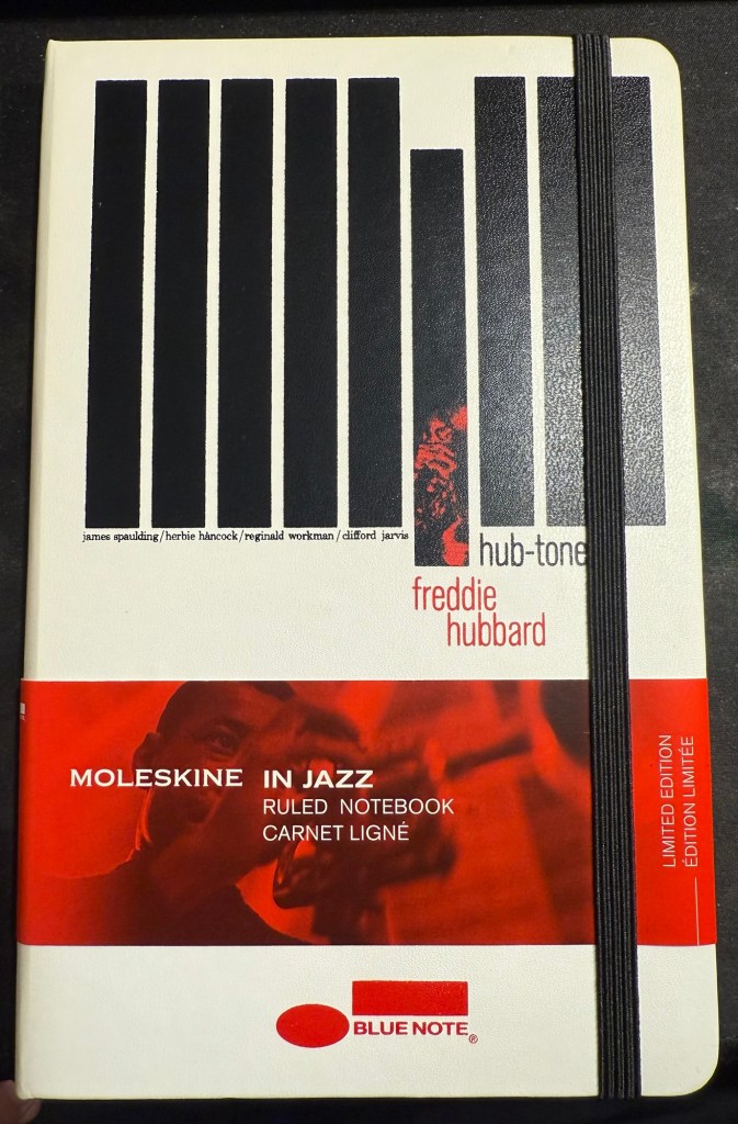
41. I opened a new Moleskine notebook – after not having opened a new one in over a year. This is the one will be used for some writing projects, and it’s one of my favourite limited editions, the Blue Note Hub Tones edition. I’ll maybe post a review of it later, but for now, this is a reminder to use the good china.
Moleskine Blue Note
42. Journaling Tip #5: look at someone close to you, someone you admire for having a skill or approach to life that you don’t have, and write down what you can do over the next few days, week, month to be more like what you like them. That’s what got me to go to more plays, concerts, shows and exhibitions now instead of just waiting until I’m on holiday abroad.
43. Great advice from Adam Savage’s latest Tested livestream – Q-Tip: Quit Taking It Personally. More often than not other people’s behaviour and choices has nothing do with you and everything to do with them.
That’s it – 43 points for 43 years. Have a great week!
A smorgasbord of stuff for your delectation to celebrate my birthday. You can read part 1 here and part 2 here. Only one more part after this one…
23. Lightening Book Review #3: The Vinyl Detective – Noise Floor by Andrew Cartmel. This is the the 7th Vinyl Detective book and possibly the weakest so far. Set in the world of 1980s electronic music it’s not about finding a rare vinyl record this time, but rather finding an aging electronic musician. There’s the usual hipster/foodie/audiophile vibes but the plot is air thin, you will immediately know whodunnit in the whodunnit, and there’s a desperate attempt to give this Scooby-Do style adventure an “edginess” using aging threesomes and references to John Fowler’s The Magus. There is the usual boring insistence on describing every turn in every journey the protagonists take, and the characters are even more cartoony than usual. The only truly enjoyable scene is the village fête in the end, and even that is highly unbelievable. Feel free to skip this one, unless you’re looking for a cozy, featherlight read between other books and there’s nothing better lined up.
Scene from today’s run
24. Lightening Book Review #4:The Vinyl Detective – Underscore, by Andrew Cartmel. This is why I still read this series – a cozy and highly imaginative adventure with a likeable cast, in a charming and vivid setting. The crime is stylized, the new characters are vivacious and it reminds me of my favourite book in the series, Victory Disc (book #3). Take a trip back to London in the 60s, with a dash of family drama, a hint of Italian passion thrown in, and of course a sprinkling of good music.
25. Lightening Book Review #5:The Thursday Murder Club, by Richard Osman. While we’re on the topic of cozy mysteries, this one was a treat. Unexpected plot full of twists and turns, a memorable and original cast of characters, a unique setting, humour and heartache, and a it dared to touch on actual issues with substance (aging, sickness and death, religious oppression, capitalism and corruption, and the limitations of the law and its enforcers). A very enjoyable read and not just because Elizabeth is now one of my favourite fictional characters.
26. My Apple Watch Ultra 2 has been acting up lately – it’s almost 2 years old and it’s been losing battery power and struggling to keep track of my laps in the pool. So far a full charge and a restart before every swim have helped, but it’s annoying. A watch at this price level should be able to last for 3 years at least, and yet we’ve somehow been trained to expect to upgrade our watches every year or two at the most, if only because they lose their ability to keep a charge after the first year or so. Originally my watch lasted almost 3 days between charges (and I’m a very active person). Now I have to charge it once a day. I’ve been contemplating moving to a Garmin for my workouts and switching back to an analog watch, but I use some of the Apple Watch capabilities to keep track of my health post treatments, so we’ll see.
27. I have ordered the Moleskine Limited Edition Peanuts notebooks (the yellow lined large hardcover and two sets of the extra large cahier notebooks). There’s something about this collection that I find irresistible, and so they will be part of my birthday gifts this year.
28. There’s something tragic about an unfilled and unfulfilled notebook and I have too many of those lying around. I’m considering what to do with them, especially with those that I’ve started using and have abandoned after a few pages. Let me know in the comments if you have any ideas.
29. Tomorrow I start reading Ulysses having just finished The Obstacle is the Way, the last book that I planned to read in May.
30. Lightening Book Review #6:The Obstacle is the Way by Ryan Holiday. I read the 10th anniversary edition of this book, which has a new introduction and a few additions to it. This is a very digestible intro to stoicism, competently written and researched by a man with a marketing background, but it had the same affect on me that Seth Godin’s books have: it glanced on my brain and left no mark. It was hard to concentrate on this book not because it was challenging but because it was not: it was like eating easily digestible, flavourless popcorn with sprinklings of anecdotal salt at the beginning of each tiny chapter. You are left hungry and unsatisfied at the end, not sure what exactly you consumed. Philosophy should make you sit up and pay attention, think, stretch your mind and sweat a bit. It was divorced from its gravitas, substance and challenge in this book, and that’s a pity.
31. There’s no greater joy than crumpling yesterday’s to do list and tossing it out.
A smorgasbord of stuff for your delectation. You can read part 1 here.
13. Big bold announcement: next month is Bloomsday, and after much hemming and hawing i’ve decided to reread James Joyce’s Ulysses and blog about it as I go along. I’ve read Ulysses three or four times between 2009-2013 but I haven’t touched it since. While I still have some of my notes on this book, my goal isn’t to reconstruct them or to lecture on the topic, but to enjoy a very good book, and see how my memory of it fairs post-chemotherapy (which has affected my memory). Why should you join along? Because Ulysses is a phenomenally good book that is enjoyable to re-read (but very challenging to read for the first time). It’s funny and touching, profound and full of adventure. It’s just built on very well crafted layers of language, meaning and context, and it’s paradoxically a book that is meant to be re-read, not read. Hopefully I will make it a bit easier and less scary to read for the first time for those brave enough to join me.
14. I have been switching my podcast listening queue around lately, which means that I got to listen to this wonderful two part episode of Alie Ward’s “Ologies”: Salugenology (Why humans require hobbies). Guest Julia Hotz talks about the things that we need to be happy as humans, and the conversation is fun to listen to and enlightening. I highly recommend it, and the “Ologies” podcast in general.
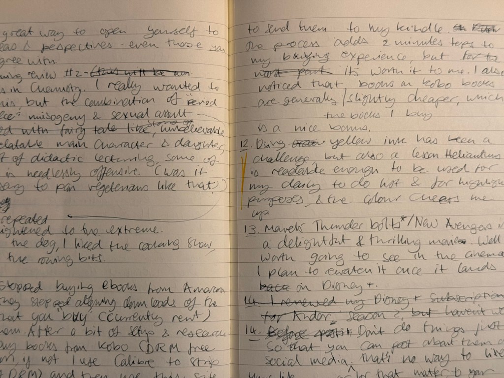
15. I’ve stopped buying eBooks from Amazon after they stopped allowing customers to download the books that they purchased (so you basically don’t own the book that you paid for if you buy in from Amazon now). I still use my Kindle Paperwhite, but I’m buying books from Kobo. I buy them DRM free where possible, and if not I use Calibre to strip them of DRM and then this site to transfer them to my Kindle (if they are DRM free you just use the sendtokindle site to upload them to your Kindle). It took me 30 minutes to get the setup working the first time, and it now adds 1-2 minutes tops to every book purchase, which is plus for me. It means that I don’t mindlessly purchase books that I don’t intend to read, and I actually think through each book purchase. I also noticed that the books I’m interested in are priced slightly cheaper on Kobo, which is a nice little bonus.
16. Using yellow ink (Rohrer and Klingner Helianthus) has been a challenge but also an education. Helianthus is readable enough to be used for my daily todo list, but thanks to this ink I’ve been learning to enjoy using a fountain pen for highlighting purposes. It’s more subtle and better behaved than traditional highlighters, and the colour pops on the page without resorting to neon shades.
17.I am thinking about the next inks to put into rotation, which is a bit unusual for me as I normally start with the pens that I want to fill, and then go find inks that go well with them. I want a blue-black for practical reasons, a cheerful green, a pink or orange, and a turquoise or teal. How do you select which pens and inks you use?
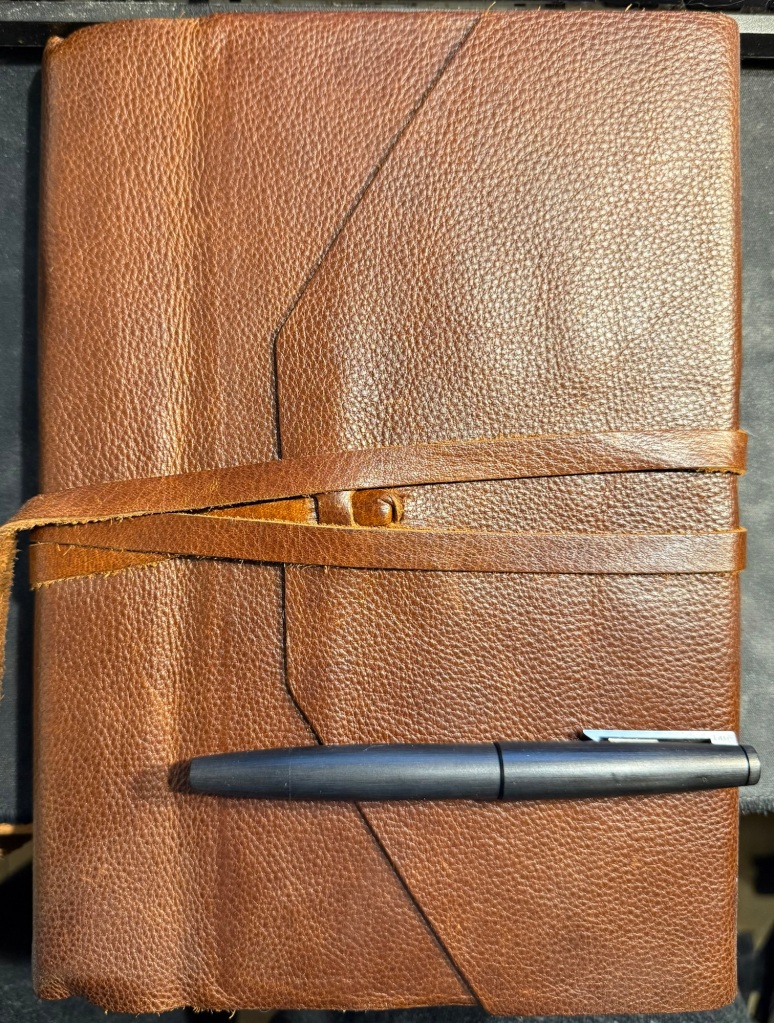
18. A bit of behind the scenes: I draft these posts longhand in a Dingbats notebook and a fountain pen. I think better on paper and it’s a way to use the pens and inks that I have. There are no AI/LLM agents/bots involved in this blog, and that’s the way it will remain. I enjoy writing, I created this blog as a hobby because I enjoy writing, and while I use AI agents as part of my job, I have no intention of letting them take away any part of the creation of this site.
Draft of this post Well worn Dingbats blogging notebook
19. Journaling tip #1: If you’ve been feeling down lately, take the time at the end of each day to review your day and score it. It doesn’t matter what scoring system you choose, but I recommend that you keep it simple and not too granular: -1, 0, +1 or 1, 2, 3, or “great”, “OK”, “meh”, “terrible”. You just want a quick way to know if the day was a good day, an average day, or a bad day. At the end of every day for a week or two think back on what happened throughout the entire day, give it a score, and explain the score in no more than a sentence or two. So for me today was: “OK – was super tired at the start, but I managed to get two naps in and recovered enough to get most of what I planned done”. At the end of the week, when you do your weekly review and plan ahead what you want to stop doing, start doing and keep doing, use these scores as an input for your decisions. Repeat this whenever you feel the need to recalibrate.
20. Journaling tip #2: if you’ve stopped journaling and want to restart, don’t attempt to backlog the days that you missed. Forgive yourself the journaling “debt” and start fresh. This is easier to do if you switch something up in your journaling routine – use a new pen, pencil or ink, a new notebook, or write in a new location.
21. A dear friend and colleague has moved to a new job in a different company. While I’m happy for him and I wish him the best of luck, I already miss working alongside him. This brings me to the following journaling tip:
22. Journaling tip #3: Take a journal, either your usual one or a new one for a special journaling “events” and write down a list of names of people that have inspired or taught you something that you are grateful for, and write down what it is they taught you. Start with those that affected you by their positive actions (kindness, encouragement, setting good examples), and then challenge yourself to journal about those that taught you by being negative presences in your life. Did an office bully teach you to be kind? Did the talentless brown-nose teach you about how much you value your integrity? You can write about both people you personally know and those in the public sphere, and you can return and edit or add on to this list whenever you want. It’s a good reference in troubled times to remind you of who you are, what you stand for, and where you want to be.
Manufactus notebook that I plan on using for journaling tip #3
It’s been a long while since I’ve posted a weekly update, and it’s my birthday week, so to celebrate I decided to write 43 points (split up to several posts to make them more manageable), in no practical order:
After a bit of drama I have managed to enrol to the 2025 Urban Sketchers’ Symposium in Poznan, Poland. I will be posting about my sketchbook and art supplies packing list later on, but do let me know in the comments if you’ll be there.
Rising tariffs and shipping costs have made online pen, ink and paper purchases prohibitively expensive for me. This may not be a bad thing, as it should encourage me to use the large stash of “stuff” that I already have.
I have been gifting people nice notebooks and pens lately, and it’s been a surprisingly heartwarming success. Giving people a notebook that matches their style and needs, coupled with a pen that suites them and an encouragement to start journaling about their lives has been one of the joys of my life in recent months.
Moleskine came out with a cool Peanuts collection of notebooks and Blackwing pencils (plus a backpack and set of pins). It’s refreshing to see them use the XL cahiers for a limited edition, as I don’t think they’ve done that since the Art collection about a decade ago.
Lightening Book Review #1 (I have a huge pile of books to review and not enough time to write a dedicated post for all of them): When the Moon Hits Your Eye, John Scalzi. Scalzi is normally very good at humorous sci-fi, but this book is not one of his successes. It’s an overtly silly, very lightweight book that is not on par with the other books he groups in this loosely thematic trilogy, The Kaiju Preservation Society and Starter Villain. It really suffers from the constant jumping around amongst a giant cast – the plot loses momentum, and you find it hard to connect to any set of characters. While it was not great hardship reading it and it’s a decent light read, feel free to skip this one and wait for the next instalment of his “Old Man’s War” series.
It’s OK to splurge and buy yourself flowers every once in a while, if you enjoy flowers.
I’ve started rucking, which is basically walking at a brisk pace outside with weight on your back. I use an Osprey hiking daypack weighed down mostly with water, but also with a giant cookbook, my journal and kindle, which brings it to around 10kg of weight. I take a break about 15 minutes into my session to sit outside and journal or meditate. If you’re curious, start with a bag that has a waist belt and not too much weight for too long, and skip the $400 overhyped specialized bags and weight plates.
Go see a play (not a musical or comedy) at your local theatre. It’s a great way to open yourself to new ideas and perspectives – especially those that you don’t agree with.
Lightening Book Review #2: Lessons in Chemistry, Bonnie Garmus. I really wanted to like this book, but the combination of graphic, repetitive and unrelenting “period piece” misogyny and sexual assault coupled with a frankly unbelievable, non-relatable and largely unlikable heroine made it impossible. Couple this with an even less believable daughter and dog (though the dog is cute), lots of didactic and condescending lecturing that is so blatantly not period true and can at times be needlessly offensive (was the vegetarian bashing necessary?) and this was a book that I didn’t really enjoy. The cooking show, dog and rowing bits were nice, though.
Marvel’s Thunderbolts*/New Avengerts is a delightful, touching, thrilling and generally great movie. It’s well worth the cinema visit, and I plan to rewatch it once it lands on Disney+.
Please don’t do things just so that you can post about them on social media. That’s no way to live your life. It’s the equivalent of voluntarily turning yourself into one of the Matrix human batteries – for AI training models’ and advertisers' use.
In the middle of April I inked up a bunch of new fountain pens, and at the end of the month I added two new fountain pens to this rotation. At the rate I’m writing with them I assume that this pen rotation will be with me until around the end of May, when I’ll be putting more “summery” inks into use.
This is a rather eclectic group of pens and inks, but I was mostly looking for inks that I haven’t used for a long time or I haven’t used at all. Here they all are (I was in a rush when I created the writing samples so they’re messy, but life isn’t Instagram, so messy it is):
Messy Writing Sample #1Messy Writing Sample #2
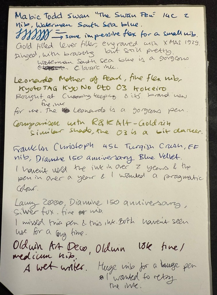
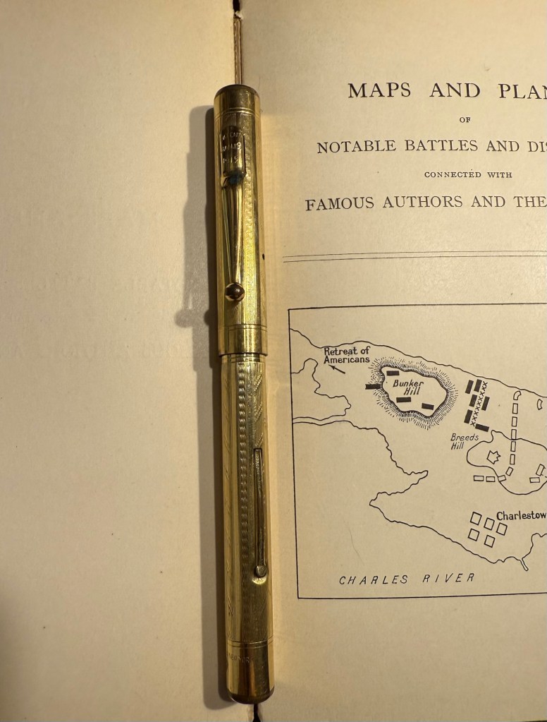
Mabie Todd Swan “The Swan Pen” 2 nib with Waterman South Sea Blue – a vintage gold plated lever filler pen, this is one of two vintage gold plated pens that I bought in Paris in Mora Stylos years ago. I don’t usually like the bling of gold plated pens, but I was drawn by the fantastic, very wet, flexible swan gold nib, and by the engraving on the pen body.
The Swan Pen
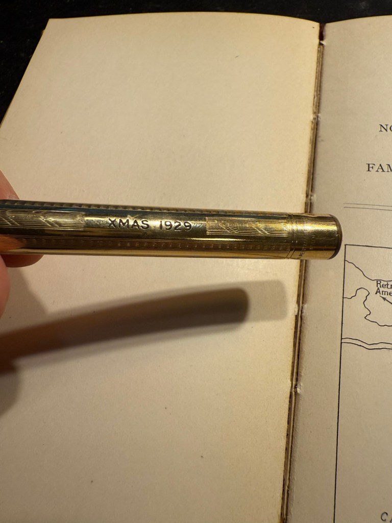
Normally engravings lower the value of a vintage fountain pen, but this one added value for me – I find it endlessly intriguing. This was clearly a Christmas gift, in 1929, and it was likely a lady’s pen, given its size and general level of decoration. I can stare at this pen and spin dozens of stories from that engraving, and this is one of the main reasons I prefer vintage pens. This one is “use grade” – the engraving, the dings on the body, the brassing on the clip, and the multitude of microscratches on it make it so – but I don’t care. It’s a treasure of a pen with a fantastic nib that I got at a very good price and gives me much joy. What else does one need?
Closeup of the inscription XMAS 1929
I chose a Waterman ink for it because they’re the best inks for vintage fountain pens – very gentle, very easy to clean out of a pen, non-staining, and on the dry side (though not as dry as Pelikan 4001 inks) which works well with this very generous nib.
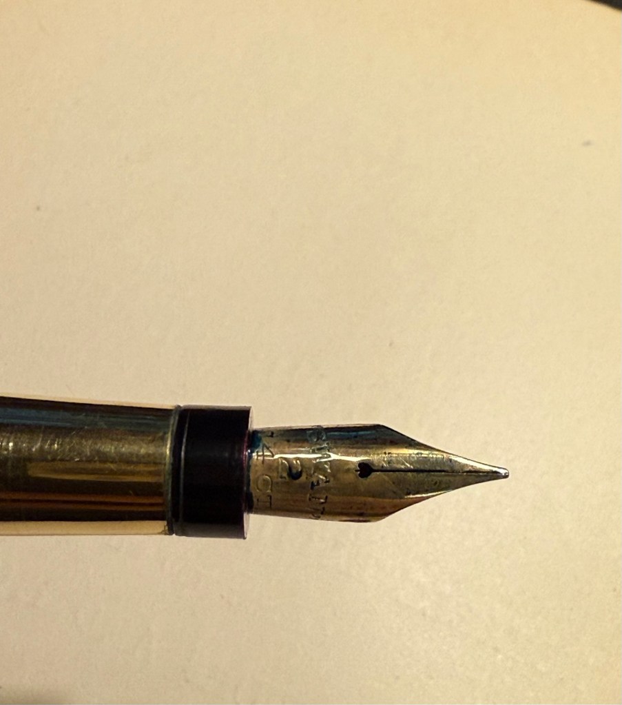
Swan 2 nib with heart shaped breather hole
Leonardo Mother of Pearl fine elastic nib with Kyoto TAG Kyo No Oto 03 Kokeiro ink – I wanted a Leonardo pen in rotation (I love them) and I wanted to try this new ink, and compare it to the Rohrer and Klingner Alt-Goldrün ink that I still had going at the time from March’s rotation. The inks are practically identical, with Alt-Goldrün being perhaps a shade lighter than the 03.
Leonardo Momento Mother of Pearl fountain pen
The Leondardo’s elastic or “flex” nib has cutouts in the nib shoulders to provide it a bit of give. It’s a nice nib that offers some line variation, but is nowhere near what you can get in vintage flex or super-flex nibs (particularly Swan and Waterman).
Closeup of the elastic nib with the cutouts in nib shoulders
Lamy 2000 fine nib with Diamine 150 anniversary Silver Fox ink – this is one of two Lamy 2000s that I have, and I really like this pens as workhorses. Silver Fox was part of the original collection of 150 anniversary inks that Diamine issued and it’s a nice mid grey that is very readable.
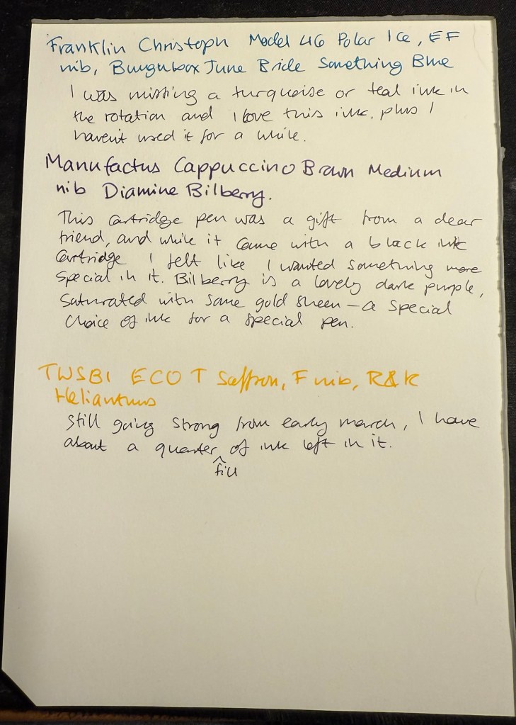
Franklin Christoph Model 46 Polar Ice extra fine nib with Bungunox June Bride Something Blue – I filled this pen about a week after the others since I wanted a teal ink that wasn’t in as wet a nib as the Swan. I got this ink as a gift from the Pen Addict Membership back in 2016.
Franklin Christoph Model 45L Turqish Crush extra fine nib with Diamine 150 anniversary Blue Velvet – another original 150 anniversary ink (Diamine later issued a second and perhaps also a third line of inks in this series, I don’t remember). This one is a nice royal blue, and another ink that I had used in years.
From left to right: Lamy 2000, Franklin Christoph Model 46 Polar Ice, Franklin Christoph Model 45L Turqish Crush
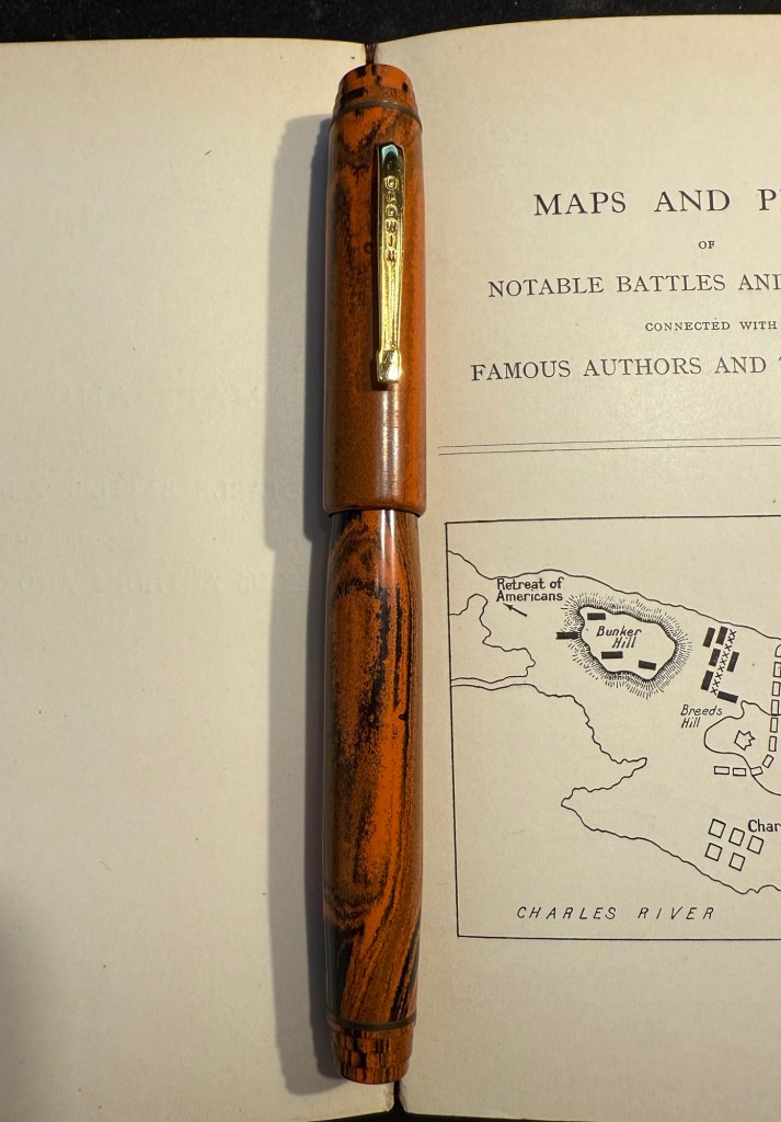
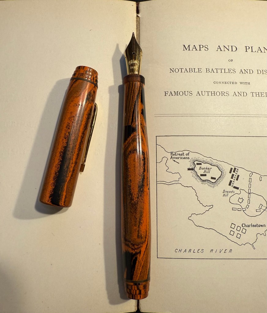
Oldwin Art Deco red and black striped ebonite, 18k medium nib with Diamine Writer’s Blood – as I’m writing this I have written this pen dry, mostly because it has a very wet and hungry nib and a standard sized converter. I bought this Oldwin from Mr Mora at Mora Stylos in Paris, and it’s a huge and surprisingly light pen.
Oldwin Art Deco red and black ebonite
The nib is also a very large nib (size 8 and not size 6), and the pen is surprisingly not smelly for an ebonite pen. The feel of the material is fantastic – ebonite is such a warm material – and I like it enough to consider refilling it instead of cleaning it out. Diamine Writer’s Blood has been in rotation recently, but it’s a new ink to me and I’m still trying to figure it out. Having it in this pen made me appreciate it more, as it really showed off its unique colour properties and shading plus sheen.
Oldwin nib
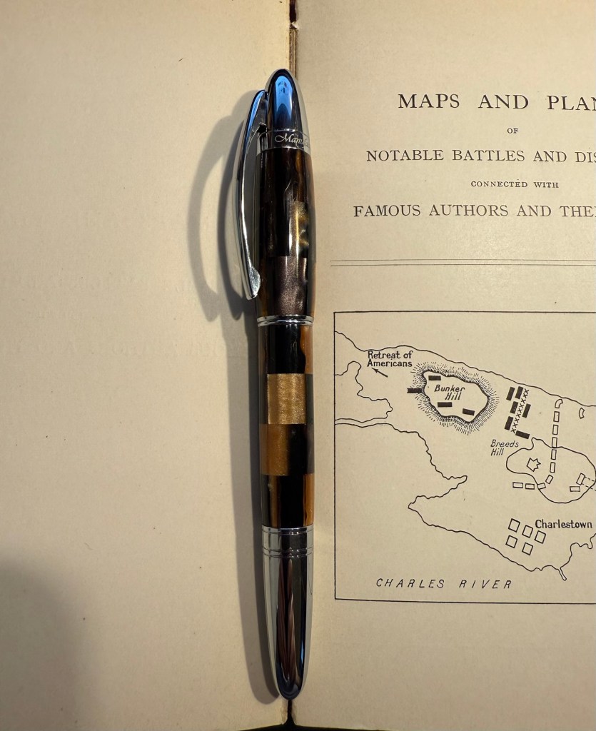
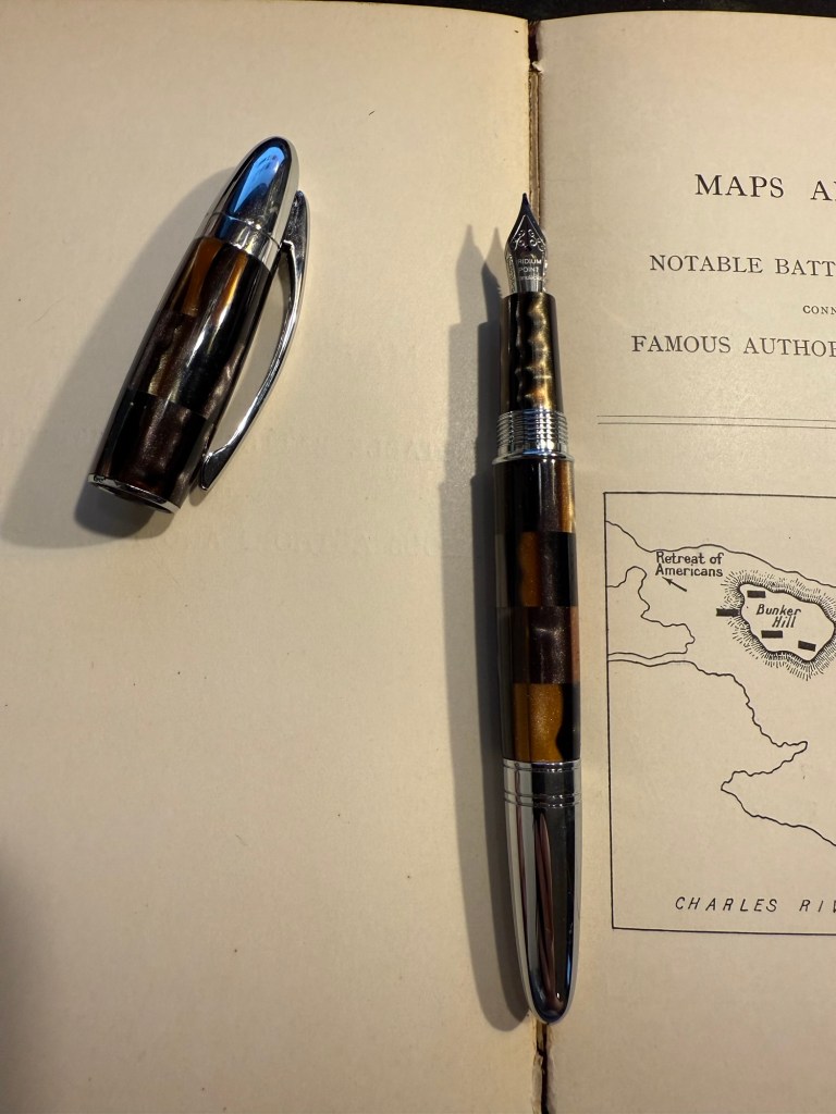
Manufactus Cappuccino Brown medium nib with Diamine Bilberry cartridge – this was a gift that I received from a dear friend who was just back from Italy and bought this (and a wonderful leather bound personalized journal) in the Manufactus store in Rome. The photo doesn’t do justice to the richness of the resin on this pen.
Manufactus Cappuccino Brown
The Manufactus has some heft to it, due to the metal body and trim, and while it states that it’s a medium nib, it runs closer to a fine nib in terms of line width. Diamine Bilberry is an interesting ink that I had in cartridge form, and I wanted a more unique ink than the standard black cartridge that came with this pen. Bilberry is saturated enough to pass as black at a cursory glance, but it’s a gorgeous rich purple with gold sheen that works well in this pen.
Manufactus Cappuccino Brown nib
Apart from these pens I still have about a quarter fill of ink in my TWSBI ECO T Saffron fine nib with Rohrer and Klingner Helianthus going from March’s ink rotation.