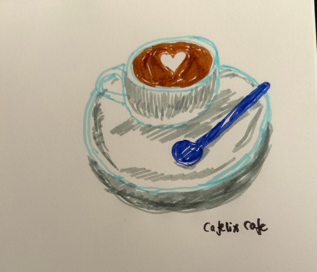
Coffee cup sketch
I got a set of Bic Kids markers and decided to sketch today’s coffee with them. You don’t need expensive drawing supplies to draw, and not every sketch needs yo be perfect.
A blog about writing, sketching, running and other things
I got a set of Bic Kids markers and decided to sketch today’s coffee with them. You don’t need expensive drawing supplies to draw, and not every sketch needs yo be perfect.
My brother went to Hamburg to see the Taylor Swift Eras concert, and while he was in the city he went to the Mokeskine store and bought me these two embossed Moleskine pocket softcover blank notebooks:

They were already embossed, even though it was clear that the embossing had been done manually in store and not in a factory. How can you tell? Look at the Hamburg coat of arms notebook (the left one in the picture). Can you see how it was embossed and then the notebook moved and it was embossed again, causing a double outline? Also the left part of the embossing is fainter than the right one.
I don’t mind it – it gives the notebook character and a human touch. It makes it less precious on the one hand and more unique on the other, as it’s literally a one of a kind notebook now. But it’s this embossing that got me thinking about the Moleskine store experience again.
I used to love going to Molesking stores. There wasn’t one locally so everywhere I would travel to I’d check if there was a Mokeskine store in the area and make a point to visit it. This was for two reasons:
Both things are no longer true, but the second of these – the stamps that Moleskine no longer puts in their stores – is what I want to focus on.
The stamps were a great idea: there was a standard Moleskine logo stamp, but there was also a local stamp (similar in concept to the design embossed on the notebooks above). Those were the best, as you could mark your notebook with a memory of the place you visited. What was even better was that you didn’t have to purchase anything or even use the stamp on a Moleskine notebook. I had a Moleskine pocket reporter that I travelled with and stamped, but I also stamped Field Notes notebooks.
Lots of people came into the store for the stamps, even those who were clearly not regular Moleskine users. And while you’re in the store, you browse the notebooks, you check out the pens and the bags, and you usually leave with a few of them. If you’re a Moleskine collector you of course pick up one of the store exclusive designs.

So what happens today when you go into a Moleskine store?
Well there are no store exclusives anymore, and instead of the free stamps you can purchase add-on personalizations to your Moleskine. Note the word purchase – these add-ons aren’t for free. You can add patches and hot foil printing (of the kind done on the Hamburg notebooks), or add charms to your notebook’s elastic closure. You can only do it on a Moleskine product, and even then not all personalizations are available for all notebooks (you can’t foil print on certain covers, for example). Also to make a notebook like the little Hamburg ones you are talking about almost doubling the price of the notebook. Yikes.
I don’t understand why Moleskine don’t:
The stamp overhead in particular seems to be negligible, particularly in comparison to the foot traffic it drove into their stores and the delight it gave to their fans. In an age where we are constantly being pushed to make impersonal purchases online, a touch of something kind, creative and whimsical like the Moleskine stamps is much needed and appreciated.

August is going to be a month of pens and inks that I haven’t used in a good long while. While I still have a small amount of ink in four of my July pens (the Kanelea, the TWSBI ECO-T Saffron, the Big I Design Fountain EDC and the Schon Design Faceted Pocket 6), they will all be written dry by the end of next week at the latest. It was time for a new lineup, and this is this month’s assortment:
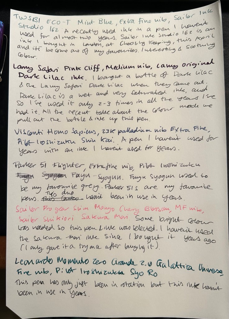
The TWSBI ECO-T is one of my favourite TWSBI designs, and so I have a few of them. The TWSBI ECO-T Mint Blue hasn’t been in use for about two years, so I decided to pull it out and use the Sailor Studio 162 with it, just for colour matching reasons. The 162 is an ink that I’ve used a few months ago but I really like it, so I felt like giving it another month in rotation.
The Lamy Safari Pink Cliff is a recent purchase that I made in Paris last April. I’ve only now inked it up as I wasn’t sure what ink to use with it — until all the discussion about the new (and not as great) Lamy Dark Lilac ink made me want to use the original Lamy Dark Lilac ink. I purchased a bottle of Dark Lilac and the Dark Lilac Safari back when they first came out, but I haven’t used the ink very much. It’s wet and very saturated and so it works best with only a handful of paper options that I have. Still, it’s a very attractive ink.
Visconti Homo Sapiens — this is the original Homo Sapiens, the one that created quite a splash when it came out. At the time it was my most expensive fountain pens, and it’s still one of my most precious pens. I bought it at Mora Stylos in Paris and had it customized with the special initial badges on the finial. I got Pilot Iroshizuku Shin Kai as a gift with my purchase, and though I love this ink I haven’t used it in a while simply because I misplaced it behind another rarely used ink.
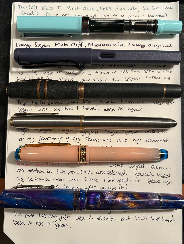
Vintage Parker 51 pens are my absolute favourites, to the point where I have a hard time seeing one in the wild and not buying it. This Parker 51 Flighter hasn’t been in use in years, but in the spirit of “use the good china” I’ve inked it up. Pilot Iroshizuku Fuyu Syogun used to be my favourite grey ink — and then Diamine came out with a series of excellent grey inks and Sailor came out with the 123. I haven’t used it in years, so I dusted off the bottle and decided to give it another try.
The Sailor Pro Gear Slim Many Cherry Blossom has been in rotation relatively recently, but the ink inside it, the Sailor Shikiori Sakura Mori, is one I haven’t used in years. I don’t have or use many pink inks, but I decided I needed something to brighten up this lineup, and the Sakura Mori ink is relatively readable. It also perfectly matches this pen, which is a nice bonus.
Leonardo Momento Zero Grande 2.0 Galattica Universe is also a relatively recently purchased pen that has been in rotation not too long ago. I just love the Momento Zero so much that I decided I wanted to ink one up, and so I chose the Pilot Iroshizuku Syo Ro to ink it up with. I haven’t used this inks in years, and I love teal inks so it was about time.
What have you got inked up for this month? Anything new? Old favourites or long forgotten pens or inks?
The Caran d’Ache 849 ballpoint is a classic which I have already reviewed in the past. While I rarely use ballpoints, I have several of these pens (all with gel refills that I have swapped instead of the Caran d’Ache Goliath ballpoint ones). Why? Because of their excellent limited edition designs.
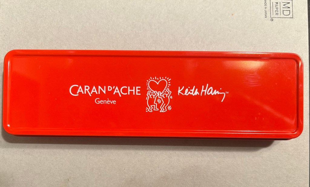
While I was in London in April I picked up two new limited edition 849s – The Keith Haring edition in red and white, and the latest 849 Nespresso collaboration.
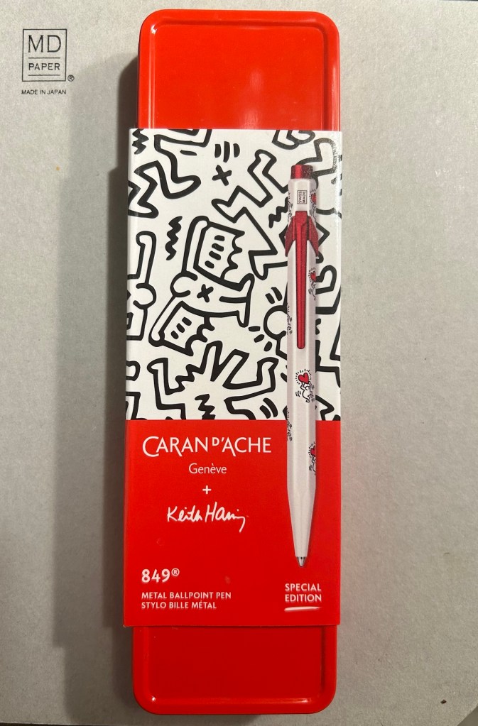
The Keith Haring edition comes in black and in red and white. I think that the red and white edition is nicer, and it appears that so do other 849 fans: the black edition is still widely available but most places have long sold out of the red and white edition.
The box is very nice, and makes for a nice gift pack.
Inside the box you also get to see some of Haring’s work.

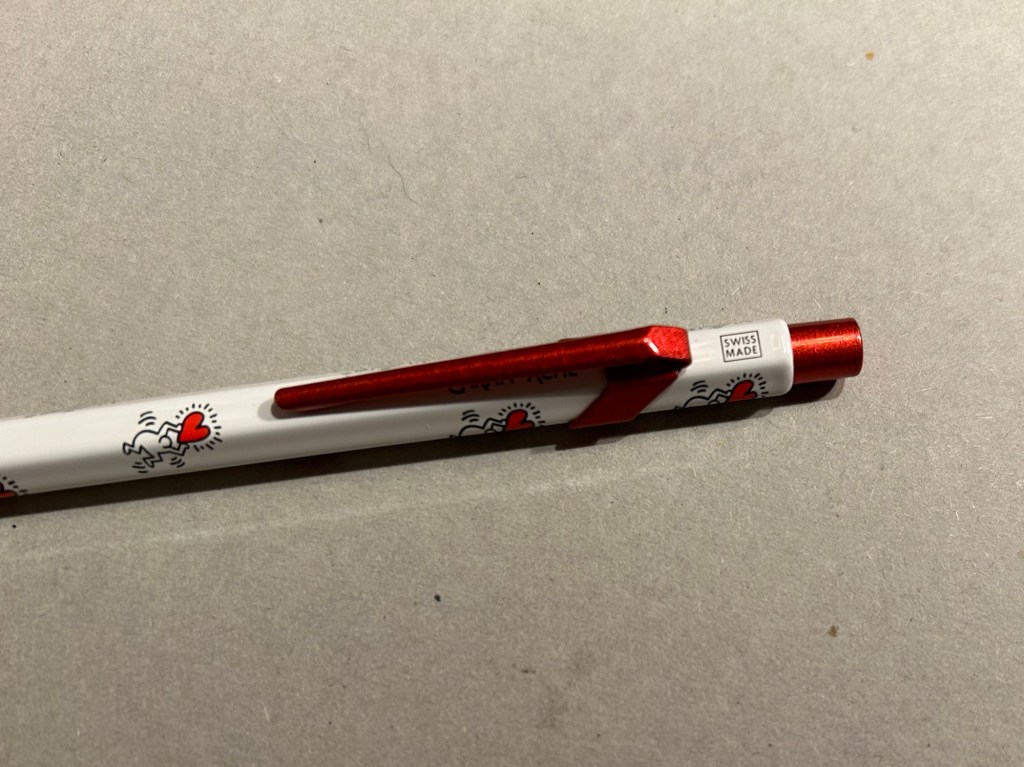
The pen itself is white, with a sparkly red knock and clip. The paint on these feels like lacquer, and the look is sleek and bold. There are dancing people holding red hearts all over the pen (so you get some Keith Haring artwork, but it’s not overcrowding the pen), and the pen body’s finish is the standard 849 glossy finish.
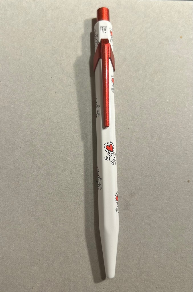
The knock and clip are probably the most striking thing about this pen. Surprisingly Caran d’Ache didn’t put any Haring branding on the pen, not even hidden with their branding under the clip.
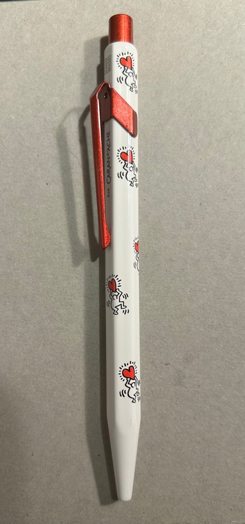
The paint on the clip and knock look like someone poured them out of red glitter paint, and then waited until they set. All in all the result, together with the Keith Haring artwork and the included box, is one of the best 849 gift pens I have seen.
The Caran d’Ache Nespresso Kazaar edition, the 6th Caran d’Ache and Nespresso shared edition, is a bit different than previous editions. Unlike previous editions that featured a silver clip and knock, the Kazaar edition is monochrome. The dark blue pen has a clip and knock in matching colours, and the result is much better than previous pens in this series.

As usual the pen is made at least in part from aluminium from Nespresso Capsules. The pen body has a bit of a matte texture to it, which makes it slightly easier to grip. It comes by default with the excellent Goliath refill, this time in black (the Keith Haring 849 also came with a black Goliath refill).
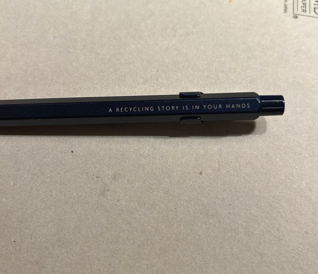
The 849 Nespresso came in the same sort of recycled cardboard box that previous editions came in. It makes for a good gift pen, even though some may find the dark navy blue colour a bit… boring.

If you like the idea of the 849 Nespresso but don’t much like the colour of the Kazaar one, I’d recommend waiting for the next edition. I have a feeling that it too will feature monochrome hardware, and it might be in a brighter colour as Nespresso are starting to run out of drab capsule colours.
Note to those who prefer gel ink refills and plan to swap the 849 refill out: the tolerances on these 849 pens are a bit weird. There are 849’s in which you can easily swap the refill for any Parker style refill with no issue, and those in which if you swap the refill you find that the knock won’t properly engage it. This is something worth taking into account if you plan on swapping the refill in the pen – there’s a risk that it won’t work with the specific pen you own. I’d recommend in this case to try swapping the refill before you purchase the pen if possible, or resign yourself to using a ballpoint. The Caran d’Ache Goliath refills are several cuts above what you get in a standard, disposable ballpoint, so the loss shouldn’t be too great.
What about you? Do you like the 849? Do you swap its refill?
Set in 1958 this tightly plotted, precise and polished mystery/detective story is very set in its time. Tokyo Express by Seichō Matsumoto, translated from Japanese by Jesse Kirkwood, is a masterwork of minimalist craftsmanship. No detail is extraneous. No scene could be cut. The setting starts as a thriller more than a murder mystery, but turns into a murder mystery a few chapters in.

This is a novel of timetables and alibis, politics and very realistic oftentimes tedious and frustrating detective work. While “Tokyo Express” has a general air of melancholy about it, it shows more empathy to its detectives than to its murder victims. The result feels a bit like a Japanese take on noir fiction, with a more minimalist take on the genre. It’s not that you dislike the victims (as is common in Golden Age detective novels), it’s that you are kept at the same distance from them as the detectives have.
This is also not the “amateur sleuth saves the day in the face of stupid detectives” type of novel. The detectives are thorough, thoughtful, methodical, not easily fooled. They use no flashy techniques, no DNA, no modern day CSI methods. It’s the old fashioned repeated, grey work of questioning people, trying to get timetables sorted out, working in small steps that the reader is always privy too (no Sherlock Holmes-like jumps made by omitting key points in the narrative).
There is nothing flashy in “Tokyo Express”. There is superb craftsmanship and a very noir novel that is well set in its time and place. I enjoyed reading it and I particularly liked the addition of maps and timetables to the book. Even if detective novels aren’t your usual fare, I’d give “Tokyo Express” a read, as it’s not the usual “whodunnit” fare.
There’s a new show out on a streaming service and I’ve started watching it. It’s part of a large franchise with a vocal fandom, and as usual, the fandom has opinions. These opinions are extreme, because that’s what social media and news sites amplify. Outrage sells. Hate sells. Abusive bot attacks drive up traffic and “engagement” so why should these companies stop them?
I too have opinions about this series, but they aren’t of the outrage kind. A few years ago I would have expressed them on Twitter, More recently I would have written about them in various group chats. These days I do neither.
I journal about them instead.
We have been trained to think that our opinions on the media we consume must be packaged attractively and shared as widely as possible. We have been told that it’s our responsibility to go on social media and let everyone know how we feel about a show, a movie, an album, a book, about every bit of culture we consume. We have been told that it’s for the benefit of our friends and for the benefit of the artists we like. It is not. It is for the benefit of a small group of shareholders.
I have no interest in feeding the outrage machine. Screaming into the bot filled void does nothing but make you hoarse, miserable, angry, and possibly part of a mob.
I also realized that I’m not interested in entering a debate or an echo chamber about this particular series. I just wanted to clarify for myself what worked in this series, what didn’t, and should I continue watching it or not.
So I journaled about it. No outrage. No drama. Just me and a blank page having a bit of a think about a streaming series. There’s no personal affront here, no mob cheering you on to hurl abuse on the series creators, no mob telling you what to think about certain casting choices, plot choices or the series creators.
My thoughts and conclusions about this series aren’t interesting, just as the name of the specific series is irrelevant. I recommend this process with every bit of media you feel the need to share your opinion about, BEFORE you share your opinion on it. It’s what I do with the books that I review. It’s what I do about podcasts, movies, series and shows. It allows for a guiltless, safe place to voice my opinions, to consider and rework them. It’s also far from the maddening crowd, which means I know that these are my own opinions and not the regurgitated opinions of others.
If you’re interested in the process, here are some questions you can use as prompts:
Do you journal about media? What prompts do you use?
Stabilo make THE highlighters – Stabilo Boss – chunky, reliable, classic. Over the years they’ve added pastel colours to their original neon coloured highlighters, and just recently they’ve expanded their pastel highlighter lineup to include the NatureCOLORS. The NatureCOLORS lineup can be bought separately, or in a wallet of all 6 new colours, or a wallet of 8 that includes two black “marker” pen. The 6 new colours are Warm Grey, Earth Green, Mud Green, Beige, Umber and Sienna. The black “marker” is just an opaque black “highlighter”.

I first saw these in a bookstore in Paris, and while I hardly ever use highlighters, the black marker and the natural tone of the other highlighters made me buy four of them to try out while sketching. As usual with Stabilo, there’s no indication on the pen body what colour it is beyond the colour of the pen body and a number that you have to look up on their site.
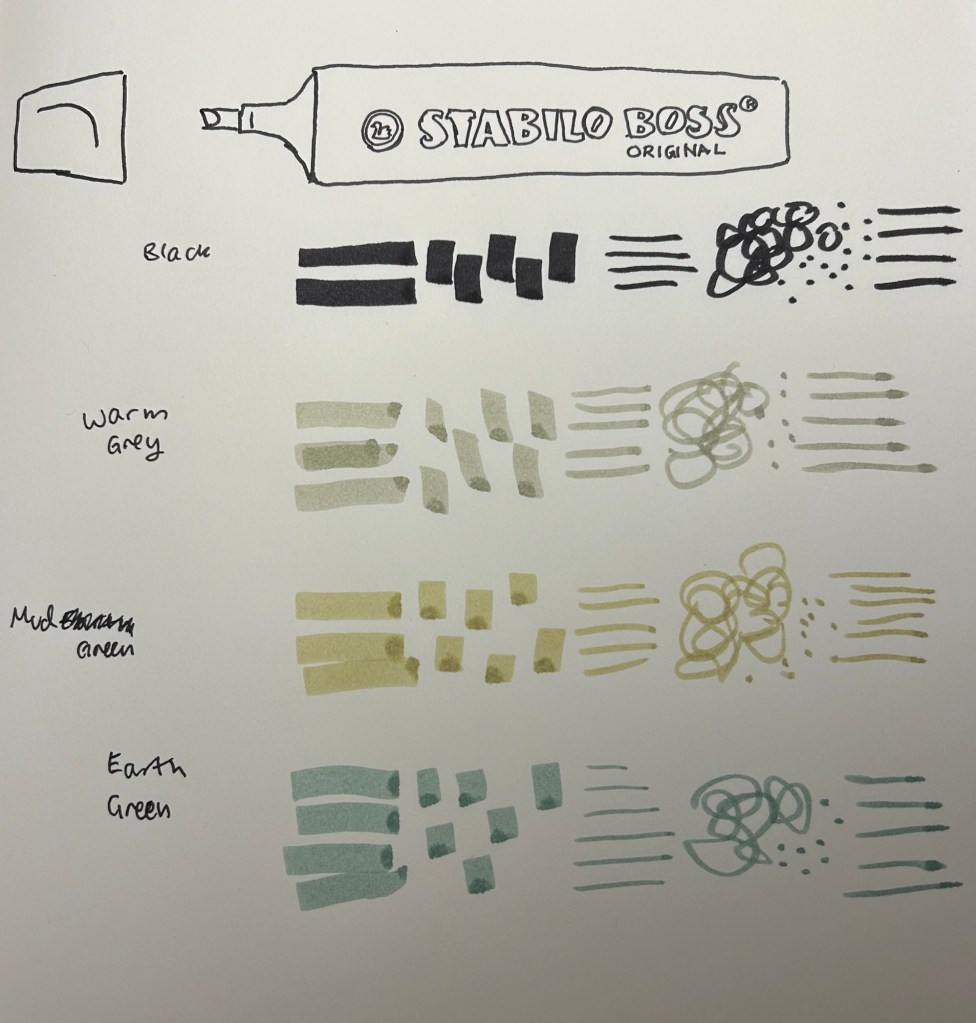
I used these pens for quick landscape thumbnails and sketches, and they work pretty well with a few caveats:
They’re also not at all built for layering and mixing, which means that trying to create layers with them will just leave you with a soggy paper mess:
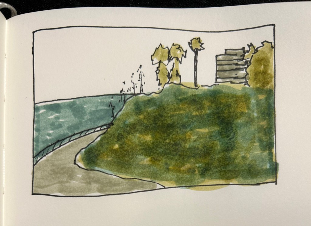
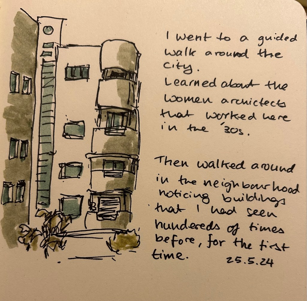
So what are they good for? They work well for quick impression sketches, particularly of buildings, where you can get shading and shadows down very quickly. I used them on an architecture walk to get an impression of the buildings and they worked very well.
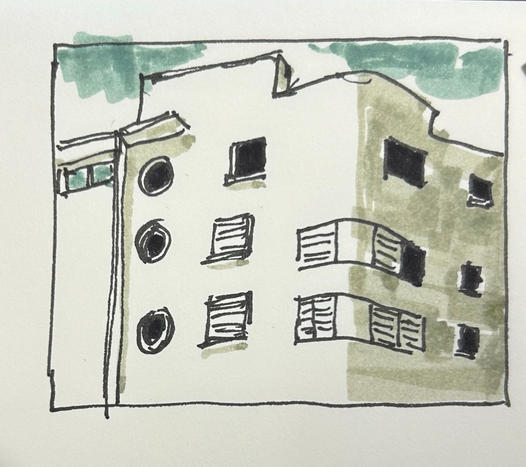
It’s difficult to be accurate with them, but in these sort of sketches I’m not looking for accuracy, just of an impression, a quick note of what I saw and what caught my eye. A photo is great, but it doesn’t highlight what made me stop and take a second look at a building.
Yes, copic markers could do the job, but they cost much, much more than a Stabilo Boss marker, they aren’t as readily available, and they dry out very quickly. Sometimes you need a cheap workhorse to get the job done, and for this new use I think the Stabilo Boss NatureCOLORS work just fine.
This month features a few new inks, and a lot of old favourites that I haven’t used for a while.
Big Idea Design’s Fountain EDC is far from perfect, and yet I’ve inked it up again. It’s the ultem and the ease of capping an uncapping it – it makes it a great EDC fountain pen even though it still has infuriating flow issues. This, however, is the last time I’m inking it for a while (after filling it three times in a row) as I have lost patience with getting it to work properly when I’m journalling. The Schneider Cognac is a new ink for me, a cartridge packet that I bought in London for a pretty steep discount. The colour is a nice orange brown with a good amount of shading and good flow.
Kanilea Pen Co Haleakala Silhouette is gorgeous and overpriced pen that I haven’t used in a while. Sailor studio 123 ink was also in my previous rotation, but I now have two bottles of this most gorgeous of grey inks, so I feel like I should give it more use.
Omas Bibliotheque Nationale is a pen that I bought about a decade ago at Mora Stylos in Paris. The nib is extraordinary, and I decided that I wanted to use it again. It lays a thick, juicy line of ink that works well with Diamine Earl Grey. Diamine Earl Grey is not only a great grey ink at a fraction of Sailor Studio 123’s cost, it also doesn’t bleed through to the other side of the paper in even the Omas’s generous ink. So I get a dark grey with plenty of shading and character, but I can also journal on the other side of the page.
Rotring Levenger 600 is a wonderful pen that Rotring needs to make more of, and Sailor Jentle Sky High is a discontinued ink that Sailor likely makes under a different name and a higher price now. I like the colour, even though it’s a blue and blue inks tend to be boring, and the Rotring works well in use for my office notes.

Sailor Pro Gear Slim Graphite Lighthouse is one of the last Sailor pens that I bought, and it’s one of my favourites. The H-EF nib is extremely fine, and not for everyone. Sailor Jentle Epinard is a great discontinued dark green ink from Sailor, and they likely make something similar under a different name and higher price (or you can find a parallel Diamine ink for much cheaper). The Sailor Jentle ink’s discontinuation was when I bought this and the other Jentle inks in use here, and I kind of regret my shopping rush. There’s no point in buying discontinued ink, as you’ll likely easily find something else similar to that (something that doesn’t use the Jentle ink’s terrible flat bottle design), or something better.
Schon Design faceted pocket six patina is a great pocket pen, and the Schneider Bermuda Blue is a great teal ink. The shading on this ink is excellent, and if I get a chance to buy another box of cartridges when this one is empty, I will.
The TWSBI ECO T isn’t as interesting to me as the ink inside it. I’ve been wanting to try out Diamine Ancient Copper for a long time, and when I was in Oxford I managed to get a bottle. It does not disappoint – great flow, great shading, great rich burnt sienna colour.

I haven’t used the Platinum 3776 in a while, and I almost forgot what a great workhorse of a pen it is. Sailor Jentle Ultramarine, a very bluish purple, long discontinued, is kind of on the boring side.
Here are the pens from top to bottom:
Big Idea Design Fountain EDC
Kanilea Pen Co Haleakala Silhouette
Omas Bibliotheque Nationale LE from 1999
Rotring Levenger 600
Sailor Pro Gear Slim Graphite Lighthouse
Schon Design Faceted Pocket Six Patina
TWSBI ECO T Saffron
Platinum 3776 Demonstrator

What have you got inked up this month?
When I started reading “4321” Paul Auster was still alive. By the time I finished it he had passed away. That does add an element of difficulty when discussing a work that is far from perfect – one feels that it’s somehow rude to point out the flaws in a recently deceased author’s works.

Nevertheless, here’s my review:
“4321” is doorstop of a book, a massive tome that demands quite a lot of time but not a lot of effort to read. Auster is good writer and he is very capable of writing very readable books. At no point during “4321” will you feel that the writing drags or that you’re struggling to understand what’s going on. In his telling and retelling of Archie Ferguson’s life in all four variations of it, Auster very adeptly makes sure that you don’t lose sight of the plot and get confused wondering which version of Archie are you tracking now.
That’s the highlight of this book, and it may also be its downfall. “4321” is Auster in his most polished, most controlled, and most repetitive. It’s all the previous themes that you’ve met in previous Auster novels, coupled with Auster’s own biography and his love for certain types of characters and relationships. It’s like watching Kenneth Branagh’s “Hamlet” – a work of supreme technical difficulty and accomplishment, polished to a mirror-like quality, and reflecting only the creator himself. Somehow after more than 900 pages you realize that there’s no there there.
The most interesting characters are the ones that Auster glosses over, slotting them into their role in Archie’s narrative (his mother Rose is perhaps the most glaring example of this), and the characters he does care about are… uninteresting. Archie, through his 4 turns in life, never evolves. He’s always a detached, not very interesting young man that looks at the events of the century from the sidelines. His friends also never evolve, and while his path to becoming a writer might be fascinating to Auster, it wasn’t very interesting to me. It was too neat, too clean, too uncomplicated. The whole thing was rather bloodless, the rank opposite of Doctorow’s “Ragtime,” which is a messy but punchy and lively affair.
You spend over 900 pages of uncomplicated, almost light reading, and get to… not a lot really. There’s nothing here that hasn’t been written about elsewhere and much better about love, life, creation and the creative mind. What you do get is to view the supreme craftsmanship of a very good storyteller. Maybe that’s enough. For me it wasn’t.
This is the second post on this topic. For an explanation on the 13 week year read this post.
As life tends to constantly throw curveballs at me, planning ahead in short bursts has proven to be invaluable. During the previous quarter my dad went through an unexpected open-heart surgery and I realized that I’d have to find a new apartment in the not so distant future. If I had planned ahead for an entire year (goals/themes, the system is immaterial), I would have had to scrap all my plans on February. As it was, I made a few minor adjustments, and finished not so far from where I originally planned.
Just before this 13 week/quarter started I got some bad news about my cat. That’s going to affect my plans, which I made before I realized that he was likely dealing with cancer. That’s OK – my plans are short term enough to allow me to easily change them, and I’ve already built plenty of wiggle room into the plans that I made. Unlike themes, which I find to be to vague to be useful, or yearly plans, which are too long term to be practical in my circumstances, 13 week planning allows for just enough time to make meaningful progress in the key areas of my life whilst being short enough to allow me to quickly pivot if necessary.
This is my third round with 13 week planning, and I’m getting progressively better at it. Here’s what I do that’s been working so far:
My planning is done on paper, and then I use Fantastical (a calendar app) and Streaks on my phone to help me keep daily track of things. I look at my weekly plan almost every day, and I track things there as well. On a weekly basis I review my progress and decide what to focus on next week. If it’s a busy week I’ll select only a few relatively easy goals, for example. The point is to build a plan that is detailed enough to cover the most important areas in your life well, and yet allows for flexibility.

Have you found this helpful? What tools do you use to achieve your goals?
