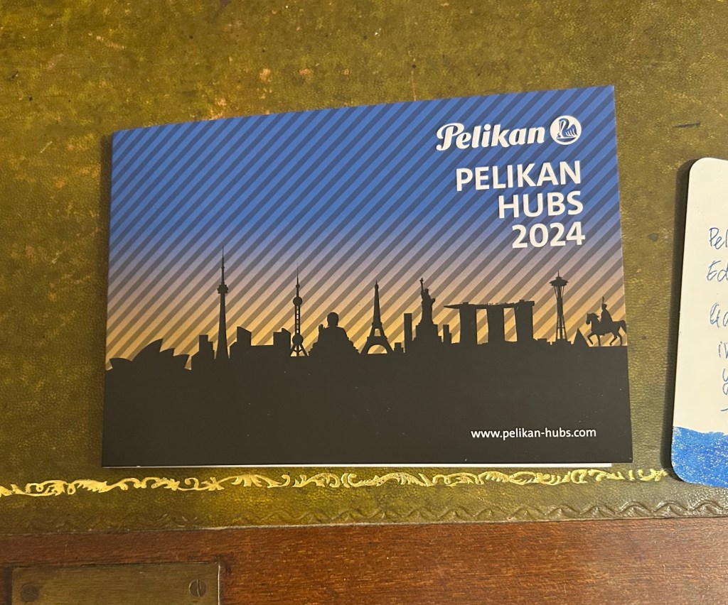
Pelikan Edelstein Ink of the Year Golden Lapis Review and Pelikan Hubs 2024

Yesterday Pelikan celebrated their annual Pelikan Hubs event, and we had a local Pelikan Hub. Since 2014 the German pen company has invited its fans to gather in groups all around the world and for one evening celebrate their love of Pelikan fountain pens and ink. The events are well organized, with a local volunteer in each country organizing the Hub location and orchestrating the event. And every year Pelikan gives Hub participants a generous gift for their participation.

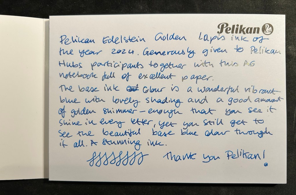
This year was no different, and Pelikan Hub participants got a full sized bottle of Pelikan’s premium ink collection, Edelstein, in the Ink of the Year 2024 colour: Golden Lapis.

Pelikan Edelstein Ink of the Year Golden Lapis

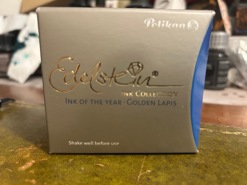
As is customary with luxury inks, the bottle is a glass work of art:

Edelstein ink bottle.

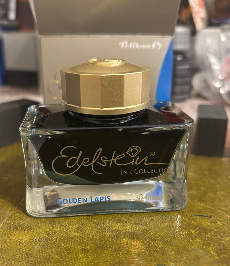
The extra thick base and wide opening work well with Pelikan Souveran pens which tend to be wider barrelled and often difficult to impossible to fill with certain ink maker’s narrow and tall ink bottles. With certain Sailor ink bottles and Diamine’s 30ml plastic bottles there’s a risk of your M400 or M800 not fitting into the bottle or of tipping the bottle while trying to fill the pen with ink. There’s no risk of that with Edelstein bottle design, though when the ink level runs very low its likely you’ll need to get creative when trying to fill your pens with ink.

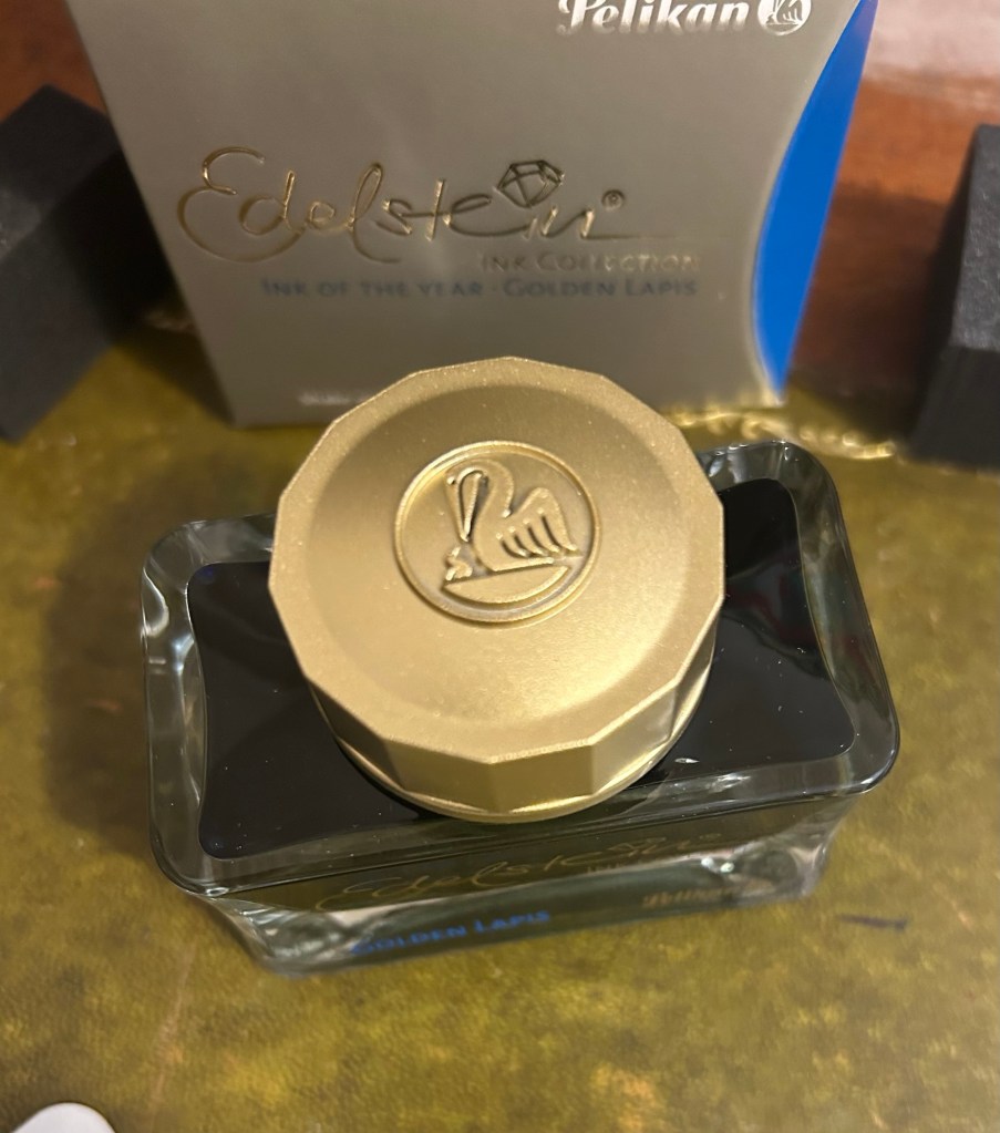
The golden cap has the modern Pelikan logo on it, with a Pelican and one chick:

The Edelstein cap

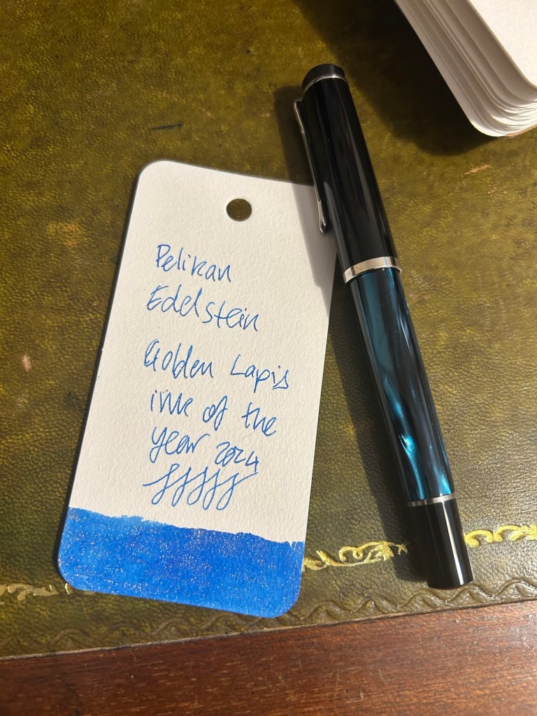
I filled a Pelikan M205 Petrol Marbled EF pen with the ink and used it for the swab and writing sample below. Here’s Golden Lapis on a Col-O-Ring card:

Pelikan Edelstein Golden Lapis ink swab

We got a nice A6 writing pad with bristol thick fountain pen friendly paper in it as part of the Pelikan Hub 2024 gifts. The paper is great though I wish there wasn’t a Pelikan logo on each page mostly because it takes so much space. The paper is thick enough for both sides of it to be useful, so it’s a shame to have to flip the page over and write only on one side if you want the full A6 page to yourself.

The A6 notepad that we received as part of the Pelikan Hub

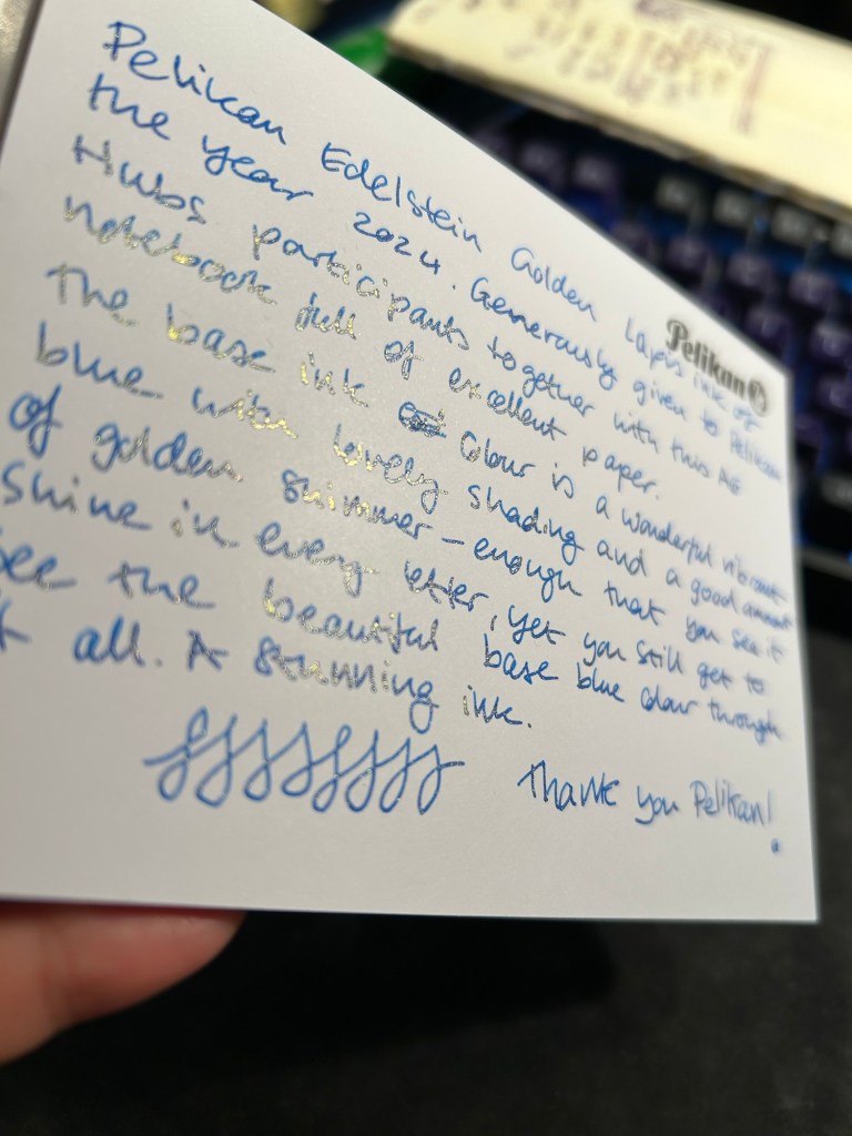
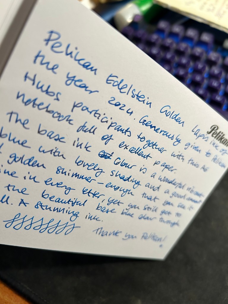
Pelikan Edelstein Golden Lapis is a gorgeous ink, period. The base rich, turquoise-y blue reminds me of Pilot Iroshizuku Asa Gao and that is high praise. The colour is rich, vibrant and has a good amount of shading that sets it apart from standard blues. To this fantastic base ink Pelikan added lots of fine, golden shimmer, and the result is stunning. Viewed directly from above the shimmer is present but subtle, oftentimes taking on the look of sheen:

Writing sample on the Pelikan A6 pad

But tilt the page slightly and the amount of gold in each letter makes the page glow:

Tilt it to the other side and the shimmer “vanishes”, which allows you to see the lovely blue ink’s colour shading much better:

Pelikan Edelstein Golden Lapis is a spectacular ink that manages to be unique in a market overflowing with blue inks with gold shimmer. The combination of the base colour, its shading properties, and the good spread of the shimmer make this an ink worth having in your collection if you’re a shimmer ink fan.

As for the Hub I participated in: it was fantastically well organized and I had a lot of fun meeting other fountain pen enthusiasts and seeing the pens they brought.

SketchingNow Travel Sketching: Lines

So I just finished the first week of Liz Steel’s SketchingNow Travel Sketching course. I wrote about my material list for this course here and about the beginning of the first week here.

Liz started the week by suggesting that we approach sketching while travelling using a 7 lines principle: sketch the scene in 7 lines, which you can then flesh out to a full sketch. While I managed to do this for the first three Eiffel Tower sketches, I started to struggle once we got to complex buildings like the Big Ben.

This went well – Eiffel Tower with 7 lines as a start.

Here’s my two initial attempts with 7 lines, and then where I moved to my usual approach, which is trying to break a scene down to simple shapes (square, circle, triangle, etc).

Where things went wrong.

I then sketched the next assigned subjects using my own approach:

At which point I realised several things:

  1. I wasn’t really learning anything new this way.
  2. I hadn’t given the new approach enough of a chance before giving up on it.
  3. The 7 lines rule isn’t rigid. It’s an artificial limitation that’s supposed to encourage observation and decision making up front, not to have me counting every pencil or pen mark.

So with that in mind, I made two decisions:

  1. I can use continuous/complex/compound lines as part of the 7 lines. Liz uses them herself, and as they are quick to sketch and require acute observation they remain in the spirit of the rule.
  2. I can use up to 10 lines if I felt that it was necessary to convey perspective or complicated shapes.

Then I went back and sketched the following using this approach:

These came out much better than in the first attempt.

Then I sketched two Melbourne scenes:

The Auction Rooms came out particularly effective- 7 lines allowed me to outline the main interest point of the scene (the roof line), and also to outline a car, so I have a feel for the scale of the buildings.

I then sketched two local scenes. The top left scene was of two little egrets waiting to be fed by the local fishmonger. I got the tree, the egrets, the buildings and with two extra lines, the windows.

The bottom sketch was of a heron on a boat in the river. I got the river, the boat, the heron, and the buildings behind the tree line. I would have been very comfortable finishing both sketches either on location or from reference photos with this strong starting point.

The final sketch was of a very complicated building in Paris. I added a few more lines just for reference for where the columns are. Like the rest of these sketches it’s not 100% accurate, and there are slightly wonky bits, but I’m looking for speed and to capture the essence of a scene when I’m travel sketching, not for photorealistic reproduction.

I really struggled with the 7 lines idea at first, but then I allowed myself a bit more freedom within this framework and I found it to be very useful and also an easy idea to carry around with me as I look for interesting things to sketch. If I can envision the scene in 7 lines and it looks interesting with just those lines, then it’s likely worth sketching.

Coming up next is shapes, where we start to work with colour. I’m curious to see what the results will be.

Sketching Now Travel Sketching: Eiffel Tower and Big Ben

So the first week of actual lessons in Liz Steel’s Sketching Now Travel Sketching course started and already there’s been a slight change of materials.

As this week will be entirely focused on line drawings, I’m switching to a non-watercolour sketchbook. For the first part of this week’s exercise, which includes working from reference photos, I’m using the Midori MD Cotton notebook in A4. It’s neither a proper sketchbook nor the A5 size format that Liz recommended, but as she also requested to upload as few photos as possible to this week’s gallery (and no more than 6) and as we have quite a bit of work to do, I decided to at least use a large notebook so I can fit more than one or two sketches on a page and thus avoid the need to stitch photos.

Eiffel Tower

We have several scenes we need to sketch as quickly as possible, starting with just 7 lines to define the scene. The 7 lines idea worked quite well with the Eiffel Tower but broke down completely for me once we got into a complex building like the Big Ben. That’s when I decided to just work with shapes and let the architecture details on the building help me determine its length and proportions.

Big Ben

Generic rules like “start with just 7 lines” are nice ideas on paper, but they oftentimes break down when we’re faced with reality. I think that the 7 lines idea would actually slow me down when sketching on location (it slowed me considerably while I was at home, and it failed completely with the Big Ben), but the basics of contour, shapes, perspective, proportion hints work no matter what.

I will try the 7 lines for the rest of the week, to see if it’s just a matter of practice, but I suspect that it isn’t.

Sketching Now Travel Sketching Course: Material List

I’ve started Liz Steel‘s Sketching Now Travel Sketching course this week, and so I’ll be posting about my progress throughout the course.

I travel a few times a year and while I already sketch during my travels, I want to improve my speed and gain enough confidence to sketch in less than ideal conditions. I rarely sketch standing up, and I don’t feel comfortable sketching while I’m waiting in line, for instance, and these are useful skills to have if you plan to sketch while on a trip that isn’t dedicated to sketching.

As usual with Liz Steel’s excellent courses, the first part is an introduction which includes an overview of the course, setting personal goals for the course, materials list/discussion and a review of where you are starting from.

I have decided to take a different approach to the materials requirements for this course. I have a pretty compact and set travel sketching set of materials, but I’m allowing myself to expand on it and change it a bit to experiment with some new techniques.

The first big change is the sketchbook I’m using. It’s a Hahnemühle A5 Watercolour Book, which includes 200gsm fine grain paper. I’ve never used it before, but as I regularly use the Stillman and Birn Alpha that Liz is using for the course and I’m not a huge fan of it, I decided to give this paper a spin instead. If it works it would be ideal for travel sketching, as it’s thin and lightweight, the paper takes watercolour washes much better than the Alpha, and I appreciate the elastic closure and hard covers. They are very convenient additions that should help me sketch while standing, and keep the sketches safe while I carry the notebook in my bag.

Hahnemühle A5 Watercolour Book

I’ve also changed my watercolour palette somewhat (it’s the bottom palette, not the top one). As I’m still not certain about it, I’m not fully documenting it at the moment. This course isn’t geared heavily towards watercolour, but I tend to like to sketch as quickly as possible on location when travelling, take a few reference photos and complete the sketch with watercolours later that evening.

The palette I’m using is the bottom one, with 24 colours, both Schmincke and Daniel Smith.

For the first time I’m adding watercolour pencils to my travel sketching kit. As Liz recommended I have a triad (yellow, red, blue), a green, a brown, a grey, a dark, and while she recommended having two lights, I have three. Why? Because having quickly available greens is very useful, the pink is useful for skin tones, and the ochre is too generally useful to be left out. All of these pencils are Faber-Castell Albrecht Durer.

Watercolour pencils.

Dry media is also more than double what I normally carry on me. Here the point is to experiment, and it’s very likely that I will say goodbye to several of these tools during the course. I normally use only Staedler Pigment Liners in 0.3, 0.5 and sometimes 0.8 when I sketch, but here I’ll be adding a Tomboq Fudenosuke brush pen to the mix, two fountain pens (a Lamy Safari and a Sailor Fude both with De Atramentis Document Black), three pencils (Faber Catelll 9000 2B, Rotring 600 0.7 and for the first time ever, Faber Castell 4B graphite aquarelle), an eraser and a pencil sharpener. I’ll also be using a medium waterbrush instead of my usual fine one.

Sketching media.

All of these tools will be carried in a Nock Co case, with the exception of the watercolour tin and rag, and a brush case.

Nock Co case, watercolour tin and rag.

I don’t think that I’ll be using these too much during this course, but these are my travel ready brushes. I keep them in a Ti2 design tube with glue tac at the bottom to prevent the brushes from moving. The brushes are Windsor Newton Series 7 numbers 4 and 7 and Rosemary & Co dagger brush 772.

Brushes

That’s the whole kit, and now it just remains to try it out and see what works and what doesn’t.

Protest sketch

Powerful speeches and half a million people at the main protest to return the hostages and for a better leadership this evening.

Bring them home now.

Sketched on location and watercolour added later as it was too dark to see colours properly.

Paris 2024 Breaking Sketch and Building New Palettes

I’ve been unhappy with my watercolour palette lately, and so I’ve been experimenting with new colours instead of some of the old ones. I usually swap out one colour at a time, try out the new colour for a while, and then either keep it or swap it out for something else. This time I’m doing my usual swap procedure, and also building a completely new palette on the side. The idea is to speed up the new colour discovery process, as there are 5-6 colours that I want to replace in my current palette, and that’s a lot.

The first colour to leave was Daniel Smith Cerulean Blue Chromium. I have too many similar blues and it’s slowing me down having to decide between them every time I need a blue. In its place I swapped Daniel Smith Rhodenite Genuine, which is a bright pink.

Samples of some of the colours I considered swapping in. Amethyst Genuine was a genuine disappointment – I don’t think I’ve seen such a bland, pale, washed out purple anywhere.

I then sketched one of the scenes from the 2024 Paris Olympics Breaking final, which I was going to see in person before I had to cancel my trip. Luckily my brother was there and sent me photos and videos, which I had fun sketching from. There was a lot of purple in this scene, so I had fun mixing Rhodenite with blues and purples on my palette.

Quick Paris Olympics Breaking sketch

The new palette is something I’m building in a Daniel Smith plastic paintbox. It’s not a box that I’d regularly use (it doesn’t have enough mixing space for me), but it’s useful for the testing I want to do.

This box came as part of a set of two, one of which had paints in it.

I then set up a legend in my sketchbook:

Next I broke ou the Alvaro Catagnet Daniel Smith Master Artist set and filled the pans with paint. I’ll give them 2-3 days to completely dry out before finishing the legend and trying them out. I would never have built a palette which is so heavily skewed towards reds, but this is part of the experiment – after a heavily blue skewed palette it’s time to try something new.

I can’t wait to give these new paints a try. I’ve worked with the Schmincke versions of Yellow Ochre (I no longer use it because of its opacity), Viridian (way to artificial a green for my tastes), Ultramarine Blue and Cobalt Blue, but it will be interesting to see Daniel Smith’s take on these colours.

Book Review: Tomorrow, and Tomorrow, and Tomorrow by Gabrielle Zevin

It turns out that when you take a bunch of stuff that you happen to like and put it in a blender, a book doesn’t come out. That should have been the tagline for this best-selling mediocre, patchwork of little substance.

“Tomorrow, and Tomorrow, and Tomorrow” by Gabrielle Zevin starts very promisingly. The first chapter, and particularly the first half of the first chapter is wonderfully well written and a joy to read. Then there are parts here and there, certain imaginative landscapes and certain descriptions mostly, that are excellently written. But the novel as a whole is a giant void of nothingness, lavishly sprinkled with clichés and woke politics, with “spicy” characters and themes thrown in every time Zevin felt that she might be losing her reader. Reading this book is like eating at a fast food restaurant – things may look enticing at first, but there’s no there there and you end up leaving hungry.

Some main points:

  • The childish, selfish, self involved, self destructive Sadie and Sam (the main characters) don’t change at all during this novel. They behave as adults exactly as they behaved as children. Not only is this incredibly boring, it’s also bewildering that this was termed a “coming of age” novel. They don’t grow up, so what exactly is the plot here?
  • There is no plot. It’s just time passing with incidents and character behaviours and interactions that are unearned and unwarranted. The only reason things seem to be “happening” is because Zevin feels like she might be losing her reader. The happening is in brackets because the events show little to no lasting effect on the main characters’ behaviour or choices beyond the superficial. The worst of these “happenings” is the killing off of a likeable character. Once he’s killed you realize that the only reason he was there and was likeable was so that Zevin can kill him off. It’s unwarranted, unearned, and insulting to the intelligence of the reader. It’s then that you realize that his involvement with Sadie and Sam was so outlandish in the first place that Zevin felt the need to justify it several times in the novel.
  • The characters include (I kid you not): a manic dream pixie girl that composes music naked to feel closer to her instrument, a Jewish Korean only child that is a talented math nerd who goes to an Ivy League college, a gay video game designer couple, a Jewish princess video game designer, an ex-Mormon video game designer couple. The book is trying so hard to be woke that it is breaking into a sweat and not really addressing or representing the historical era it is set in or the video game industry. As a woman in tech, a system programmer in an as male dominated field as Sadie’s, her experience is utterly, utterly unrepresentative. There’s lip service in a few scenes where Sam get the credit for her work, but Zevin was clearly not really interested in tackling the experience of always being the only woman in a room full of people who don’t believe you should be there.
  • The book skirts all kinds of interesting themes (sexism, racism, abuse, trauma, disability, the immigrant experience, financial and class disparities, creative ruts) but tackles non of them. They all just go “whoosh” by, leaving no mark, placed there just as if they were chores on Zevin’s to do list.

My guess is that reviewers and book club recommenders were taken in by the first chapter and didn’t really trudge through the entire 400 plus pages of the book. I would strongly recommend that you spend your reading time elsewhere. The bits and pieces that are worth reading aren’t worth the bits and pieces that are not.

Oh, and the use of Shakespeare (and “The Iliad”) is utterly unearned and jarring. I have no idea how either Zevin or her publisher had the gall to name the book after such a masterpiece of a speech.

How I Use My Notebooks: Gym Journal

Here’s an idea that I haven’t seen discussed before: take a pen and a pocket notebook with you to the gym and journal in between sets.

This is my gym journal:

Moleskine Pocket lined hardcover Mickey Mouse limited edition and Zebra G-405 pen

It’s a battered Moleskine pocket hardcover lined notebook, a limited edition Mickey Mouse one from years ago. There was a series gash in the spine, so I fixed it with some gaffer tape. I use a Zebra G-450 gel ink pen, and it lays down a bold, 0.7 black line.

I don’t use this notebook during every gym session, but when I’m trying out new things, when I’ve got a lot on my mind, or when I’m trying to solve a specific problem I take it with me. I don’t write details about my workout (rep numbers, weights, etc) as I have an app for that.

So what do I write in this notebook?

  • How things felt during the workout, particularly when I’m trying something new or if I’m recovering from an injury.
  • Notes on other gym goers bad behavior. I don’t want to confront them, but I do get frustrated when people don’t return weights, don’t use a towel or wipe down the equipment, and hoard equipment during the gym rush hour. Writing it down allows me to let off steam and focus on more productive things (like my workout, or returning equipment that I know is no longer in use back to its place, or on anything else).
  • Ideas or projects that I’m brainstorming at the moment. I oftentimes use a workout to think about something I’m considering or something I’m stuck on. I jot a few notes in between sets to not forget the ideas I came up with during that time.
  • Things I want to journal about later, in my “regular” journal. These are usually things that I forgot to journal about and want to get back to later in the day, when I have time to sit down and better process them.

The main point of this journal is to get me as much as possible off my phone. It’s tempting to check the news for the umpteenth time, or doom scroll various feeds, or play mindless games while you wait between sets. My goal is to bring these habits down to a minimum, and this journal is a useful tool in the search for less screen time.

Sample entry from last year. I write with gym gloves on, hence the atrocious handwriting.

I originally thought that it would be embarrassing to use a notebook in the gym, but I decided that “so what, who cares” is the attitude to take in this case. People do much more embarrassing things at the gym and nobody comments on it. I use an inconspicuous notebook that isn’t at all precious, and a hardy, inexpensive, inconspicuous gel ink pen to go with it. Both have survived falls and encounters with misplaced weights, so they are gym hardened, Don’t bring large, colourful notebooks with you, and don’t bring pens that look expensive or draw attention to themselves. You’re going for the “boring, not worth paying attention to” look here.

Would you consider taking a pen and notebook with you to the gym? If you already do, how do you use your gym notebook?

Paris 2024 Olympics Moleskine Notebooks

Just as I wrote a post about Moleskine no longer making store exclusive limited edition notebooks, my brother went to Paris (during the Olympics) and found not one but two store exclusive limited edition notebooks. Moleskine have officially cooperated with the Paris 2024 Olympic games and they have outdone themselves.

The first notebook is a large lined hardcover notebook that could be purchased standalone, or as part of a set that included three Olympics themed charms (in the colour of the medals) and a pen. The box was sold out, as were the charms (and yet it was still on display in the store window, because reasons). The notebook was still available and it is glorious, a perfect example of Moleskine’s design prowess.

This is the notebook still in the wrapper:

Wrapped notebook from the front

The front facing part of the wrapper has a discreet Paris 2024 logo sticker on the right side. The back part of the wrapper is anything but discreet. There are games logos, games sponsors, multiple designations of the officialness of the notebook, as well as pictures of the notebook cover and the lined interior with its bookmarks (more on them later). It’s busy back here:

Wrapped notebook from the back.

Removing the wrapper reveals the notebook itself. The Olympic logo is given its pride of place, and the rest of the cover is given over to a celebration of the Paris 2024 font. The only colours here come from the foiled gold of the flame and the Olympic rings. It’s a classic and sleek design:

Front cover unwrapped.

I expected the back cover to just be more of the Paris 2024 font in black on white. Instead there’s a set of letters that are gold foiled, and I really like the effect. It’s chic, classy and very well thought out. The Moleskine logo is there, but it doesn’t call attention to itself, and the black rubber band almost disappears from view:

Back cover unwrapped

Inside the front endpapers have the usual in case of loss section, the Paris 2024 logo prominently displayed, the Moleskine logo, small and discreet, and a letter in French:

The front enpapers

Here’s the letter, from Tony Estanguet, the head of the organizing comittee for Paris 2024 and an Olympic champion. Note that it, unlike the “In Case of Loss” part uses the Paris 2024 font. It’s written in French and is a celebration of the Paris 2024 games and their uniqueness (first opening ceremony not in the stadium, first games with gender parity, first games with Breaking, 100 years since the previous Paris games, first event open to participation by the general public – Marathon for All). It ends with a celebration of the notebook in your hand, which is a nice touch.

Close up on the letter.

The back endpapers have logos of the various Olympic events. As usual, these are well placed and the back pocket and the endpaper prints match perfectly. It’s the little details that matter in these notebooks, and Moleskine always nails them.

Back endpaper

Inside the back pocket are some Olympic themed treats: four sticker sheets, and a folded map of the event locations.

Stickers and folded map

The stickers feature the Phryges, the Olympic mascots for the 2024 games, participating in various sports:

First two sticker sheets
Second two sticker sheets

Then there’s a stylized map of the various events locations in Paris, France and Tahiti:

The map.

Finally, inside the notebook are not one, not two, but three ribbon bookmarks in the colour of the Olympic medals:

The bookmarks.

All in all this is an extremely well thought out design, one that takes pride in the games and cares about every little detail. It’s a worthwhile memento of the event, and it just shows what Moleskine can do in terms of localized special editions when they put their minds to it.

The second notebook is a soft cover cahier created for those who want a cheaper, more colourful and lightweight alternative commemorative notebook from the event. Here it is wrapped:

Wrapped front cover

Here’s the back cover. Again, lots of info here (the price was half that of the hardcover).

Wrapped back cover.

The front cover features a very colourful illustration of Phryges doing various game related things alongside iconic Paris monuments and symbols. There’s a lot of playfulness here, and it’s a delight to look at all the little details here:

Front cover.

The cover has a pleasant texture to it. The back cover has a Phryge in the back waving hello above the Moleskine logo in white:

Back cover

Moleskine clearly love the Paris 2024 font because it is once again the star in both front and back endpapers, this time with only the numerals in use:

Front endpaper

There’s a pocket in the back:

Back endpaper

The paper is blank, and it’s stitched using blue thread – very fetching. It lies flat with little effort:

Paper and stitching

Here’s a writing sample on the paper (both notebooks feature the same standard Moleskine paper – 70/gsm ivory coloured acid-free paper:

Writing sample

Close up on the writing. Fountain pens show the same strange mottled pattern that they do in this kind of paper, and wider, juicier fountain pens will spread:

Closeup on the writing sample

There is see through and bleeding with the fountain pens and the rollerballs. This paper works best with gel ink pens, ballpoint pens, fineliners and pencils:

Back of the page

All in all these notebooks are well worth their price in my opinion. They are well designed, provide a lovely memento of the Paris 2024 games, and they are unique to the Paris Moleskine stores. I only wish that Moleskine would create more of these for their stores. They were clearly a success in Paris, for good reasons.

What do you think about these notebooks? Would you purchase one or both of them?