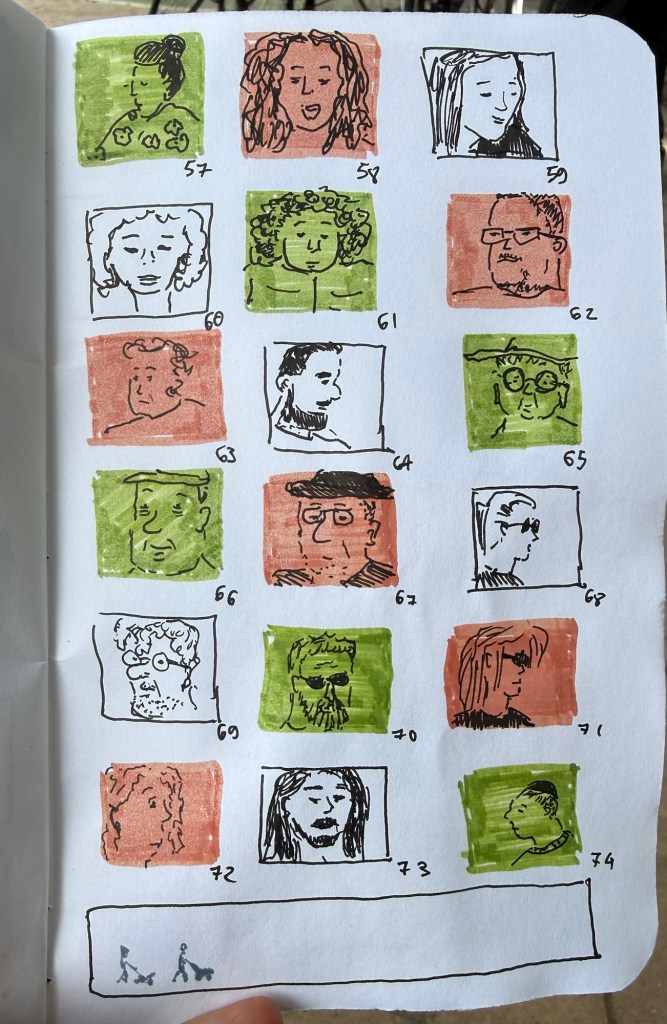
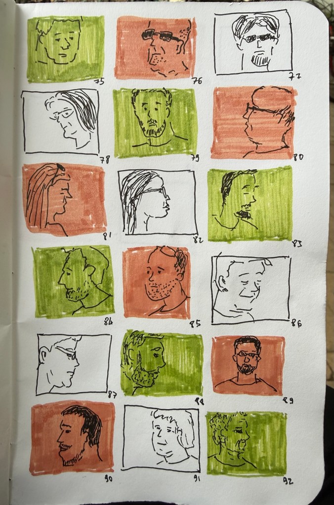
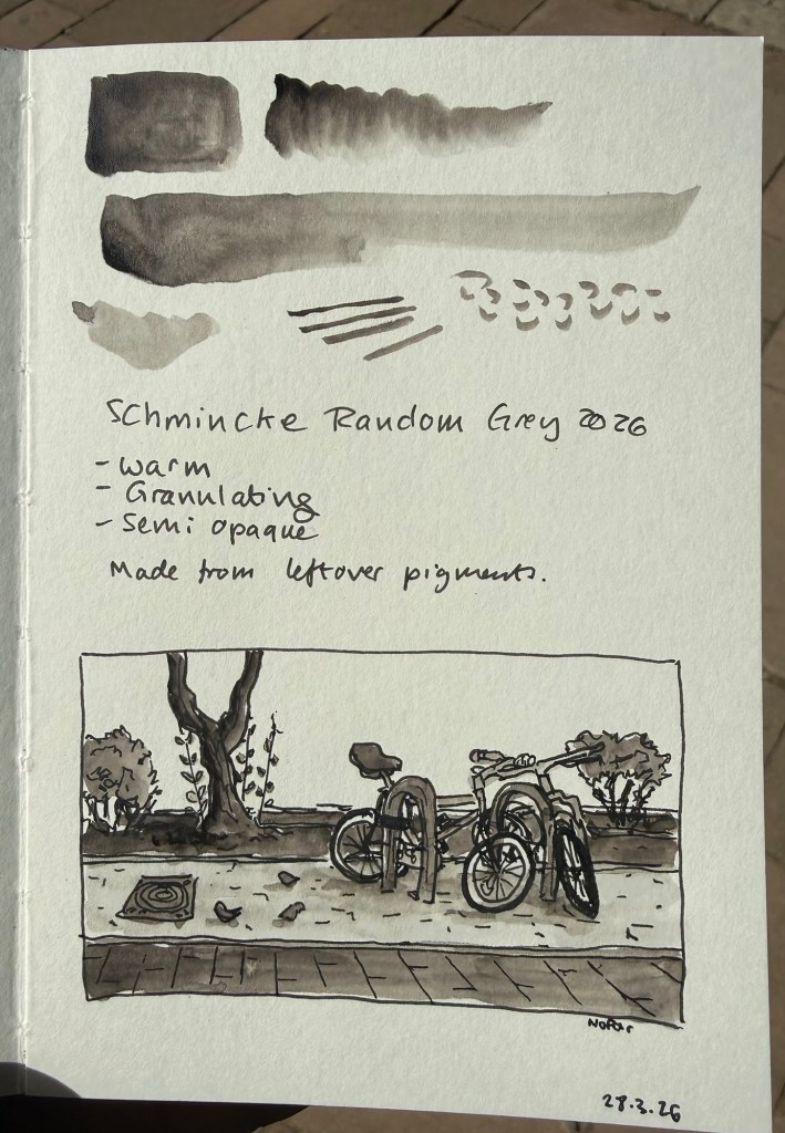
Schmincke Random Grey 2026 Watercolour
Once a year Schmincke, the German art supply company (makers of the best watercolours in the world) produce a limited edition colour out of the leftover pigments they have. The pigments come from their pastel production- which uses almost 100% pigment.
In 2024 the made an acrylic Random Grey. In 2023 the Random Grey was a pastel.
This year’s Random Grey is a watercolour. It’s a warm grey, granulating, and semi opaque. While I normally prefer cool or neutral grey’s, this colour looked interesting enough for me to give it a try.
The paint comes in a 15ml tube and though it’s a series 1 pigment it cost double the price of Schmincke’s usual series 1 watercolours (note: professional watercolours are usually priced differently by the kind of pigment they use. Blues tend to be more expensive than earth tones, for example. Schmincke’s series 1 are the cheapest and series 4 the most expensive). I’m not surprised as it’s a limited edition, but if you’re just looking for a warm grey Random Grey isn’t the most cost effective option.
I filled three half pans with Random Grey (one for me and two to gift) and there was plenty more to go around, so if you’re interested in this watercolour but are price conscious you can try finding other artists in your area that would be willing to split the tube. Schmincke’s watercolours are superb and it’s very easy to fill a pan or half pan with paint, let it set for a day or two and then use it.
The shade really surprised me. Yes, it’s a warm grey, but it’s not too far away from a neutral grey to become unusable for all but certain lighting conditions. It does not have that yellowish brown tinge that makes warm grey’s so… atmospheric. I enjoyed using this pigment, its granulation and layering possibilities enough to add it (at least temporarily) to my watercolour palette.
Is this a bit of a gimmick? Yes. Is it also a fun and interesting grey to have around? Also yes. I look forward to mixing and combining it with some pinks and reds and seeing what comes out.
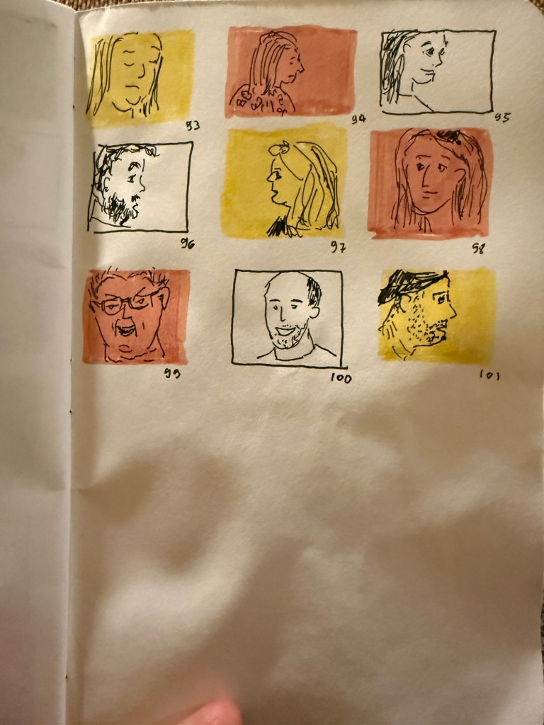
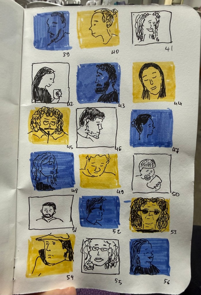
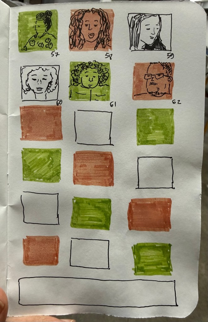
Note: I sketched this on Pith paper, which is not watercolour paper. On watercolour paper Random Grey’s granulating properties will be even more pronounced.