I’ve been unhappy with my watercolour palette lately, and so I’ve been experimenting with new colours instead of some of the old ones. I usually swap out one colour at a time, try out the new colour for a while, and then either keep it or swap it out for something else. This time I’m doing my usual swap procedure, and also building a completely new palette on the side. The idea is to speed up the new colour discovery process, as there are 5-6 colours that I want to replace in my current palette, and that’s a lot.
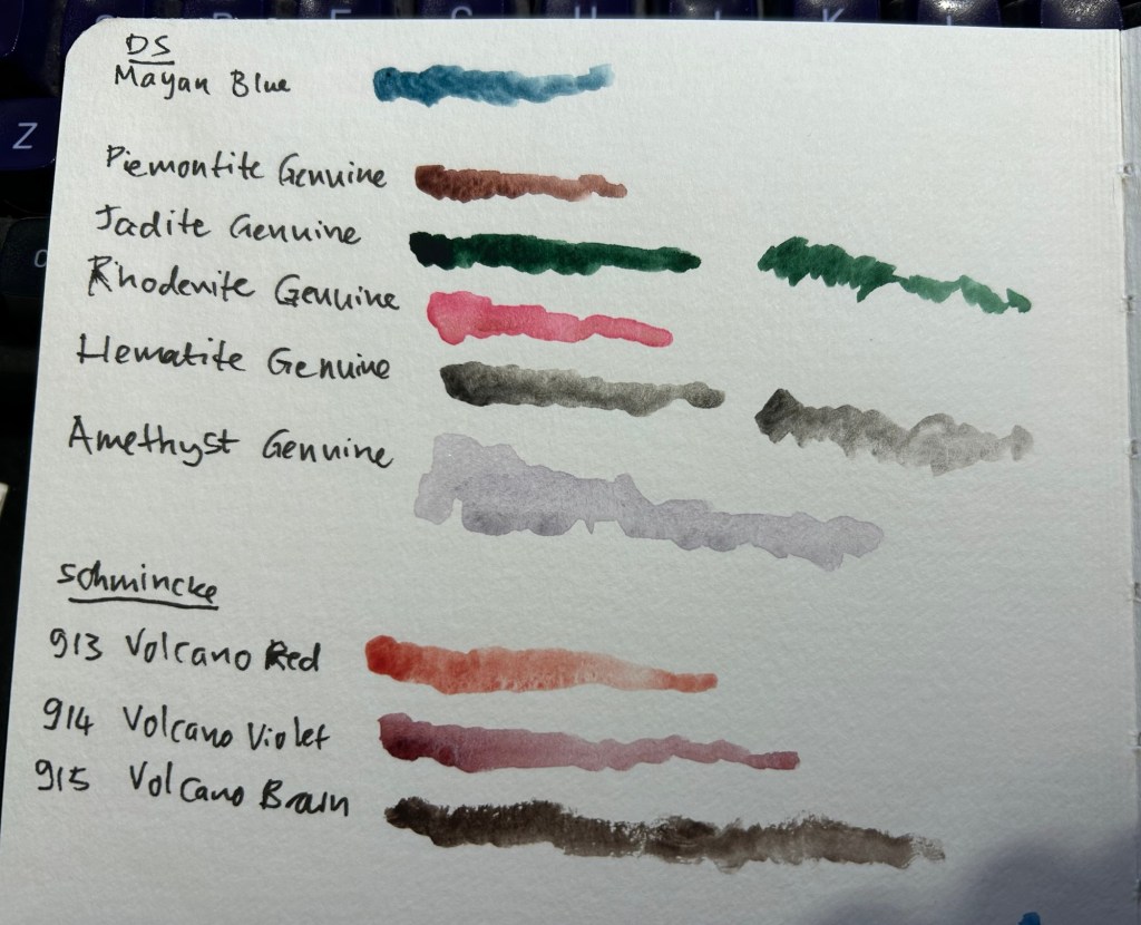
The first colour to leave was Daniel Smith Cerulean Blue Chromium. I have too many similar blues and it’s slowing me down having to decide between them every time I need a blue. In its place I swapped Daniel Smith Rhodenite Genuine, which is a bright pink.
Samples of some of the colours I considered swapping in. Amethyst Genuine was a genuine disappointment – I don’t think I’ve seen such a bland, pale, washed out purple anywhere.
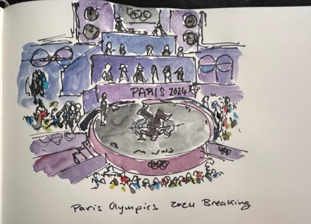
I then sketched one of the scenes from the 2024 Paris Olympics Breaking final, which I was going to see in person before I had to cancel my trip. Luckily my brother was there and sent me photos and videos, which I had fun sketching from. There was a lot of purple in this scene, so I had fun mixing Rhodenite with blues and purples on my palette.
Quick Paris Olympics Breaking sketch
The new palette is something I’m building in a Daniel Smith plastic paintbox. It’s not a box that I’d regularly use (it doesn’t have enough mixing space for me), but it’s useful for the testing I want to do.
This box came as part of a set of two, one of which had paints in it.
I then set up a legend in my sketchbook:
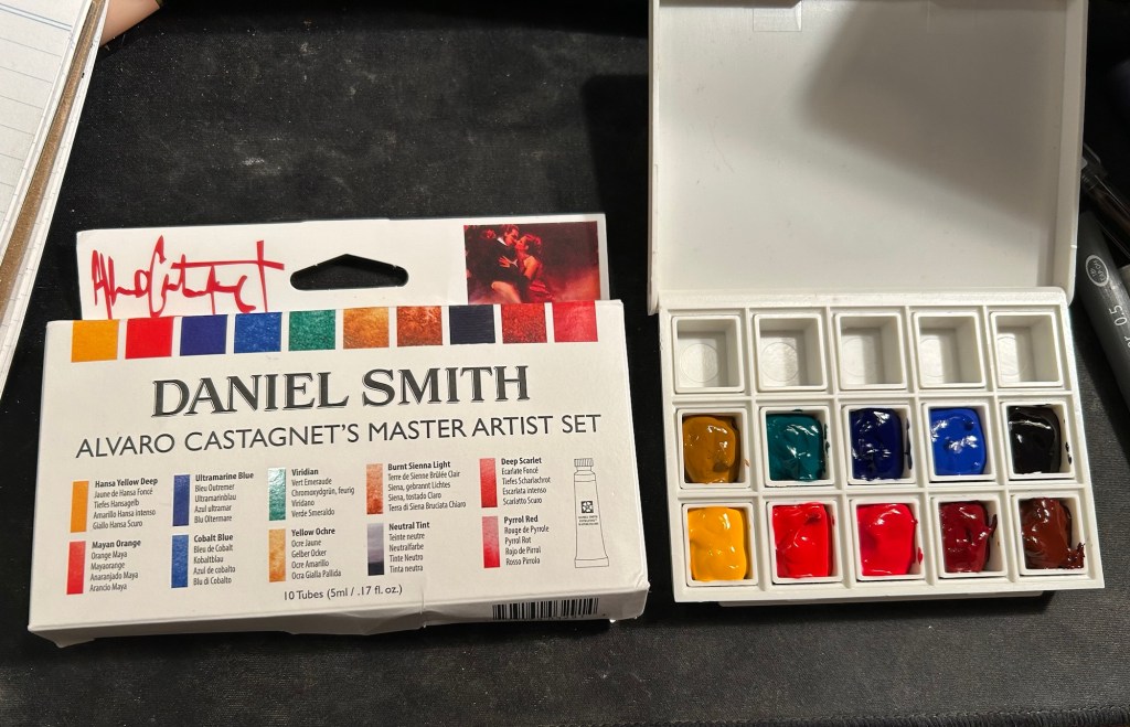
Next I broke ou the Alvaro Catagnet Daniel Smith Master Artist set and filled the pans with paint. I’ll give them 2-3 days to completely dry out before finishing the legend and trying them out. I would never have built a palette which is so heavily skewed towards reds, but this is part of the experiment – after a heavily blue skewed palette it’s time to try something new.
I can’t wait to give these new paints a try. I’ve worked with the Schmincke versions of Yellow Ochre (I no longer use it because of its opacity), Viridian (way to artificial a green for my tastes), Ultramarine Blue and Cobalt Blue, but it will be interesting to see Daniel Smith’s take on these colours.
It turns out that when you take a bunch of stuff that you happen to like and put it in a blender, a book doesn’t come out. That should have been the tagline for this best-selling mediocre, patchwork of little substance.
“Tomorrow, and Tomorrow, and Tomorrow” by Gabrielle Zevin starts very promisingly. The first chapter, and particularly the first half of the first chapter is wonderfully well written and a joy to read. Then there are parts here and there, certain imaginative landscapes and certain descriptions mostly, that are excellently written. But the novel as a whole is a giant void of nothingness, lavishly sprinkled with clichés and woke politics, with “spicy” characters and themes thrown in every time Zevin felt that she might be losing her reader. Reading this book is like eating at a fast food restaurant – things may look enticing at first, but there’s no there there and you end up leaving hungry.
Some main points:
The childish, selfish, self involved, self destructive Sadie and Sam (the main characters) don’t change at all during this novel. They behave as adults exactly as they behaved as children. Not only is this incredibly boring, it’s also bewildering that this was termed a “coming of age” novel. They don’t grow up, so what exactly is the plot here?
There is no plot. It’s just time passing with incidents and character behaviours and interactions that are unearned and unwarranted. The only reason things seem to be “happening” is because Zevin feels like she might be losing her reader. The happening is in brackets because the events show little to no lasting effect on the main characters’ behaviour or choices beyond the superficial. The worst of these “happenings” is the killing off of a likeable character. Once he’s killed you realize that the only reason he was there and was likeable was so that Zevin can kill him off. It’s unwarranted, unearned, and insulting to the intelligence of the reader. It’s then that you realize that his involvement with Sadie and Sam was so outlandish in the first place that Zevin felt the need to justify it several times in the novel.
The characters include (I kid you not): a manic dream pixie girl that composes music naked to feel closer to her instrument, a Jewish Korean only child that is a talented math nerd who goes to an Ivy League college, a gay video game designer couple, a Jewish princess video game designer, an ex-Mormon video game designer couple. The book is trying so hard to be woke that it is breaking into a sweat and not really addressing or representing the historical era it is set in or the video game industry. As a woman in tech, a system programmer in an as male dominated field as Sadie’s, her experience is utterly, utterly unrepresentative. There’s lip service in a few scenes where Sam get the credit for her work, but Zevin was clearly not really interested in tackling the experience of always being the only woman in a room full of people who don’t believe you should be there.
The book skirts all kinds of interesting themes (sexism, racism, abuse, trauma, disability, the immigrant experience, financial and class disparities, creative ruts) but tackles non of them. They all just go “whoosh” by, leaving no mark, placed there just as if they were chores on Zevin’s to do list.
My guess is that reviewers and book club recommenders were taken in by the first chapter and didn’t really trudge through the entire 400 plus pages of the book. I would strongly recommend that you spend your reading time elsewhere. The bits and pieces that are worth reading aren’t worth the bits and pieces that are not.
Oh, and the use of Shakespeare (and “The Iliad”) is utterly unearned and jarring. I have no idea how either Zevin or her publisher had the gall to name the book after such a masterpiece of a speech.
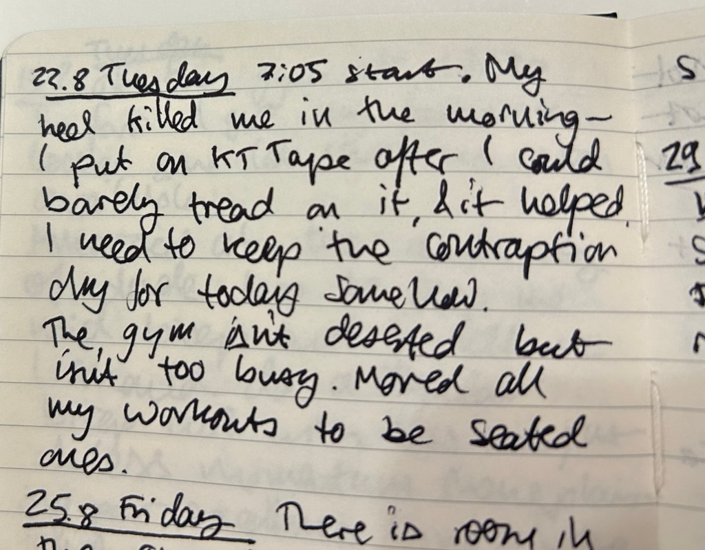
It’s a battered Moleskine pocket hardcover lined notebook, a limited edition Mickey Mouse one from years ago. There was a series gash in the spine, so I fixed it with some gaffer tape. I use a Zebra G-450 gel ink pen, and it lays down a bold, 0.7 black line.
I don’t use this notebook during every gym session, but when I’m trying out new things, when I’ve got a lot on my mind, or when I’m trying to solve a specific problem I take it with me. I don’t write details about my workout (rep numbers, weights, etc) as I have an app for that.
So what do I write in this notebook?
How things felt during the workout, particularly when I’m trying something new or if I’m recovering from an injury.
Notes on other gym goers bad behavior. I don’t want to confront them, but I do get frustrated when people don’t return weights, don’t use a towel or wipe down the equipment, and hoard equipment during the gym rush hour. Writing it down allows me to let off steam and focus on more productive things (like my workout, or returning equipment that I know is no longer in use back to its place, or on anything else).
Ideas or projects that I’m brainstorming at the moment. I oftentimes use a workout to think about something I’m considering or something I’m stuck on. I jot a few notes in between sets to not forget the ideas I came up with during that time.
Things I want to journal about later, in my “regular” journal. These are usually things that I forgot to journal about and want to get back to later in the day, when I have time to sit down and better process them.
The main point of this journal is to get me as much as possible off my phone. It’s tempting to check the news for the umpteenth time, or doom scroll various feeds, or play mindless games while you wait between sets. My goal is to bring these habits down to a minimum, and this journal is a useful tool in the search for less screen time.
Sample entry from last year. I write with gym gloves on, hence the atrocious handwriting.
I originally thought that it would be embarrassing to use a notebook in the gym, but I decided that “so what, who cares” is the attitude to take in this case. People do much more embarrassing things at the gym and nobody comments on it. I use an inconspicuous notebook that isn’t at all precious, and a hardy, inexpensive, inconspicuous gel ink pen to go with it. Both have survived falls and encounters with misplaced weights, so they are gym hardened, Don’t bring large, colourful notebooks with you, and don’t bring pens that look expensive or draw attention to themselves. You’re going for the “boring, not worth paying attention to” look here.
Would you consider taking a pen and notebook with you to the gym? If you already do, how do you use your gym notebook?
Just as I wrote a post about Moleskine no longer making store exclusive limited edition notebooks, my brother went to Paris (during the Olympics) and found not one but two store exclusive limited edition notebooks. Moleskine have officially cooperated with the Paris 2024 Olympic games and they have outdone themselves.
The first notebook is a large lined hardcover notebook that could be purchased standalone, or as part of a set that included three Olympics themed charms (in the colour of the medals) and a pen. The box was sold out, as were the charms (and yet it was still on display in the store window, because reasons). The notebook was still available and it is glorious, a perfect example of Moleskine’s design prowess.
This is the notebook still in the wrapper:
Wrapped notebook from the front
The front facing part of the wrapper has a discreet Paris 2024 logo sticker on the right side. The back part of the wrapper is anything but discreet. There are games logos, games sponsors, multiple designations of the officialness of the notebook, as well as pictures of the notebook cover and the lined interior with its bookmarks (more on them later). It’s busy back here:
Wrapped notebook from the back.
Removing the wrapper reveals the notebook itself. The Olympic logo is given its pride of place, and the rest of the cover is given over to a celebration of the Paris 2024 font. The only colours here come from the foiled gold of the flame and the Olympic rings. It’s a classic and sleek design:
Front cover unwrapped.
I expected the back cover to just be more of the Paris 2024 font in black on white. Instead there’s a set of letters that are gold foiled, and I really like the effect. It’s chic, classy and very well thought out. The Moleskine logo is there, but it doesn’t call attention to itself, and the black rubber band almost disappears from view:
Back cover unwrapped
Inside the front endpapers have the usual in case of loss section, the Paris 2024 logo prominently displayed, the Moleskine logo, small and discreet, and a letter in French:
The front enpapers
Here’s the letter, from Tony Estanguet, the head of the organizing comittee for Paris 2024 and an Olympic champion. Note that it, unlike the “In Case of Loss” part uses the Paris 2024 font. It’s written in French and is a celebration of the Paris 2024 games and their uniqueness (first opening ceremony not in the stadium, first games with gender parity, first games with Breaking, 100 years since the previous Paris games, first event open to participation by the general public – Marathon for All). It ends with a celebration of the notebook in your hand, which is a nice touch.
Close up on the letter.
The back endpapers have logos of the various Olympic events. As usual, these are well placed and the back pocket and the endpaper prints match perfectly. It’s the little details that matter in these notebooks, and Moleskine always nails them.
Back endpaper
Inside the back pocket are some Olympic themed treats: four sticker sheets, and a folded map of the event locations.
Stickers and folded map
The stickers feature the Phryges, the Olympic mascots for the 2024 games, participating in various sports:
First two sticker sheetsSecond two sticker sheets
Then there’s a stylized map of the various events locations in Paris, France and Tahiti:
The map.
Finally, inside the notebook are not one, not two, but three ribbon bookmarks in the colour of the Olympic medals:
The bookmarks.
All in all this is an extremely well thought out design, one that takes pride in the games and cares about every little detail. It’s a worthwhile memento of the event, and it just shows what Moleskine can do in terms of localized special editions when they put their minds to it.
The second notebook is a soft cover cahier created for those who want a cheaper, more colourful and lightweight alternative commemorative notebook from the event. Here it is wrapped:
Wrapped front cover
Here’s the back cover. Again, lots of info here (the price was half that of the hardcover).
Wrapped back cover.
The front cover features a very colourful illustration of Phryges doing various game related things alongside iconic Paris monuments and symbols. There’s a lot of playfulness here, and it’s a delight to look at all the little details here:
Front cover.
The cover has a pleasant texture to it. The back cover has a Phryge in the back waving hello above the Moleskine logo in white:
Back cover
Moleskine clearly love the Paris 2024 font because it is once again the star in both front and back endpapers, this time with only the numerals in use:
Front endpaper
There’s a pocket in the back:
Back endpaper
The paper is blank, and it’s stitched using blue thread – very fetching. It lies flat with little effort:
Paper and stitching
Here’s a writing sample on the paper (both notebooks feature the same standard Moleskine paper – 70/gsm ivory coloured acid-free paper:
Writing sample
Close up on the writing. Fountain pens show the same strange mottled pattern that they do in this kind of paper, and wider, juicier fountain pens will spread:
Closeup on the writing sampleCloseup on the writing sample
There is see through and bleeding with the fountain pens and the rollerballs. This paper works best with gel ink pens, ballpoint pens, fineliners and pencils:
Back of the page
All in all these notebooks are well worth their price in my opinion. They are well designed, provide a lovely memento of the Paris 2024 games, and they are unique to the Paris Moleskine stores. I only wish that Moleskine would create more of these for their stores. They were clearly a success in Paris, for good reasons.
What do you think about these notebooks? Would you purchase one or both of them?
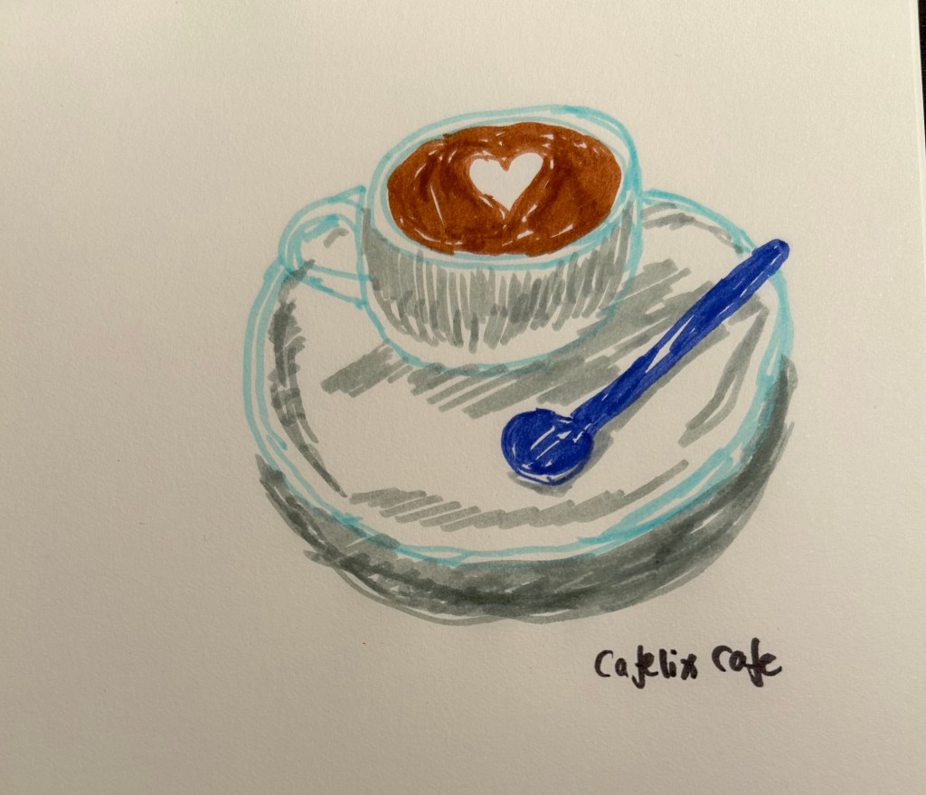
I got a set of Bic Kids markers and decided to sketch today’s coffee with them. You don’t need expensive drawing supplies to draw, and not every sketch needs yo be perfect.
My brother went to Hamburg to see the Taylor Swift Eras concert, and while he was in the city he went to the Mokeskine store and bought me these two embossed Moleskine pocket softcover blank notebooks:
They were already embossed, even though it was clear that the embossing had been done manually in store and not in a factory. How can you tell? Look at the Hamburg coat of arms notebook (the left one in the picture). Can you see how it was embossed and then the notebook moved and it was embossed again, causing a double outline? Also the left part of the embossing is fainter than the right one.
I don’t mind it – it gives the notebook character and a human touch. It makes it less precious on the one hand and more unique on the other, as it’s literally a one of a kind notebook now. But it’s this embossing that got me thinking about the Moleskine store experience again.
I used to love going to Molesking stores. There wasn’t one locally so everywhere I would travel to I’d check if there was a Mokeskine store in the area and make a point to visit it. This was for two reasons:
Moleskine stores used to have store exclusive limited editions of their notebooks. It usually meant that one of the their limited edition collections had a specific notebook design that was only available for purchase in a Moleskine store.
Moleskine store used to have large rubber stamps specific to that store that you could freely use to personalize your notebook.
Both things are no longer true, but the second of these – the stamps that Moleskine no longer puts in their stores – is what I want to focus on.
The stamps were a great idea: there was a standard Moleskine logo stamp, but there was also a local stamp (similar in concept to the design embossed on the notebooks above). Those were the best, as you could mark your notebook with a memory of the place you visited. What was even better was that you didn’t have to purchase anything or even use the stamp on a Moleskine notebook. I had a Moleskine pocket reporter that I travelled with and stamped, but I also stamped Field Notes notebooks.
Lots of people came into the store for the stamps, even those who were clearly not regular Moleskine users. And while you’re in the store, you browse the notebooks, you check out the pens and the bags, and you usually leave with a few of them. If you’re a Moleskine collector you of course pick up one of the store exclusive designs.
Lord of the Rings Gates of Moria notebook that was my journal from July 6th 2019 to November 16th 2019
So what happens today when you go into a Moleskine store?
Well there are no store exclusives anymore, and instead of the free stamps you can purchase add-on personalizations to your Moleskine. Note the word purchase – these add-ons aren’t for free. You can add patches and hot foil printing (of the kind done on the Hamburg notebooks), or add charms to your notebook’s elastic closure. You can only do it on a Moleskine product, and even then not all personalizations are available for all notebooks (you can’t foil print on certain covers, for example). Also to make a notebook like the little Hamburg ones you are talking about almost doubling the price of the notebook. Yikes.
I don’t understand why Moleskine don’t:
have at least one or two limited editions only available in store. It seems like they have enough stores to justify this.
keep the free stamps in store as well as offer personalization services for those who want them.
The stamp overhead in particular seems to be negligible, particularly in comparison to the foot traffic it drove into their stores and the delight it gave to their fans. In an age where we are constantly being pushed to make impersonal purchases online, a touch of something kind, creative and whimsical like the Moleskine stamps is much needed and appreciated.
Moleskine store stamps in the Lord of the Rings journal
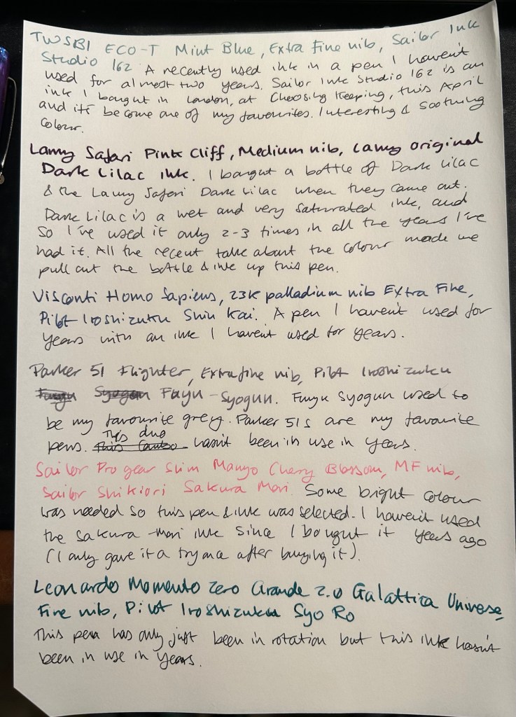
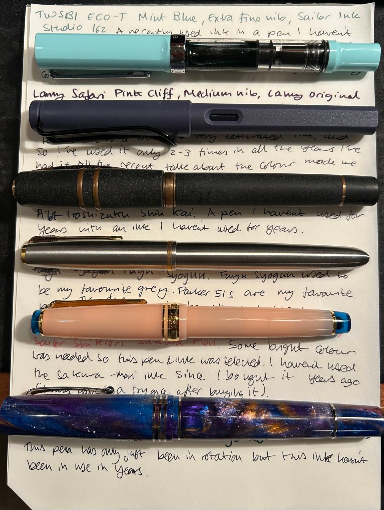
August is going to be a month of pens and inks that I haven’t used in a good long while. While I still have a small amount of ink in four of my July pens (the Kanelea, the TWSBI ECO-T Saffron, the Big I Design Fountain EDC and the Schon Design Faceted Pocket 6), they will all be written dry by the end of next week at the latest. It was time for a new lineup, and this is this month’s assortment:
Writing sample of August’s pens
The TWSBI ECO-T is one of my favourite TWSBI designs, and so I have a few of them. The TWSBI ECO-T Mint Blue hasn’t been in use for about two years, so I decided to pull it out and use the Sailor Studio 162 with it, just for colour matching reasons. The 162 is an ink that I’ve used a few months ago but I really like it, so I felt like giving it another month in rotation.
The Lamy Safari Pink Cliff is a recent purchase that I made in Paris last April. I’ve only now inked it up as I wasn’t sure what ink to use with it — until all the discussion about the new (and not as great) Lamy Dark Lilac ink made me want to use the original Lamy Dark Lilac ink. I purchased a bottle of Dark Lilac and the Dark Lilac Safari back when they first came out, but I haven’t used the ink very much. It’s wet and very saturated and so it works best with only a handful of paper options that I have. Still, it’s a very attractive ink.
Visconti Homo Sapiens — this is the original Homo Sapiens, the one that created quite a splash when it came out. At the time it was my most expensive fountain pens, and it’s still one of my most precious pens. I bought it at Mora Stylos in Paris and had it customized with the special initial badges on the finial. I got Pilot Iroshizuku Shin Kai as a gift with my purchase, and though I love this ink I haven’t used it in a while simply because I misplaced it behind another rarely used ink.
The pens from top to bottom- TWSBI ECO T Mint Blue, Lamy Safari Pink Cliff, Visconti Homo Sapiens, Parker 51 Flighter, Sailor Pro Gear Slim Manyo Cherry Blossom, Leonardo Momento Zero Grande 2,0 Galattica Universe
Vintage Parker 51 pens are my absolute favourites, to the point where I have a hard time seeing one in the wild and not buying it. This Parker 51 Flighter hasn’t been in use in years, but in the spirit of “use the good china” I’ve inked it up. Pilot Iroshizuku Fuyu Syogun used to be my favourite grey ink — and then Diamine came out with a series of excellent grey inks and Sailor came out with the 123. I haven’t used it in years, so I dusted off the bottle and decided to give it another try.
The Sailor Pro Gear Slim Many Cherry Blossom has been in rotation relatively recently, but the ink inside it, the Sailor Shikiori Sakura Mori, is one I haven’t used in years. I don’t have or use many pink inks, but I decided I needed something to brighten up this lineup, and the Sakura Mori ink is relatively readable. It also perfectly matches this pen, which is a nice bonus.
Leonardo Momento Zero Grande 2.0 Galattica Universe is also a relatively recently purchased pen that has been in rotation not too long ago. I just love the Momento Zero so much that I decided I wanted to ink one up, and so I chose the Pilot Iroshizuku Syo Ro to ink it up with. I haven’t used this inks in years, and I love teal inks so it was about time.
What have you got inked up for this month? Anything new? Old favourites or long forgotten pens or inks?