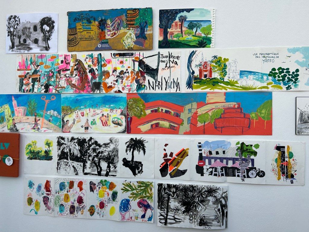
I went to a very special Urban Sketchers sketchwalk and drink and draw today. The event celebrated the end of a special sketch swap between a group of sketchers in Barcelona and in Tel Aviv, and there were sketchers there from all over the world (Spain, the Netherlands, Canada, India, etc). We met at Gan Meir in central Tel Aviv for a sketchwalk followed by a drink and draw at the top of Libling house. It was hot, it was humid, and I needed a break by the time I got to the garden, so I went to the nearby Stephan Austrian Bakery for a cold coffee and a Sachertorte, a rare but much needed treat.
Coffee and cake.
A lot of people came in to pick up an ice cream cone, including this little fellow:
For some reason he didn’t get any ice cream.
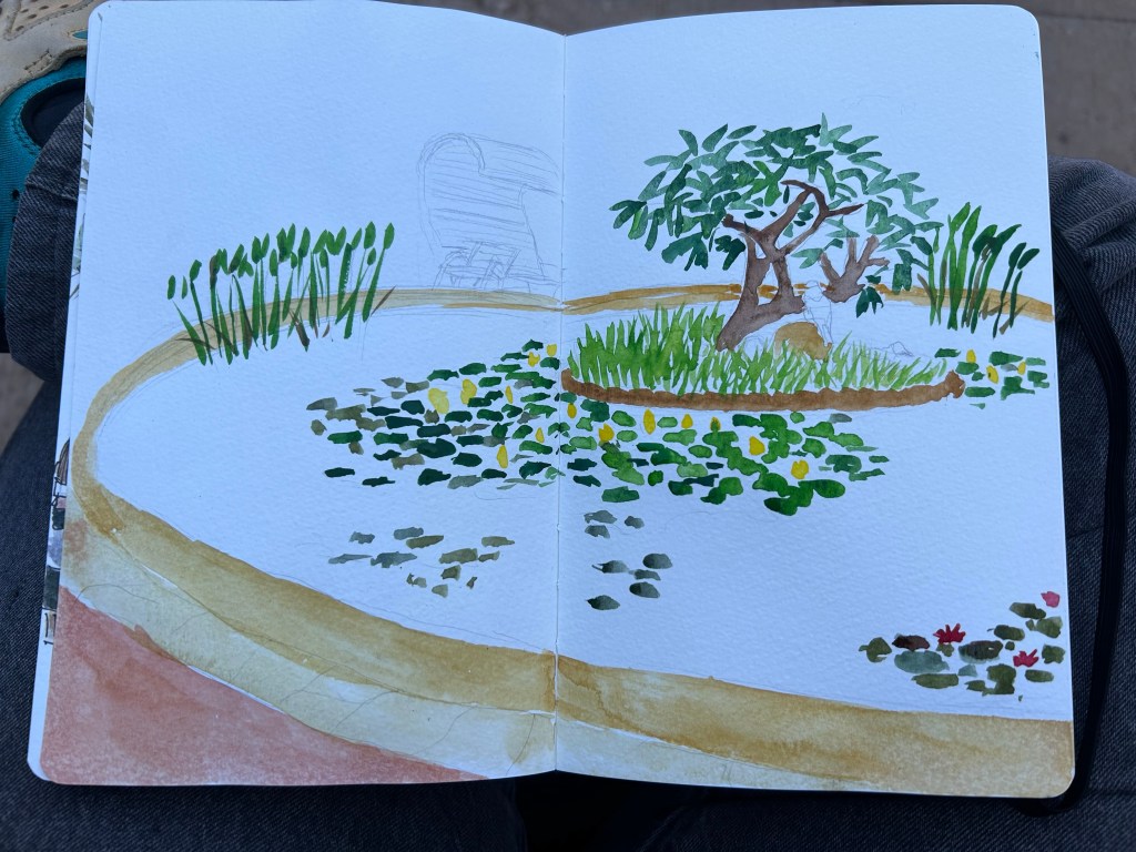
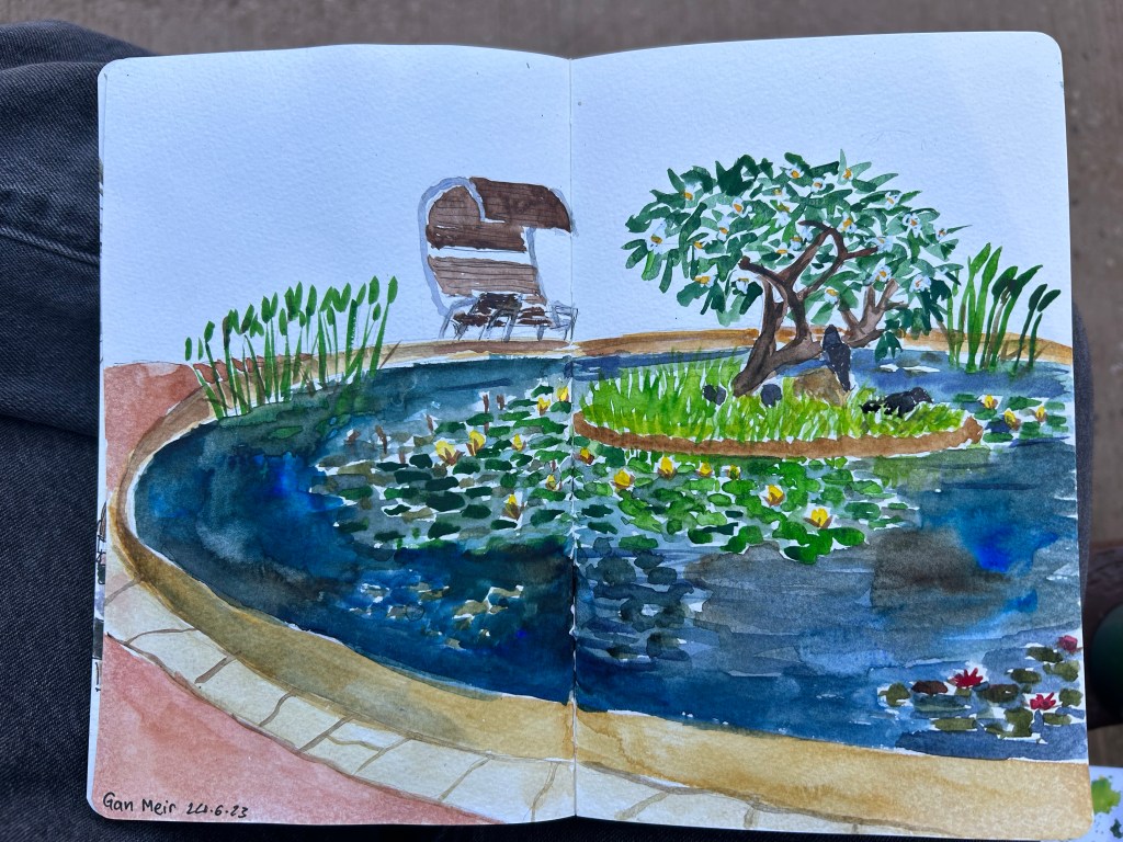
I then went back to the garden and started sketching the waterlily pool:
Work in progress
There was a group of ping pong players nearby, and I got hit by balls several times. I was also visited by several curious children. It’s all part of the Urban Sketching charm.
The waterlily pond complete
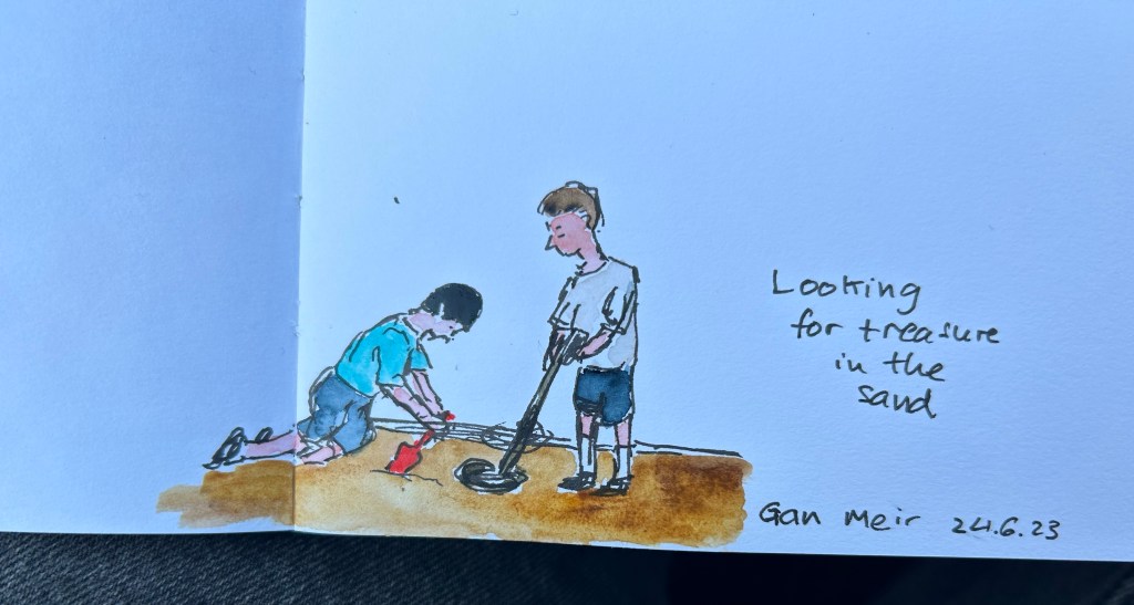
I then saw a group of kids with a metal detector, searching for treasure in the sand, so I sketched them quickly:
Treasure hunters.
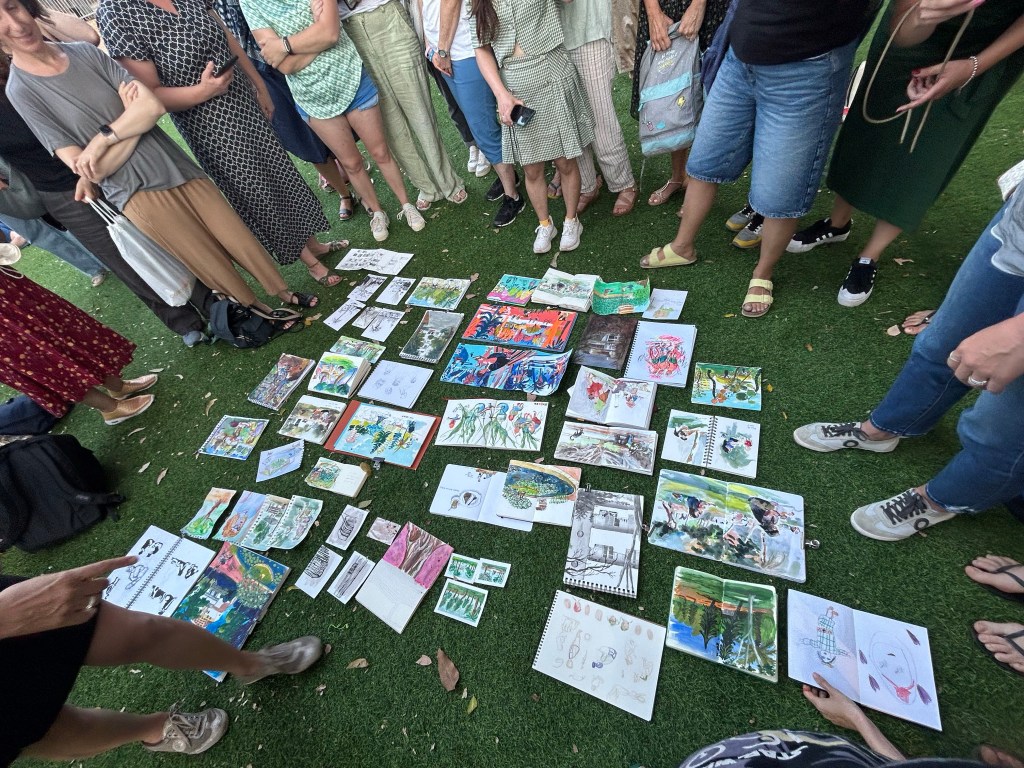
This was our sketchbook throw down, and I loved seeing all the different styles and sketch subjects together,
Sketchbook throw down.
We then went to Leibling House nearby, and there saw some of the sketch swap participants’ work. We had a party on the roof, and I got to talk to sketchers from all over the world, and see so many different sketching styles.
The exhibition
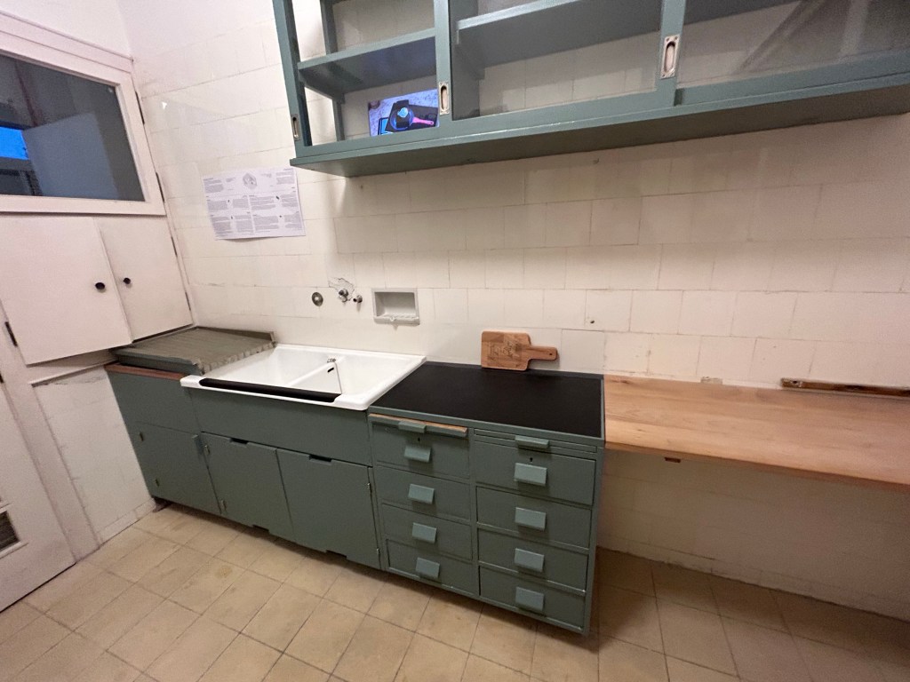
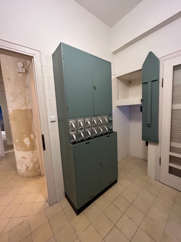
I had to leave early, but I did get to check out Leibling House and see their Frankfurt Kitchen, which is pretty amazing:
Actual storage space, proper sinks for washing dishes and room to dry the dishes.Storage space for dry goods, and foldable iron board. Perfect use of space.
What struck me most is how the sketchers from abroad saw and sketched the same tired old local monuments and tourist attractions. Through their work I got to see them with new eyes, and it made me want to visit them and try to sketch them myself. I also got to see Leibling House for the first time, and I plan on returning to it in the future, as it’s a wonderful museum and exhibition space.
This review has been languishing in my drafts for the past two months, as life (and particularly work) has gotten so hectic. As I wrote the Franklin Christoph x Stilo e Stile 03 Sparkling Rock dry today, I thought that it was about time to finish this review and publish it.
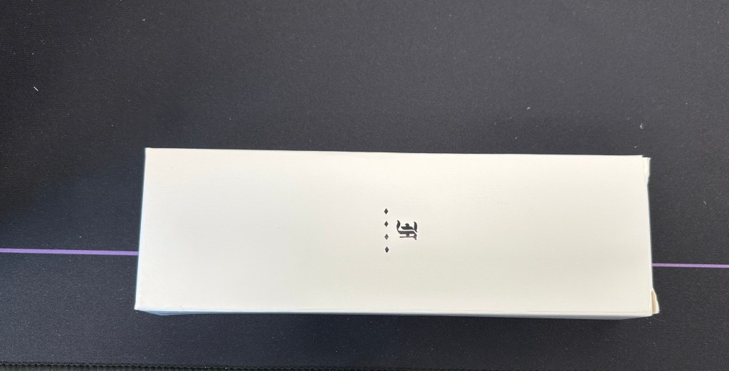
The outer box
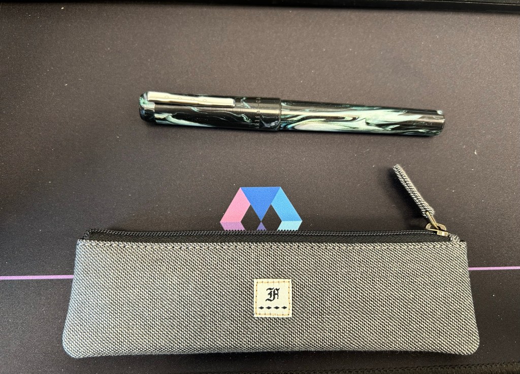
I don’t write much about packaging since I don’t care much for it, unless it is clearly overdone and something that unnecessarily added to the price. Franklin Christoph’s packaging is one of my favourites as the outer box is simple and elegant enough to be sent as a gift to someone, without being flashy. But what makes it even better is that many of their pens come with a pen pouch. These pouches are fantastic, and the one that I got features a velvety interior that protects the pens from scratches, and a grey, denim-y like external fabric that I really like.
Pen and pouch.
This collaboration between Franklin Christoph and Italian pen store Stilo e Stile is a model 3 pen with a gorgeous black, white and green resin with chatoyance, sparkle and a great deal of depth to it. Photos flatten it out and do it no justice. It’s a breathtaking material.
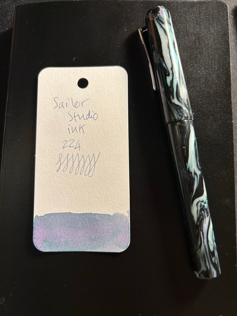
I purchased an extra-fine nibbed pen, and used it for writing and a bit of sketching using the Sailor Studio 224. The 224 grows a bit darker with time, but still features a lot shading and some gorgeous dual colouring. I was worried that it would be too light to be readable, but that was not the case.
Pen and Ink: Sailor Studio 224 ink sample written with the 03 Sparkling Rock
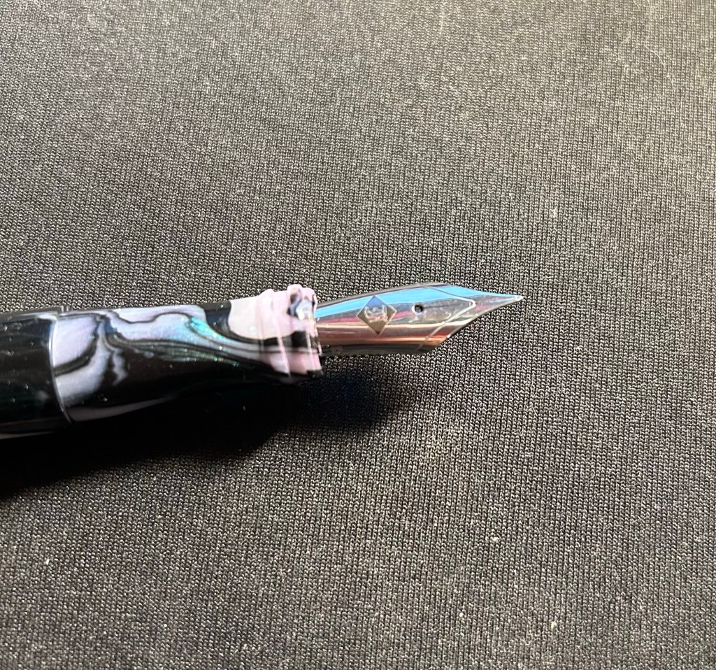
I have a few Franklin Christoph pens and I love the pens that they make, but this is the first Franklin Christoph pen that I have that has a pen clip. So while the model 03 is as well made and well balanced as the other Franklin Christoph’s I’ve tried, I did notice that the finial above the clip had a tendency to screw itself a bit loose sometimes. It never got to the point where it screwed off and got lost, and I doubt that it will, so it wasn’t really an issue, just something that I noticed. The clip is secured to the cap with a screw, and is robust and springy, and completely unaffected by the state of the finial.
Closeup on the finial and clip. My camera has issues with photographing the pen material.
This is the Sparkling Rock 03 as I used it, uncapped and unposted (you can technically post it, but I don’t see why as it’s long enough and clearly better balanced to be written unposted), and it is perfectly sized to be comfortable for long writing sessions. Unless you grip your pen with your fingers right on top of the nib, the two ridges in the end won’t bother you. I found them useful as they helped me position my hand better.
03 Sparkling Rock
The nib unit is a standard number 6 nib, and screws out easily, for both cleaning and swapping out. The pen itself, like all Franklin Christophes, is a cartridge-converter, and comes with a good quality converter.
Franklin-Christoph nib
This brings me to the reason for this review: in a pen market that features ever increasing limited-editions in ever increasing prices, Franklin Christoph offers a refreshing alternative. You can go to their website, find a variety of pen shapes in a variety of resins, know that you are getting a very good quality pen that will be a breeze to clean and maintain, and in many cases to convert to an eyedropper if you so please. And the prices aren’t eye watering. You can even splurge on an interesting nib grind, allow yourself to experiment a little, knowing that in the worst case you can easily swap out a nib on your own. It’s the ultimate fountain pen for those venturing out of the beginner pen group and wanting to experience something better, without paying gold nib prices or going the vintage route. It’s also very tempting to collect more and more of them, as you try out different shapes, sizes and resins, which explains why there are quite a few members in the 50th pen club (after buying 49 FCs you get the 50th, personalized, and for free).
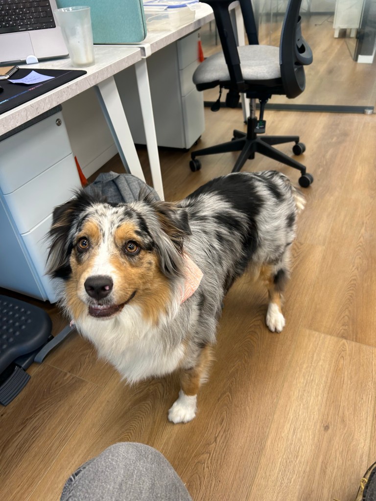
Trying out a new sketching setup so I decided to sketch Belle. She’s a young Australian Shepherd that belongs to a colleague and regularly comes to the office.
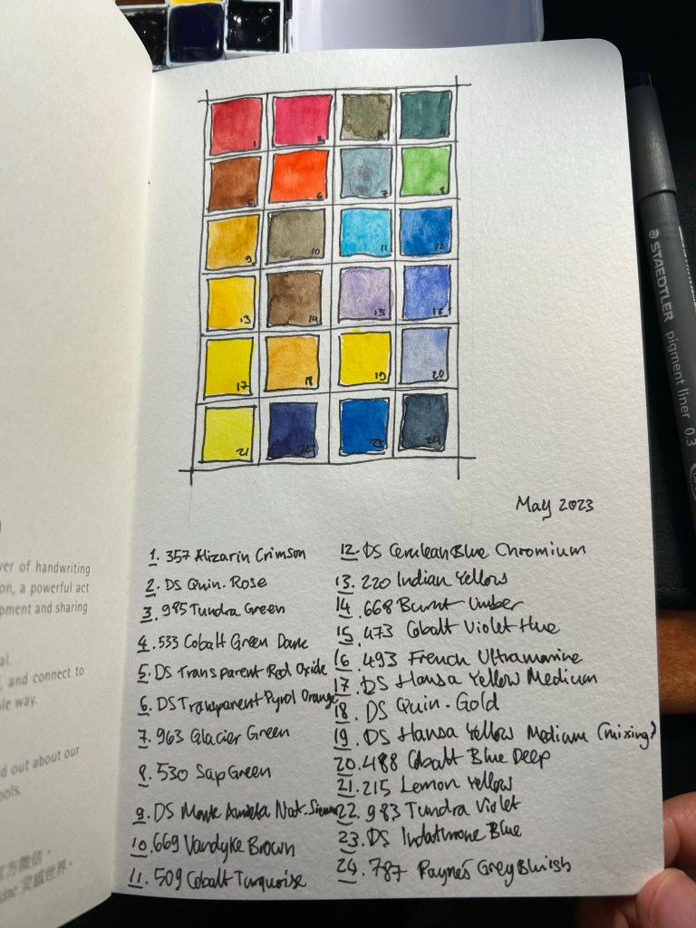
So after writing this post about the physical side of building a new watercolour paint box, here is my updated palette. I’m using a new Moleskine Portrait Watercolour Sketchbook as my sketchbook of choice for the watercolour part of Liz Steel’s teacup course (that starts today), and so I used the first page to create an index for my current palette.
My watercolour palette for May 2023
Every watercolourist’s palette is unique and full of choices that reflect their subject matter preference, the place they live in, and various personal idiosyncrasies. Please don’t copy anyones palette as-is (including mine), but rather understand the artist’s choices and tailor your palette choices to your own needs. To this end, I will explain some of the choices behind my paletter.
There are 24 half-pans in my palette, and 23 unique colours. Daniel Smith Hansa Yellow Medium now appears twice in my palette, once for mixing and once for using as an unmixed mid warm yellow. Yellow paints get dirty if you even look at them, and they are difficult to clean after a dab of this or that paint made its way to them. Of the three yellows in my palette I use DS Hansa Yellow Medium the most for mixing, which is why I opted to have a second half-pan of it this time (it’s a new change that I’m trying out).
Of the 23 paints, 15 are Schmincke Horadam and the rest are Daniel Smith. I’m pointing this out so that you feel comfortable mixing between paint manufacturers on your palette. This can be done so long as you are using the same grade of paint in each maker (artist grade, for example).
There are some classic examples of watercolour palette building in this palette and some that are a bit off. There are warm and cold sets of yellow (Hansa Yellow Medium, Lemon Yellow), red (Quin. Rose and Alizarin Crimson) and blue (French Ultramarine and Cobalt Blue deep), and there’s a rather standard set of earth tones (Pyrol Oxide, Monte Amiata Natural Sienna, Van Dyke Brown and Burnt Umber) but there’s some weird stuff too. I’ll be focusing mostly on the weird stuff.
There are three greens in my palette. I sketch mostly landscapes and having premixed greens saves a LOT of time. Of the three greens I use Sap Green the most, either by itself or lightening it with yellow or darkening it with blue. It also has a brightness and vivacity that you cannot obtain by mixing your own green. The two other greens are opaque (which means they don’t mix well), and cover two very common and difficult to mix green shades. Schmincke Tundra green is part of their super-granulating series, and has some pink undertones to it. It also covers a wide variety of olive coloured local plants. The Cobalt Green Dark is a brand new addition to the palette, replacing Schmincke’s forest green. This paint works as an “artificial” green, for things like benches and fences that were painted green, and a greyish-green for the many greyish-green local plants.
Then there are some “magic” paints. Schmincke Glacier Green is on the palette as a cool “glass” and sea blue, and it’s super-granulating and dual pigmented. You can see the pigment party going on with it in my swatch of this colour. Liz Steel has influenced me to add an orange and a turquoise to the palette. They bring joy to the painting, the turquoise is useful as “glass” and “windows” when I want something brighter than the Glacier Green and the orange paint is much brighter and more alive than any mixed orange that I could ever hope to create. It’s useful to add a splash of colour to a painting, to help focus the eye in a certain area. The two Daniel Smith blues on my paletter are also Liz Steel inspired, and at least one of them may be on its way out due to low use.
Paynes Grey Bluish is one of my most heavily used pigments, as part of sky and sea scenes, denim jeans, as a shadow colour, for asphalt and to darken other mixes. A must have for me.
The two violets on the palette are also personal choices, though the Tundra Violet will likely be replaced with something else in the near future. Purples are very difficult to mix without getting muddy not registering as purple, which is why the Cobalt Violet Hue paint on my palette. The super-granulating Tundra Violet is much less useful, and may find its way out my palette.
I hope this gave you some insight as how to think about the pigment choices that you make for your palette. Again – create your own palette and don’t just force yourself to use a copy of someone else’s